A little more than a year ago, I attempted to answer the question, ‘which stock sector is best?‘
The answer, of course, is that it depends. It depends on what time horizon you are evaluating, whether you care about overall performance, risk-adjusted performance and so forth.
My conclusion to that article is that no sector is ‘best’ and the best strategy is to have diversified exposure to a basket of sectors.
I thought today I would expand on that a little bit by talking about how we currently approach sector exposures portfolios.
Within the funds we own, whether they are value, momentum or simple market capitalization, the sector weights are based on the signals (value, momentum, etc.) with some constraints so that the sector exposure doesn’t deviate too much from the benchmark.
If energy stocks are cheap, they may show up in value funds. If they have positive momentum, then they show up in a momentum fund. In a perfect world, they would show up in both (cheap but moving higher). We don’t attempt to manage around those exposures so we are happy to see the constraints that the fund managers use.
Within the individual stock exposure, we attempt to hold the sectors in equal weights, with two basic caveats. This wasn’t always the case and there are a lot of factors that come into play here based on client circumstances, so not everyone will have this today.
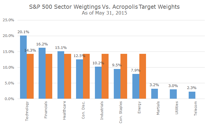
The other caveat is that we don’t hold all 10 of the sectors in equal weight, we exclude the three smallest sectors: materials, utilities and telecommunications that together add up to 8.6 percent of the S&P 500.
The following chart shows the natural market weights as of May 31st in blue and how that compares to an equal weight portfolio of the seven largest sectors in orange (I only labeled the first one since they are all the same).
We started the equal weighting process as a risk management operation, wanting to avoid having too much exposure to any one sector. We think that the market gets it wrong sometimes and people had too much technology exposure in the late 1990s and too much financials exposure heading up to the 2008 financial crisis.
When we tested how an equal weight portfolio performed, we were surprised by how good the results were using data as far back as we could find, which, unfortunately, is only the late 1980s.
The following chart shows the growth of a dollar for the equal weight strategy for just the seven sectors (in blue), all 10 sectors (in orange) and the S&P 500 (in grey).
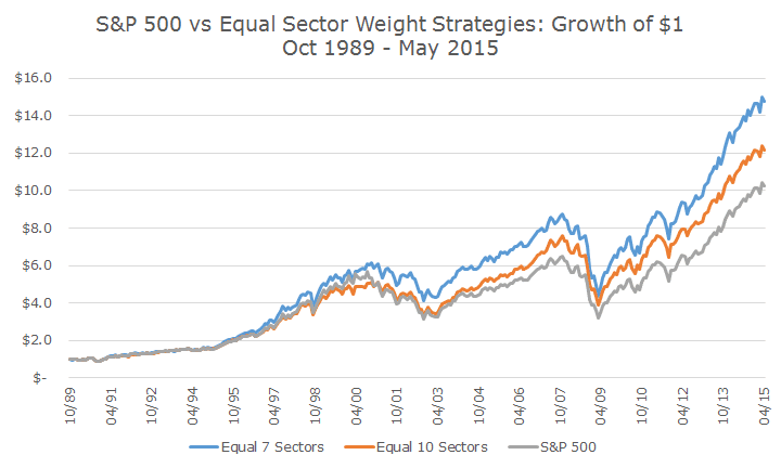
Of course, these kinds of results make me worry about data mining – is this really a true phenomenon or is it a spurious result?
The first test was to look and see whether the outperformance was statistically significant, and it is for the seven sector equal weight – we have 99.5 percent confidence that the outperformance is real and not a lucky twist of the data.
That’s not true for the 10-sector equal weight performance, where the confidence level is only 68.7 percent. Interestingly, we can say with 90.2 percent confidence that the seven-sector equal weight out-performed the 10-sector equal weight.
Even if we can be confident about the outperformance after the fact (which may or may not be indicative of future results!), the question remains: why would this be true? What’s special about seven sectors? Should we test at five, six or eight?
I don’t think that the seven sectors in particular are special other than it includes all of the major sectors. But the bigger question about why it has worked boils down to the same thing as always: tilts to value, momentum, size and quality.
Our trusty five-factor model (the fifth is overall market beta) explains 97 percent of our sector portfolios, which is very high and, you guessed it, there is absolutely no alpha to speak of. We get nice, statistically significant positive tilts to value and quality by equal weighting these sectors.
I am a little surprised that I hadn’t done this before, but for the first time last night, I ran each of the sectors against our five factor model and the results were fascinating.
You might have guessed that technology stocks don’t tend to be value oriented and that utilities have a very low beta to the overall market, but would you have guess that energy stocks are tilted towards momentum (you certainly wouldn’t have over the past year). I plan to hit on these relationships in more detail another day, so hold onto your hats!
There may be ways to use this data to really try and optimize our sector weights. We’ve looked at how to over/under weight based on our sector conviction, but aren’t satisfied with the research. Fortunately, we don’t have to look too hard since our current approach holds up nicely.