Until I read the book ‘Hedge Hogging’ by Barton Biggs before the 2008 financial crisis, I had never heard the term ‘drawdown,’ which refers to the peak-to-trough decline of an investment or market.
A drawdown measures the depth and length of a decline and illustrates how long it takes to earn back money lost from the last peak.
It’s a commonly used term in the hedge fund community, partly because hedge fund managers don’t earn their incentive allocation, or 20 percent of the profits, until a drawdown is reversed.
The following chart shows the drawdowns that the S&P 500 experienced over the past 25-years (I pretended as though January ended yesterday).
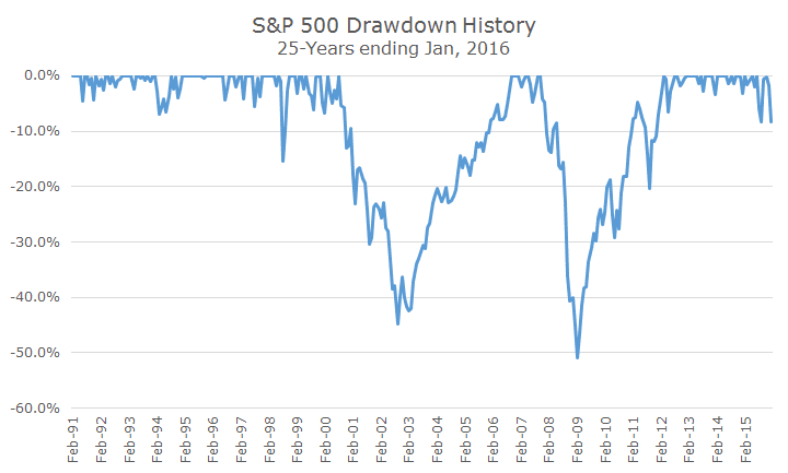
There were no material drawdowns until 1998, when the Russian government defaulted on their debt and caused a currency crisis. It was easy to forget because, as you can see on the chart, it was a brief downturn and was gone almost as quickly as it arrived.
The tech wreck followed the tech bubble, which is the first of two major drawdowns in the chart. You can see that the S&P 500 lost around 45 percent during that episode and after the market bottomed in September 2002, it wasn’t until October 2006 that the drawdown ended.
Sadly for investors, it was only a year before the 2008 financial crisis created a second drawdown, this time more than 50 percent (using monthly data). That drawdown ended in April 2012, and markets were quiet until recently.
You can see the current market turbulence, but it’s obviously quite small compared to the two big drawdowns over the past 25 years.
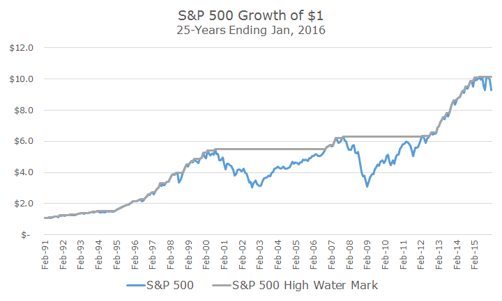
If that chart isn’t intuitive, the following graph might be helpful. The blue line shows the actual growth of the S&P 500 and the grey line represents the high watermark over time. The difference between the market level and the high water mark represent the drawdowns.
For fun, I thought I would show the drawdown for WTI crude oil (in orange) for the same time period and it’s really quite shocking if you ask me. I count four drawdowns of around 40 percent or more and I’m amazed that the current drawdown that began in 2008 is still down more than -70 percent.
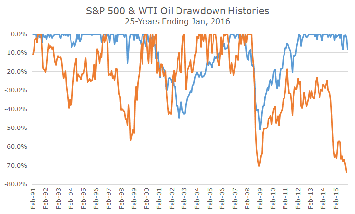
We’ve stayed away from commodities as a buy and hold investment and generally don’t like the risk/reward trade-off. We hadn’t looked at the drawdowns, but it confirms to me that commodities are a lousy long-term investment, since oil is the largest constituent in energy indexes.
We do invest in the bond market, and the drawdown history (shown in yellow) is quite different than for stocks or commodities. Bonds have endured losses, but nothing like stocks or commodities.