For a few years now, I’ve been pondering why academics always evaluate the cheapness or expensiveness of stocks based on the price-to-book (PB) measure. Even more oddly, they call it book-to-market, but that’s a mystery that won’t be solved.
In case it’s been a while since you’ve had an accounting class, the book value of a company is equal to the assets minus the liabilities, or equity of a company.
There are a lot of accounting problems with using book value, most notably that the value of the assets are generally not what you could sell them for in the market – especially for companies like Coca-Cola, where a lot of the asset value is intangible (how much was that Mad Men ending worth?)
Practitioners always look at the price-to-earnings (PE) ratio, so I wondered why the two camps look at the world differently. I posed this question to the high priest of the Efficient Market Hypothesis, Gene Fama, at a conference once and he said that you basically couldn’t tell the difference between the two measures in the returns and that using price-to-book for portfolios meant less turnover.
Now I have no reason to doubt Fama – he knows eons more about this than I ever will, but it’s been nagging at me anyway.
Thanks to the computational work of one of our summer interns, Griffin Diemer, I can confirm what Fama already told me. I’m glad that we (okay, Griffin) did the actual work, though, because we now have a little more insight into the answer after doing the work.
I also want to say that I was inspired to look into this after reading a paper by Cliff Asness, Andrea Frazzini, Ronen Israel and Toby Moskowitz, who are all affiliated with AQR, a firm that we work with.
In the paper, ‘Fact, Fiction, and Value Investing,’ which can be found if you click here, they wrote something similar, that ‘value can be measured many ways, and is in fact, best measured by a composite of many variables.’
So Griffin and I downloaded the data from the Ken French data library at Dartmouth and replicated some of the work the AQR folks did. Not surprisingly, they were right, but they reported the results in risk-adjusted-returns and I just wanted to see the raw returns.
The chart below shows the annual returns for portfolios that are formed on three metrics, the price-to-earnings ratio, the price-to-book ratio and the price-to-cash flow ratio. Each group of portfolios is cut into four groups: cheap, neutral, expensive and ‘N/A.’
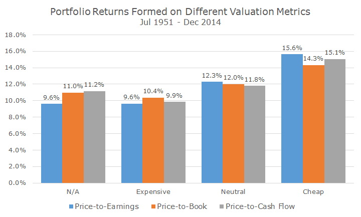
That N/A portfolio refers to companies where you can’t compute a ratio because there were no earnings, cash flow, or the company had a negative book value. This becomes surprisingly important.
Just looking at the chart, you can see that it doesn’t matter which metric you use – the cheap portfolios all perform better than the neutral portfolios, which in-turn, all fare better than the expensive portfolios. No surprise there.
But the answer to my question about which metric works best, seems to be the PE ratio – these portfolios fared a half of a percent better than the price-to-cash flow portfolios and 1.3 percent per year better than the price-to-book portfolios. I assume that’s why practitioners like the PE ratio the most.
You and I can tell a difference when we’re eyeballing this, but Fama couldn’t tell the difference, because he means that in the statistically significant way. Griffin tested the difference and Fama is right – you can only say with 83.5 percent confidence that the PE ratio is better than the PB ratio.
You might be thinking to yourself that 83.5 percent is pretty good and you might not be as strict as Fama, who requires 95 percent confidence to tell two things apart and I understand that. But here’s the rub: the PE-ratio data isn’t as good because there isn’t as much of it.
That’s weird because we have the same number of monthly returns and the same number of companies to form portfolios.
The difference is that funky ‘N/A’ category. It’s pretty hard to have a negative book value, but negative earnings happen all of the time. As of December 2014, a full one-third of US companies had negative earnings and fall into the N/A category. That compares to 3.6 percent of companies with negative equity.
On that basis, we can say that the PE-ratio numbers are inflated and the PB-ratio data is more representative of the overall market. When we evaluate companies, we use the combined approach, looking at both the PE- and the PB-ratio.
Asness et al write that the combined approach is better because each measure has its own problems due to accounting mismanagement, missing data and just random errors. It would be bad if value only ‘worked’ if you used one variable – it should work across metrics and, thankfully, it does.