One of the most notable market reactions to the election is the rally in small cap stocks.
For the month of November, the S&P 600 Small Cap index gained 12.55 percent, compared to a 3.70 percent gain for the S&P 500 index of large cap stocks. It was fourth best month for the S&P 600 Small Cap index since its inception in 1994.
While the results were definitely a surprise, they also illustrate how market premiums like size, value, momentum and quality show up in returns: quickly and without much forewarning.
The chart below shows the returns for the S&P 600 Small Cap index (in orange) compared to the S&P 500 index of large cap stocks. The out-performance and a casual glance suggests that small cap stocks are a much better investment.

The following chart helps distill the winning and losing periods by comparing how small cap stocks fared compared to large cap stocks over time. You can see that since the inception of this index in 1994 through 1999 that small cap stocks underperformed substantially – a pretty long period to suffer through as an investor.
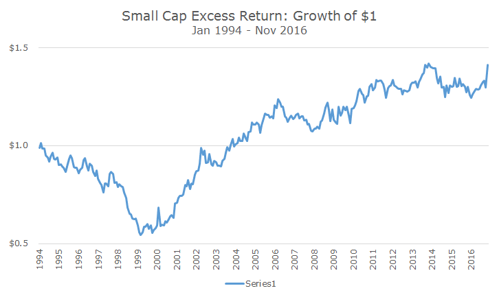
More recently, you can see that small cap stocks really haven’t done much compared to large cap stocks since 2010. There was a period of outperformance in 2013 that faded away in 2014.
After the rally last month, we’re back to the peak outperformance, but it’s tough to say where we go from here. Is it the beginning of something larger or another head fake like a few years ago?
It’s this uncertainty that keeps us fulling invested in our approaches all the time. We don’t think that we can time the market, and we certainly don’t think that we can time whether small caps will outperform large caps or whether value stocks can outperform growth stocks.
The averages can be misleading as well. For example, period to last month, over the life of this index, the small cap stocks beat large cap stocks by 1.15 percent per year (on average).
After November, small cap stocks beat large cap stocks by 1.52 percent per year, but we know that it was only one month that brought the average annual return higher by 0.37 percent per year.
It’s important to remember that with every ‘average’ there are all kinds of outliers on both sides. The histogram below shows the monthly difference in returns between large and small cap stocks and while there are more winners than losers (in blue), there are a lot of losers (in orange).
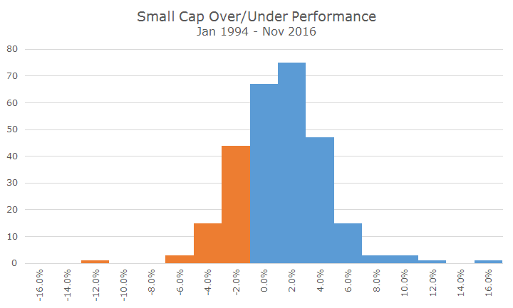
If you would have asked me a month ago whether we’d have such a big return, I would said that it was unlikely given the chart above. Well, occasionally, the unlikely happens and you get a big result that you expect statistically but not in real life.
We’re all feeling good right now because the outlier event was positive, but as you can see above, there are some bad months too. I can guarantee that we’ll field more calls after a bad month than a good one and that the impact of that bad return would sting for months afterward.
A few clients are likely to want more small cap stock exposure after last month, but the trick is to stay disciplined through the bad and good periods and keep your allocation roughly constant. It’s simple in theory, but hard to do in reality.
For now, though, we can just bask in the glow of the outperformance even though we know that every day is a new day and that it can go anywhere from here.