Long-term interest rates have moved up swiftly in recent weeks. On April 20th, the 10-year German government bond had a yield of 0.06 percent.
Around that time, I couldn’t stop writing about negative interest rates (see here and here) because the 10-year Swiss government bond yielded -0.13 percent along with the government bonds of a half-dozen other European countries at shorter maturities. I read at one point that one-third of all outstanding bonds issued in Europe had a negative yield.
Former bond king Bill Gross famously said that German bonds where the short of a lifetime, meaning that they were overvalued and prices were sure to fall. And fall they did, although too much for Gross, who had positioned his fund to profit if they fell, just not too much (click here and here for some summaries).
Yields in Germany (the bellwether European bond market) rose substantially, started to drift lower and have spiked sharply in the past few days. US bond yields have also risen in recent days in sympathy with the German market and a lot of investors are wondering whether ‘this is it,’ the beginning of higher interest rates.
Naturally, I headed over to our bond guys, Ryan and Cliff to see what they thought. Ryan flatly said, ‘Dave, we’re just watching volatility.’ He is absolutely right.
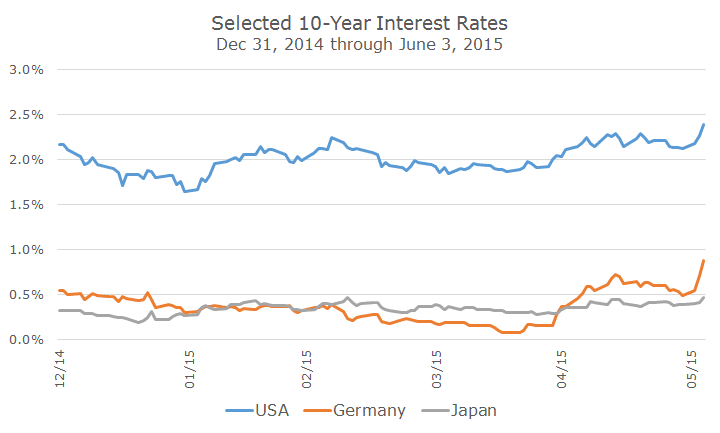
The chart above shows the yields on a year-to-date basis and from that perspective, yields are high. If we, as Sherlock Holmes says, widen our gaze, to one year, we can see that, in this context, yields are off of their lows but still not particularly high.
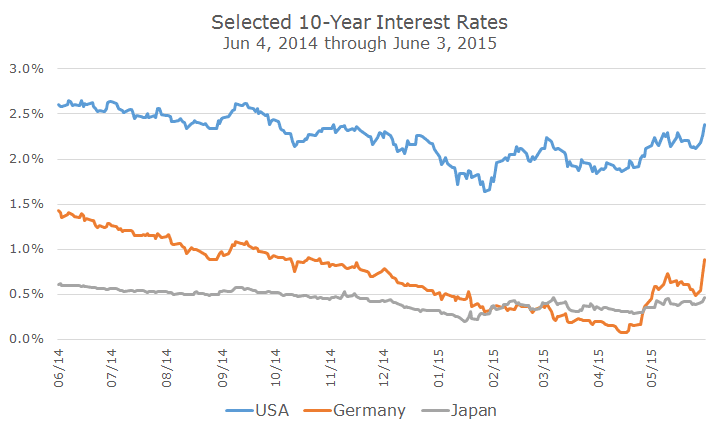
Looking back at one year, you can see that, in general, US and Japanese bond yields are slightly lower but largely unchanged from the overall trend. German bond yields are different and more interesting because they were on a straight path downward until mid-April and have sprung halfway back in no time.
I think the following chart sums up the shifts in global bonds nicely, although it’s an unusual looking chart and deserves some explanation.
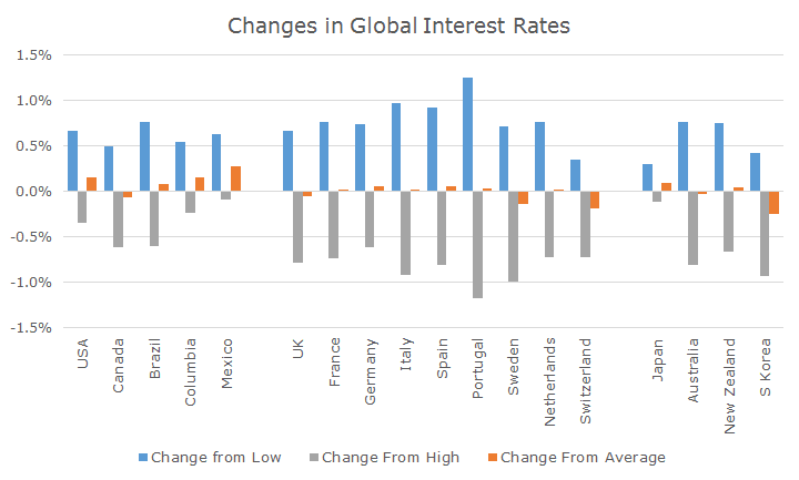
This chart shows the difference between current bond yields from 15 global markets over the past year relative to their low, high and average yields. The blue bars show the difference in yield between the current yield and the low yield over the last 12 months.
In the US, for example, the low water mark was 1.64 percent and yesterday’s yield was 2.31 percent, a difference of 0.67 percent, which is what the blue bar basically shows.
Conversely, the grey bar shows the difference in yield between high yield over the past year and the current yield. The high yield was 2.65 percent, so we know that today’s yield is 0.34 percent.
The difference between the high and low yield is 2.15 percent and the orange bar shows the difference between the average yield and the current yield, so we can see that interest rates now are 0.16 percent higher than the average over the past year.
When we look across all of the markets, looking mainly at the orange ‘average’ bars, we can see that yields really haven’t changed much. Some are higher, like here in the US, and some are lower, like in S. Korea. Overall, the average difference is 0.02 percent, which means that overall, yields are in their midpoint over the past year.
We can see that there are wide differences between the highs and the lows, which gets back to Ryan’s point – bond yields have been volatile, but, really, there’s not much to see here.
Of course, we’ll have to see where things go from here, but it’s far, far too soon to say that these are the higher interest rates we’ve been waiting for over the past six or eight years.