We’re only 10 days into the new year, and markets of all stripes are off to a rocky start. I think people intuitively understand that stocks are volatile, and after two years of 20+ percent gains for the S&P 500, a small “give-back” isn’t so hard.
Bonds are another story. Most people quickly admit that they don’t understand them very well but know they are supposed to be the “safe” part of the portfolio. Compared to stocks, bonds are safe, but they can lose money, as they have in recent years.
As an industry, we also make bonds difficult to understand when we use words like duration, option-adjusted spreads, convexity, etc.
The irony is that bonds are much simpler than stocks. Bonds have a beginning, middle, and end. Stocks, hopefully, have no end, but that makes them more difficult to value.
Part of the irony is that bonds’ simplicity means you can do a ton more math with them, which is a turn-off for many people.
So, today, I will try to simplify bonds a little bit by breaking down the returns into the income you earn and the price changes that result from interest rate changes.
Before I get started, I have two disclosures. First, I couldn’t get the index data I wanted, so I used a Vanguard mutual fund as a proxy for the bond market. It’s an index fund, so it’s close to what I want but imperfect.
Second, I capped the loss on the chart so you don’t see anything worse than five percent. That’s a cheat because the bond fund lost -13.2 percent in 2022, much more than the five percent bottom on the chart (and the index lost -13.0 percent, so you can see it’s close but not exact). I took out more than five percent of the losses because it made everything else on the chart harder to read.
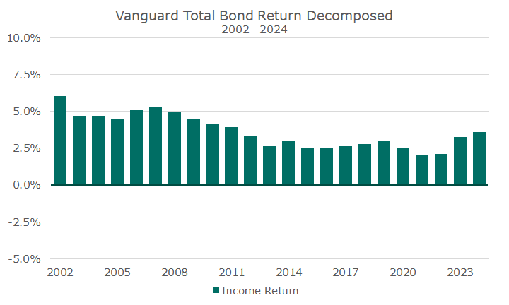
Okay, with that out of the way, let’s start with the fund’s income each year for the past 23 years (that’s as far back as I could get). The following chart doesn’t include the price movements; it’s just the income.

Sometimes, I compare this to the rental income on a property. It’s the cash that comes in the door. You can see that the interest income was much higher before the 2008 global financial crisis, averaging around five percent.
The average income over this period was 3.6 percent, almost exactly the income return in 2024. Although income fluctuates, it isn’t very volatile.
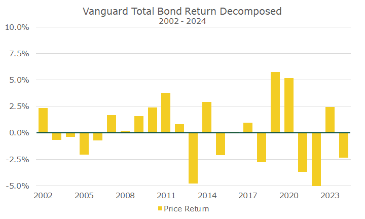
The above chart ignores the price of the rental building, which moves around constantly. So, the following chart looks at the price returns for the fund.

The first thing to note is that the price movements are much more volatile than the income generated—more than 3.5 times more volatile. This is also where my chart isn’t complete because I’m not showing the -15.3 percent price loss in 2022.
The second thing worth noting is that the average price movement is -0.3 percent. Over the last 23 years, the income earned was the predominant return driver, but the price generated a lot of noise!
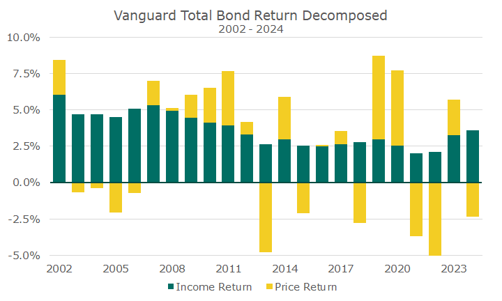
Now, let’s add the price return and the income return together.

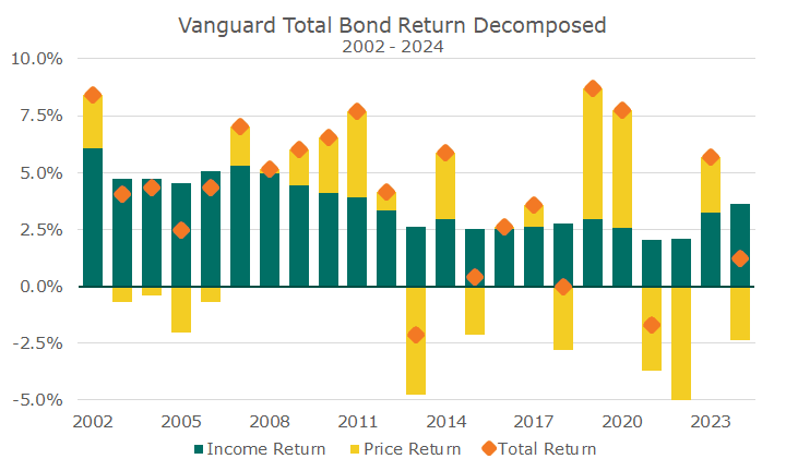
And, let’s make it a little easier to read by adding an orange diamond that shows the total return each year. It simply combines the two returns together. In years where the price is high, like the first year, it’s simply an addition of the price and income return.
In a bad year, like 2013, the price return was -4.8 percent, and the income return was 2.6 percent, so the total return was -2.2 percent. The orange diamond is negative, representing a loss, but the income offsets some of the price movement. Again, the chart is incomplete because you can’t even see the orange dot in 2022 (but I already gave you the numbers).

But here’s an important point: the price loss in 2022 is exactly what is facilitating the higher income payments. Notice how the higher price spikes with lower income payments shortly thereafter. Then, notice how the price decline in 2022, which you can’t see, is causing the income return to rise (I’m showing the income return again so you can see what I’m talking about).

I can’t say I was happy about the 2022 price loss and negative total return, but I do think it’s a good thing because it leads to higher interest income. I want to get back to the high-income days of the early 2000s, but the only way for that is for interest rates to go higher. They already have, but it takes a little time to show up in the income.
When rates were low before 2020, I used to say that I wanted rates to go higher because such low rates were for the birds. I knew that meant some bad years for prices, but if your time horizon is longer than your bond portfolio’s duration (jargon alert!), you were better off in the long run.
Okay, with that jargon alert and thinking about what I’ve written, I think I made it easier. So, look at the charts again and focus on the income return. The price return is noise, and the shorter your time window of analysis, the noisier it is.


