It’s an interesting question. The ability to call the tops and bottoms with perfect accuracy is considered the “holy grail” of bond market investing. We spend a great deal of effort talking to clients about the risk of trying to make speculative calls – the risk of being wrong of course.
Just as an exercise I thought it would be neat to imagine what it would be like if we called the bottom in rates in 2012. The closing low for the ten-year Treasury was 1.39% on July 24, 2012. For the ease of calculating returns I compared the performance of two portfolios, (one short and one long), starting on July 31, 2012 through August 31, 2014 – a 25 month period that saw the yield on the ten year yield bounce around between 1.50% and 3.00%.
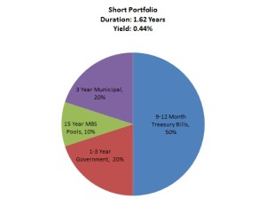
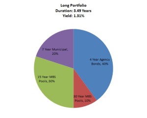
The two portfolios that I created are quite different. Both are well diversified and have the same amount of credit risk, but the short portfolio is positioned to protect against a rise in interest rates with a duration of 1.6 years in 2012 compared to the longer portfolio with a duration of 3.5 years. Because of the shape of the curve at the time, the longer portfolio had a positive yield premium over the shorter portfolio – a signal that the market was demanding extra compensation in exchange for taking additional interest rate risk.
Over the first year yields rose along the intermediate and long parts of the curve. The move in interest rates was much more pronounced in the intermediate part of the curve – causing the curve to steepen further. The drop in market value for the longer portfolio was compounded even more by durations in the mortgage-backed sector extending as refinance activity slowed to a halt.
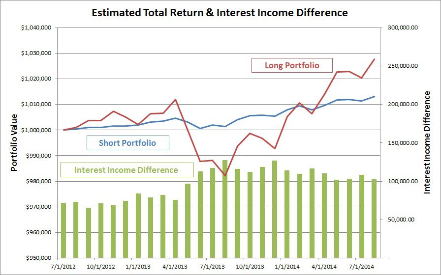
After one year the decision to go short appears to be a very good one. Total return for the short-term portfolio was only .20%, but compared to -1.19% for the long-term portfolio over the same period things look ok.
But now because of higher yields, the difference in interest income between the two portfolios is larger. Put another way, the additional compensation for holding a portfolio of longer duration assets has grown, (shown by the green bars in graph).
As you can see from the same graph, higher interest income for the longer portfolio has more than made up for the underperformance from the first year. Over the second half of the period we saw some volatility in rates, but most rates currently sit about where they were this time last year, and the total return for the longer portfolio is more than double the performance of the shorter portfolio after 25 months.
The purpose of this isn’t to say that the longer portfolio is the most appropriate portfolio for every bank. One thing the graph shows very well is the difference in volatility between the two portfolios. The longer portfolio could create a lot of discomfort for some institutions who aren’t willing to see that kind of price volatility – which is understandable considering the effect it can have on tangible equity. In addition to determining if certain risks are appropriate, it’s important to also consider whether the compensation for taking on the risk is acceptable.
Like I said at the beginning of this article – we spend a lot of time talking about the risk of being wrong when investors make market calls. But in this case, being right at first didn’t turn out to be so good in the long run.
In reality the future is unknown. A rapid move higher in interest rate is still very possible and may move a longer portfolio back underwater. But instead of trying to be tactical with portfolio allocations, a proper investment strategy should focus on modelling more than just the most likely scenario and making sure that the risk in the portfolio is being considered in the context of the overall balance sheet.
Cliff Reynolds, CFA
This article was originally published in the September issue of ALM Insights. Click here to read the rest of the issue.
Click here to join the email list for ALM Insights and our other newsletters.


