When I drove out for lunch yesterday, the selloff caused me to switch from my regular setting on the dial, St. Louis Public Radio, in favor of CNBC via satellite radio.
What a mistake! I wish that I had stayed with the calm, reassuring (though non-market) related discussion on public radio because by the time I got back from lunch, the CNBC anchors has scared the dickens out of me.
The breathlessness reporting, anxiety proving questions that have no answers (when will it end, how low will it go!?!), lists of stocks that are down and constant tick-by-tick barking updated prices for the Dow is really enough to make you go crazy.
The past few days have been striking in that markets have moved by more than a percent for several days in a row. While there is nothing new about that in general, it’s been uncommon in the past few years.
It’s well known that large US stocks have enjoyed an average return of about 10 percent per year since 1926. Of course, we know that there are some great years, like last year when the S&P 500 rose by almost one-third and horrible years like 2008, when the same index dropped by 37 percent.
So, it isn’t enough to know the average return, you also need to know how returns vary around that average. The most common measure is the standard deviation, which for stocks is about 20 percent.
In any given year, you could expect a return of 10 percent, plus or minus 40 percent (two standard deviations), and 95 percent of the time, you would be right.
Of course, that’s average volatility. Some years are more volatile than others. The chart below shows the annualized volatility (based on daily data) for the S&P over the past 15 years.
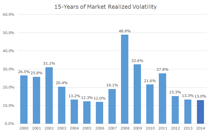
Looking at the chart, I mentally break up this time into four periods. First is the tech wreck that happened between 2000-2003, when volatility was higher than average.
Second, markets were calm coming out of the tech wreck (and rising, but you don’t see it in this chart). Then, the crisis hits and volatility goes through the roof. What an awful time. But then, volatility moderates and gets pretty low.
Even with the market whipsawing around in the past few days, the volatility that we’ve experienced this year (indicated in dark blue since it isn’t a full year), has been pretty tame.
I suppose that putting the past few days’ worth of price action into context doesn’t make for very exciting television (or satellite radio). The only silver lining to the financial media news hype is that they aren’t talking about ebola in America.
