The performance of the S&P 500 over the past two days has reminded me of charts that I have seen over the years that show the impact of missing the best days in the market.
These charts offer a good message about remaining fully invested, which I wholly agree with, but the charts are also a little misleading in my view. I decided to create one of my own to show the data in what I think is a more fair way.
In the chart below, the first column simply shows what would have happened to investors that held the S&P 500 every day this year – the buy and hold investors like us.
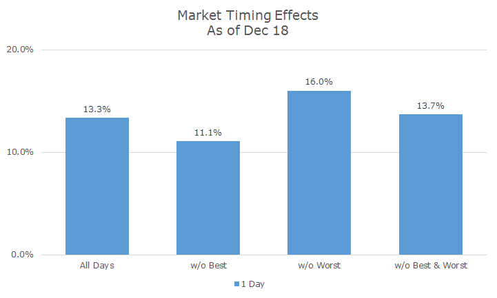
The next column shows what would have happened if you missed the best day of the year, which happened to be yesterday. This is the chart that everyone shows with the message, ‘see what happens if you miss the best day of the year? It costs you 2.5 percent in return.’
That’s perfectly accurate, but I’ve often wondered what it would look like if you missed the worst day of the year. That is shown in the next column and the results are fantastic – you beat the market by 2.7 percent.
If you’re going to go down this road, it seems to me that a more fair presentation shows what happens if you missed the best and worst day, like when the judges throw out the best and worst score during Olympic figure skating.
Then I wondered what this would look like if you looked at the best and worst 10 days this year. The results are shown below in orange.
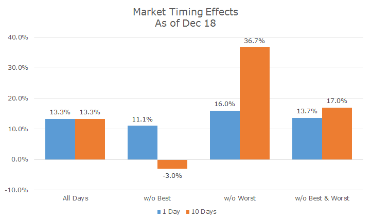
The first column is the same, simply the results for holding the S&P 500 throughout the entire year.
The second column shows what would have happened if you missed the 10 best days and the results are pretty awful – your returns would be negative.
Conversely, the third column shows what you could have made by avoiding the worst 10 days and, again, the results are outrageously good.
The fourth column again shows the results without the best and worst 10 days and cutting off the best and worst trading days has nice, positive impact.
I didn’t run the numbers (though I will in the future), but I would expect the volatility to be meaningfully lower if you don’t have the most extreme events at either end of the distribution.
Now I know why people don’t make the chart without the worst days – the allure of market timing is very strong.
Unfortunately, the strategy is totally impossible because you don’t know which days were the best or worst until the year is over. Until yesterday, the best day was Wednesday. It’s possible that there’s an even better day before the end of the year – or a new worst day.
There are a number of practical matters like price gapping up or down, transactions cost, etc., but they don’t matter since the whole thing could never happen.