The end of summer was notably quiet, but summer is over and judging from Friday’s market reaction, it appears that volatility may be back.
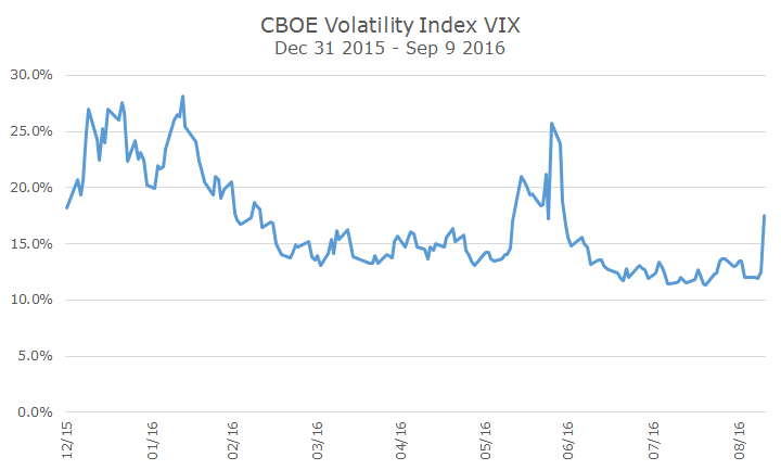
The chart below shows the expected volatility priced in to options as measured by the Chicago Board of Exchange (CBOE) Volatility Index (VIX).
You can see the volatility was high at the start of the year when we suffered a 10 percent correction. Expected volatility cooled off as markets recovered until the Brexit, which sent volatility sharply higher. It wasn’t long before markets were quieted down again until Friday.
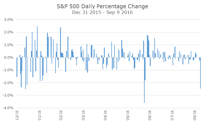
Most people don’t think about volatility as an index, so I thought I would show the daily percentage change for the S&P 500 so far this year. You see basically the same thing – wide swings in the beginning of the year and relative quiet outside of the Brexit and Friday.
So what happened Friday that disturbed the quiet waters? Fedspeak.
Fed members have been all over the place for weeks talking about how a hike is likely in the not too distant future and think that markets are discounting a near term hike too much.
Boston Fed President Rosengren noted that a ‘reasonable case’ could be made of a September hike given the labor market improvement and said that waiting to hike could put the economy at risk of over-heating.
The market based estimates for a hike in September doubled from a 15 to 30 percent chance of a hike. While that’s a big move, it’s still well less than a coin toss – which is the market’s estimate for a December hike.
One of the interesting things about the decline on Friday was that both stocks and bonds fell together. A longtime reader and client had asked earlier in the week about how stocks and bonds both rose at the same time and wondered whether that was common or not.
The scatterplot shows the daily return of stocks and bonds each day that both markets were open over the past three years. The top right quadrant shows the days that both markets gained in value, while the bottom left quadrant showed the days when both markets lost value.
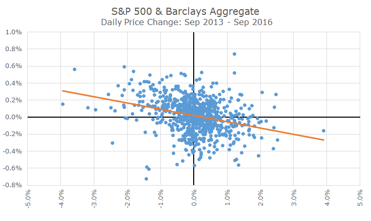
The other two quadrants are when one market gained and the other fell in value. It’s hard to tell without the orange line that serves as an average, but the days where one market zigged while the other zagged were the most common (over this period, and in general).
The fact that these two assets don’t move together is exactly what we like about them because of the diversification value of the low correlation.
To be sure, there will be days where both markets lose like Friday, but there will also be days where both move higher together, like on Wednesday.
At this point, it’s impossible to say whether we’re entering into a period of more prolonged volatility like the beginning of the year or a short-term blip like the Brexit.