The late Thanksgiving and my usual Christmas-denial meant that I was surprised to see that this is effectively the last Insight for the year. Yes, I could send one on Christmas Eve and another on New Year’s Eve eve, but returns have been so good this year, that I thought we could all take a break and enjoy the holidays.
Before I go, however, I thought I would show what we already know, which is that the S&P 500 has been very good, for a very long time. It’s been so good, in fact, that I think it will be hard for the next five or ten years to look as good as the last five or ten years. But, the future is always hard to predict, so let’s just take a look at the past.
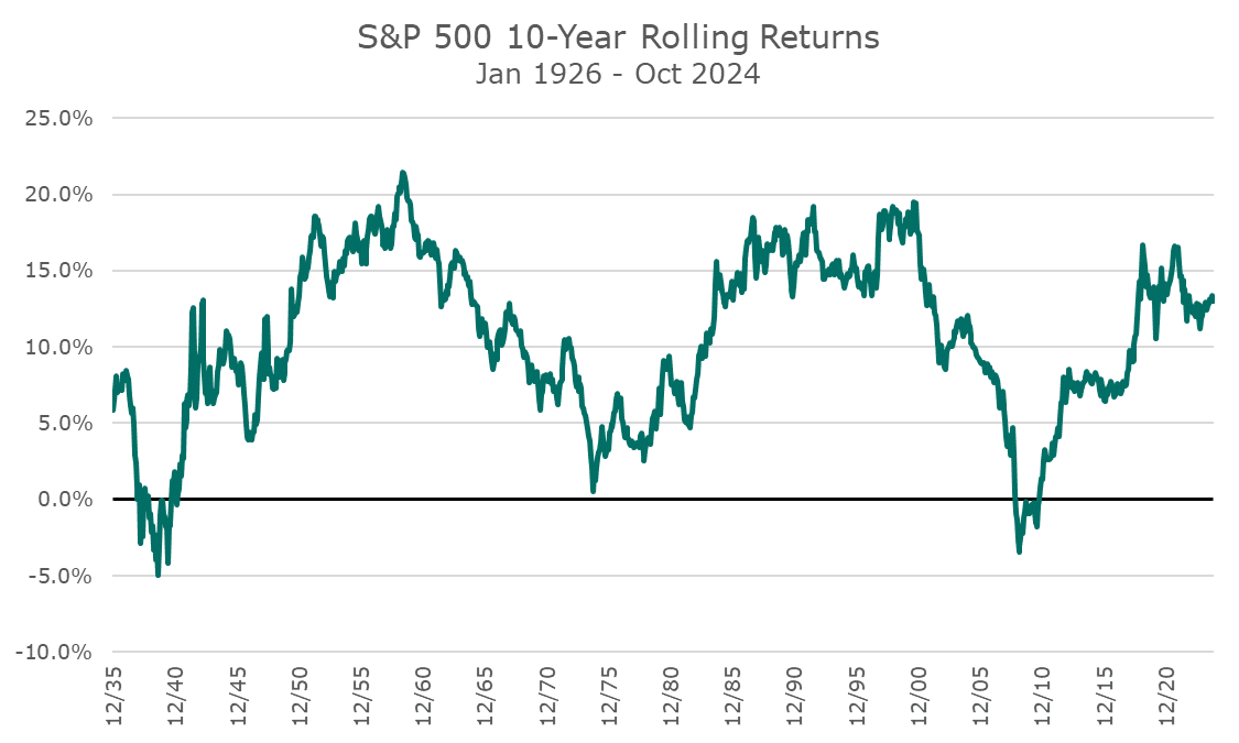
The first chart shows the rolling 10-year returns for the S&P 500. I like this chart because it shows that markets have been both pretty good and pretty lousy for fairly long stretches. There are only two periods where the ten-year return was negative -once in the Great Depression, and once when we were in business, in 2008.
And we’ve had returns this good for long stretches in the 1950s, 60s, 80s, and 90s.

As a teenager, I remember someone telling my dad that the Dow has never lost money over ten years. I didn’t run the numbers since I think the Dow is a silly index, but looking at the chart above, it may be true.
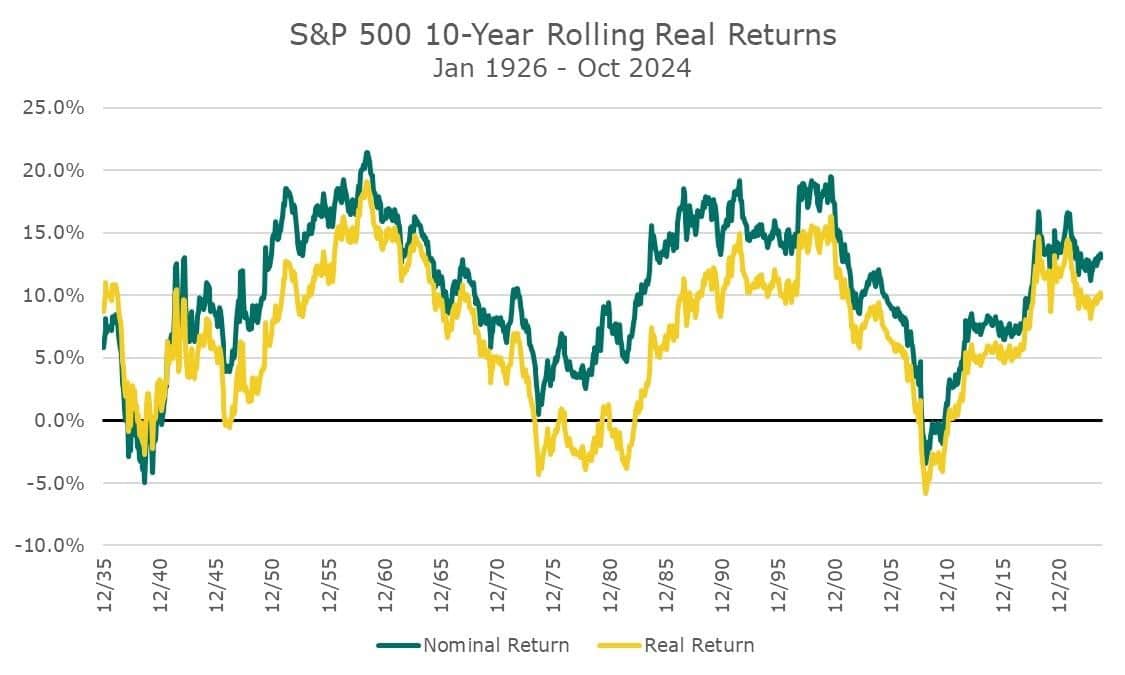
My dad explained to me later that this person wasn’t considering inflation. So, my next chart shows the ‘real’ or inflation-adjusted return in yellow, along with the nominal (pre-inflation) number. This chart highlights how tough the 1970-s was – even if markets weren’t negative on a nominal basis, they were negative on a real basis for a very long time. I can see why BusinessWeek ran the ‘Death of Equities’ article at that time.

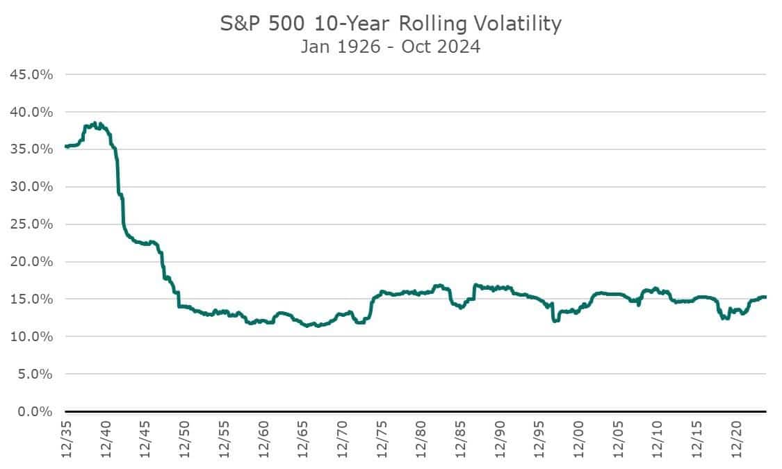
As long as I was fussing with rolling ten-year data, seeing the rolling realized volatility would be interesting. I was genuinely surprised to see this chart because it so darn steady once the Great Depression is out of the picture.
For our long-term capital markets assumptions, we use the average volatility of the whole time frame, which puts the volatility somewhere around 18-20 percent. I didn’t realize it, but that’s a source of conservativism because the market hasn’t been that volatile for any ten-year period for about 75 years.

Lastly, I wanted to show the rolling ten-year Sharpe ratio for the market. The Sharpe ratio looks at the market’s excess return (the market return over the risk-free cash return) and divides that by the realized volatility.
Even if that isn’t an intuitive explanation, the basic idea is that higher is better. Here, the last ten years have a pretty elevated Sharpe ratio – not the best of all time, but above the average.
Stocks are expensive today, and when I rerun these charts in ten years, you’ll see lower levels than you see right now (except for volatility, which I hope stays so constant).
There may be a crash or a slog where nothing happens, but it’s not worth ‘getting out’ since the consequence of getting that wrong can often be so high. What if you got out five years ago and missed these returns? What if you sell now and the market crashes? Will you have the nerve to get back in?
Our whole approach is ensuring we have an allocation we can live with in good times and bad. In the good times, like these, we can be jealous of our neighbor who is making more money, but in the bad times, we can stick with our strategy even when it seems like the sky is falling.
Neither is easy to live with day in and day out, but the results can be powerful over time.
Happy Holidays, and all of the best in 2025!


