They say that the only free lunch in finance is diversification. With stocks trading at lofty valuations and bonds yields historically low, it’s sensible to look at other alternative strategies that could potentially lower risk or increase return (or better yet: do both).
Over the last five years, investors have flocked to ‘alternative’ investments, although the definition of alternative is pretty broad and can include things as generic as REITs (which we own, but don’t think of as alternative) to esoteric strategies like statistical arbitrage.
Since the alternative category is broad, a lot of investors have bought so-called ‘multi-alternative’ funds that invest in a variety of strategies.
By my count, there are 125 distinct multi-alternative mutual funds on Morningstar that invest in a broad array of strategies including: long-short stock, long-short bond, managed futures, distressed debt, arbitrage, global macro, etc., in a single fund.
While I am always interested in evaluating an alternative investment opportunity that would allow me to diversify client portfolios and think that a ‘one-and-done’ approach could make sense, I am pretty disheartened by the choices at this point.
The chart below is a scatter-chart that compares the monthly returns of the S&P 500 and the multi-alternative category of funds created by Morningstar.
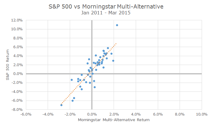
Each dot on the chart shows the return for both the S&P 500 and multi-alternative category. For example, the highest dot shows that when the S&P 500 was up slightly more than 10 percent as seen on the vertical axis, the multi-alternative fund was up a little more percent, as seen on the horizontal axis.
When you look at how all the dots are clustered, you can see a distinct pattern: when the S&P 500 is up, so is the multi-alternative category. The converse is true as well, when the S&P 500 is down, the multi-alternative category is too.
The orange dotted line plots the relationship and you can see that most of the blue dots are scattered closely around the orange line. That line is a visual representation of the correlation, which you can see is quite positive.
This is actually a bad outcome because what it’s telling you is that you’re not getting much diversification from the multi-alternatives. It’s true that the returns aren’t as extreme for the multi-alternative funds as a whole, but you’re getting a very similar return pattern.
Let’s compare that to something that we know is diversifying: bonds. The scatter-chart below is perfectly identical to the one above except that on the horizontal axis, I’ve plotted the Barclays Aggregate Bond index.
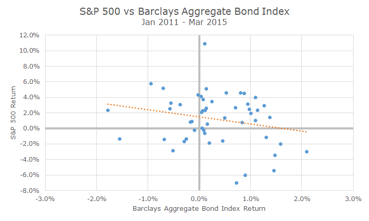
When you look at the dots as a whole, there isn’t such a distinct pattern – the dots are scattered fairly evenly, although there are a bunch in the top right quadrant because this happened to be a period where both stocks and bonds fared well.
The orange line tells an important story, because you can see that there is no positive relationship between stocks and bonds like there was with stocks and alternatives.
Furthermore, the dots are not very clustered around the line like they are with the multi-alternative returns, which signals that bonds returns are doing their own thing unrelated to stocks.
Of course, there are some individual funds within the multi-alternative category that may be diversifying, but that’s unique to the fund, not the strategy as we can see here in the data.
When you do find a fund that was in fact diversifying, there are still a number of difficult questions to answer: will it be diversifying in the future, what is the source of the returns, how risky are the returns, what are the costs and tax-consequences, etc.
In other words, it’s not so easy to find true diversification beyond the traditional stock/bond model that we have employed for the past dozen years. It may be out there, and we will keep looking, but the bar for actually investing your investment dollars is quite high.

David is a trusted advisor to 50 families, delivering comprehensive financial solutions, including financial planning, investment management, cash management, tax planning, estate planning, and charitable giving. As Chief Investment Officer, he leads the Investment Committee and the research and trading team. His team continuously evaluates investment strategies and securities, working closely with Portfolio Managers to implement them effectively.