For years now, inflation has been an afterthought in the investing conversation because it’s been so dormant. In fact, for a few years, the worry was centered around deflation.
And yet, here we are, somewhere in a pandemic (I’d like to think near the end, but omicron is a good reminder that we just don’t know what’s around the corner), and we’re talking about supply-chain bottlenecks and looking at government data that shows consumer prices are almost six percent higher than they were a year ago.
I don’t know about you, but I think the discussion is confusing because people disagree about what ‘transitory’ means and there’s no single definition of transitory. And, we’re all afraid of the 1970s (my memories were fond, but I wasn’t paying for anything at that point and had no savings to speak of beyond my Legos).
So today, I thought I would walk through what the bond market thinks inflation will do. While I think the market view is calming compared to a lot of the breathless reporting, I want to make two things clear.
First, this is what the bond market thinks – not Dave Ott or anyone at Acropolis. We all do some armchair forecasting in our conversations, but the firm doesn’t have an official view. Second, the bond market gets it wrong (it’s just a bunch of people, after all. Yes, they have money on the line, but people are crazy and no one knows what’s happening next).
So, with those non-legal but very real disclaimers out of the way, the best way to see what the bond market thinks inflation will do is to look at the difference between traditional Treasury bonds and Treasury Inflation-Protected Securities (TIPs). The difference between those yields is called a ‘breakeven.’
Here’s what the breakeven rates showed last week:
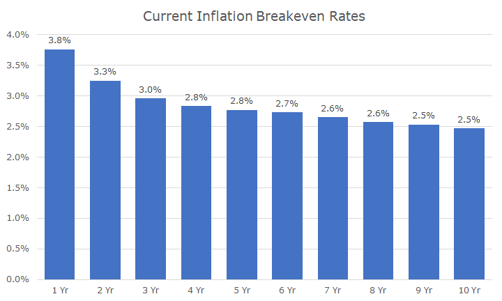
So, the breakeven rate shows that in the next year, the bond market expects inflation will be around 3.8 percent. That is much less than the last year, which is why many people (especially at the Fed) call the current bout of inflation transitory.
You can see that over the next five years, the market expects the annualized inflation rate to be 2.8 percent. And over the next 10-years, the breakeven rate suggests that the market thinks the inflation rate will be around 2.5 percent.
The big point of the breakeven rates is that the market expects a lot of inflation over the next few years, but it moderates and the inflation rate drops over time (it’s not deflation, which is falling prices – it’s disinflation, which is a deceleration).
I like this chart, but I don’t think in annualized terms like this, so I decided to create a chart that shows the inflation year-by-year based on this data. But I have even more disclosures – this is far too precise to expect reality to turn out like this illustration. There are also a bunch of technical details that this skims over.
Still, I’m showing it because it highlights the point about inflation being front-loaded, but I don’t want anyone to look at and think that there is a true forecast for inflation in the 10th year of the next 10 years.
This chart also includes the annual inflation rate for the last 10-years to help with the context. You can see that inflation barely budged over two percent in any given year over the last decade, until last year (and I cheated and used 10-months, but I’m confident, we will see more of the same in the next few months).
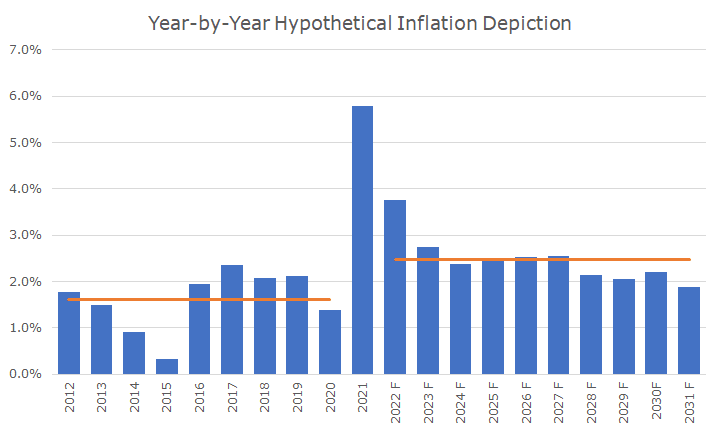
The orange line shows the average inflation rate for the last 10-years and then again for the next 10 years. You can see that the average rate looks about like the breakeven rate, which makes sense.
You can also see that the expected inflation rate in the coming decade is almost a percentage point higher than it was over the last 10-years, which is one of the arguments that I hear that this inflation isn’t transitory. And, by this measure, it certainly isn’t.
You can make the case that the latter five years of the 10-year forecast sort of looks like the last five years, but I don’t think a lot of attention ought to get paid to that because it’s five years from now and I’ve already said twice that we don’t know what’s around the corner.
The other big point from both of the charts is that the market does not expect anything like the 1970s, which I think is what the market is worried about. I don’t think most people are worried that inflation comes in at 2.5 percent – on average – over the coming decade. Our financial planning software assumes 3.0 percent, so we’re still conservative in our planning compared to forecasts.
But since I love charts, I made one that shows the current market expectation for inflation compared to the last 10-years and overlayed the 1970s on top of it.
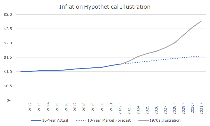
Just like the previous chart, I showed the actual rate of inflation over the previous years, which is depicted by the solid blue line. The blue dotted line shows what the bond market thinks inflation will look like, and you can see a kink about now when inflation is high and the new, higher rate set in.
But you can also see why this isn’t like the 1970s – and a little bit of the 1980s, actually. For this chart, I started in 1972 where 2022 should be, which takes the chart out to 1982. I did that because inflation was very strong in the first few years of the 1980s before then-Fed Chair Paul Volker came in and ‘broke the back’ of inflation.
In truth, I should show this last chart on an inverted basis, because really the value of your dollar goes down with inflation. Over the full 20-year period, even when inflation was moderate (2021 notwithstanding), a dollar lost about a third of its purchasing power.
If the bond market has it all wrong, and the next decade is like the 1970s, then the purchasing power falls by about two-thirds over the full 20-year periods, and that’s obviously a pretty big deal.
And while a lot of the discussion about what investment fares best with inflation (commodities, real estate, bitcoin, etc.), the inverted version of this last chart illustrates how important stocks are to the equation, even though stocks don’t do well with inflation spikes.
As always, the key here is to think about the long term. That chart shows a 20-year time horizon. That doesn’t look like much in a chart but think about your life 20-years ago. If you had kids, what were they doing?
Do you look the same as you did 20-years ago? I can’t say much about the next 20-years, although I expect more gray hair. Well, probably less hair, but it will be gray, and not just from whatever inflation comes our way.

David is a trusted advisor to 50 families, delivering comprehensive financial solutions, including financial planning, investment management, cash management, tax planning, estate planning, and charitable giving. As Chief Investment Officer, he leads the Investment Committee and the research and trading team. His team continuously evaluates investment strategies and securities, working closely with Portfolio Managers to implement them effectively.