I like to say that this newsletter is a mix of information on investing, financial planning, and economics. Regular readers know that I tend to focus most on investing, then financial planning, and economics is a distant third place.
The current inflation environment, however, is forcing me to cover more economics, although the reality is that inflation materially impacts investing and planning. Today, I will look at inflation in isolation, but you can expect more articles on how it impacts the other two primary topics.
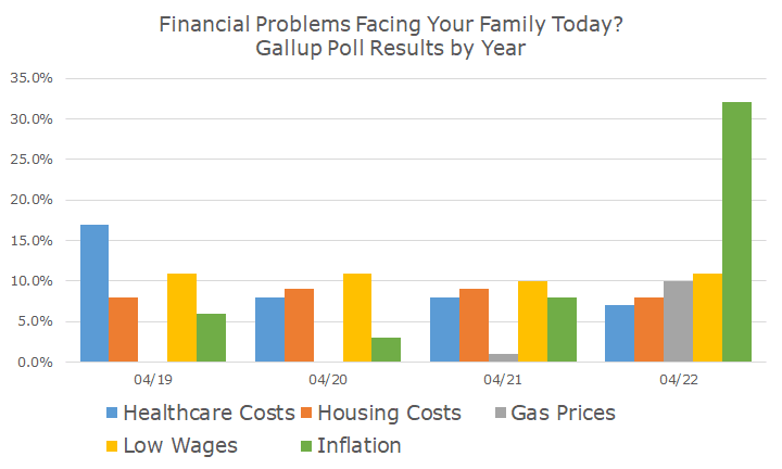
The results from this Gallop poll suggest to me that you won’t mind hearing more about inflation. The chart below shows how Americans answered the question, ‘what is the most important problem facing your family today,’ by Gallup.
It’s not surprising to see inflation top the list, but I was surprised by the massive difference between the inflation and the rest of the answers. I also thought it was interesting that except for low wages, all of the other issues are inflation too.
Gas prices didn’t even register three years ago, and now it’s the third largest concern. Healthcare costs, the leader four years ago, is now the laggard.
Maybe it shouldn’t be surprising that high gas prices bother people since energy costs are 34.6 percent higher than a year ago. Food prices are 10.1 percent higher, which means that everything besides food and energy is up 6.0 percent, making the headline rate 8.6 percent.
Perhaps it’s worth noting that food prices aren’t a result in the Gallup poll.
More interesting still is the actual basket of goods and services that the Bureau of Labor Statistics (BLS) uses to calculate inflation, as seen here:
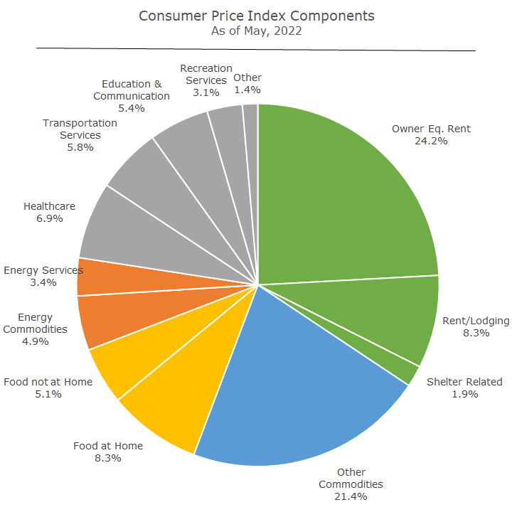
I know it’s a little hard to read, so I’ve done some color-coding that you may find helpful. The three elements of green are related to shelter, and the largest item in the entire index is a little controversial: owner equivalent rent, but I’ll get to that in a minute.
Then you see all other commodities in blue. The BLS starts with food and energy, which are large and volatile components (as seen in orange and red, the ‘hot’ colors). The ‘other’ commodities include things like home furnishings, clothes, new and used cars, and alcohol.
In gray are the other services, like healthcare, education, transportation, and recreation, which are pretty self-explanatory.
Less obvious is the one I mentioned above, owner equivalent rent. The idea here is to show what homeowners would pay in rent if they rented their homes.
On the real estate website Zillow, you probably know that you can get a ‘Zestimate’ of your home’s value. Their computer looks at recent sales in your neighborhood and does some calculations based on square footage, bathrooms, etc., to create a value for your house.
They also have a Rent Zestimate that does another calculation to guess what the rent might be if it were for rent. I don’t know how they do this one, but that’s not the point. The point is that they are converting the value somehow into a rent, presumably based on the costs estimated with owning the house and the profit you might make as a landlord.
I think that’s what the BLS is doing, and it’s controversial because it’s a guess. I know that Zillow doesn’t get home prices right, especially here in U City, where the properties vary a lot despite their close proximity, and I assume that the Rent Zestimate isn’t great either. I don’t know how the BLS does it, but it’s a guess. That’s a controversy for another day, but I thought I would mention it.
Now that we have a sense of what makes up the Consumer Price Index (CPI), let’s look at how it has fared over the decades.
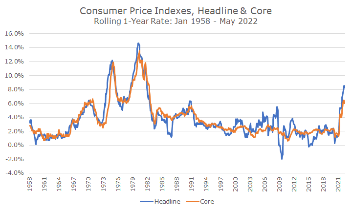
The chart above shows the rolling one-year inflation rate for headline and core inflation. Headline inflation includes everything in the pie chart above, and core inflation excludes food and energy.
I’ve found that many people don’t like the distinction between headline and core, arguing that nobody goes through life without food and energy. True that!
The reason economists strip it out is that those two items are much more volatile than everything else, which you can see in the chart above, especially in the last 20-years.
The current spike is pretty shocking, and my hairy eyeball analysis is that it’s the third worst spike in our country’s recent history. Economists might argue about whether the two earlier spikes were together or separate, but I’ll say separate.
I’d also say that core inflation is pretty hot, too – gas and energy prices are very hot, hotter than they’ve been in years, but it’s wrong to blame what’s happening now on the two.
I was looking at different time frames, just like I do for stock and bond returns, and instead of looking at the past year of inflation, I decided to look at the past five years.
This isn’t to minimize what’s happening – in fact, I’m more bothered by this chart because it shows the first material medium-run increase in rates since the debacle that started in the 1960s and ended in the 1980s. And equally bad is that the five-year rate hasn’t even breached four percent, and we’re over eight now – as some of the older data points drop off, this will go a lot higher.
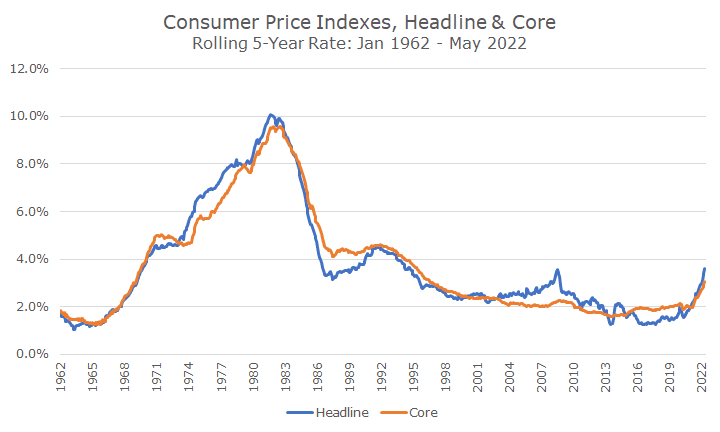
I also think it highlights the big difference between the inflation of decades ago because it shows how persistent it was for so long. Today, we’re acting as if we know exactly what to do: raise interest rates until we break the back of inflation.
We say that because that’s how Fed Chair Paul Volcker did it at the peak of the problem – when inflation had run at 10-percent for five years. We’re not even at 10-percent now, and it’s ‘only’ been one year.
But that is the question and the dilemma that the Fed faces. We rightly look at Volker retrospectively as a hero because he fixed the problem that had been vexing the US for many years at that point. But we should also realize that his actions also sent us into a meaningful recession.
Right now, the Fed wants to thread the needle and raise interest rates enough to whip inflation now but not enough to send us into recession or longer-term stagflation (low growth and high inflation). I’m glad I’m not a Fed governor.
If you haven’t read it in the papers, the issues behind the current bout of inflation are pretty well known: too much stimulus coming out of the pandemic, pent-up demand from the pandemic, supply chain problems, the war in Ukraine, energy policy, and the Federal Reserve’s delayed response to the initial data.
That’s a long list of issues. Some of them seem manageable, like the supply chain issues. Does anyone think businesses won’t figure that out in a few years? Others can’t be undone, like the stimulus and delayed response. And others still are a wildcard, such as the war in Ukraine.
I have to admit that I don’t have much of an opinion about where inflation goes from here. My hope is that despite being late to the inflation problem, the Fed will now do what it takes to tame prices.
Since that may be more of a statement about my natural optimism, I take comfort that the bond market thinks that, too, at this point. (I should disclose that I was on Team Transitory last year and thought that inflation would be on its way down by now).
My last chart of the day shows the five-year breakeven inflation rate, which is simply the difference in yield between a five-year nominal Treasury note and a five-year Treasury Inflation-Protected Security (TIP).
The breakeven rate tells you what bond investors think inflation will be over the next five years (there are different time periods, and I picked five years out of a hat. For context, the one-year breakeven is at 5.4 percent, and the 10-year breakeven is 2.8 percent.
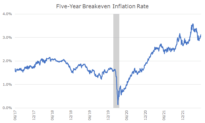
I should note that the bond market gets it wrong too: last year, they thought inflation would be around three percent, and it’s well more than double that.
The good news, however, is that the bond market still thinks that inflation will be contained. If the bond market was predicting truly runaway inflation, the Fed would be responding far more harshly (one presumes), and the stock and bond markets would be harder hit as well.
This week, the Fed has a meeting, and we will know more about their policy response on Wednesday afternoon. We already see the effect of their actions in a few areas, notably housing.
The rate on a 30-year mortgage was 3.11 percent at the end of last year and was 5.23 percent at the end of last week. While home purchases are hanging in there, the volume of refinancing has dried up to pre-pandemic levels.
It’s reasonable to assume that we’ll see more signs of slowing as interest rates rise. That’s the point – it’s part of snuffing out inflation. The question, as noted above, is whether the Fed can thread the needle and get inflation back to target while avoiding a recession. Let me repeat myself: I’m glad I’m not a Fed governor.