The Bureau of Labor Statistics (BLS) reported Friday that the labor market improved in December and for 2014 as a whole.
In December, payrolls increased by 252,000 and over the course of the year, 2.95 million new jobs were created, the most added in a single year since 1999. The newly created jobs were one of the key elements in the falling unemployment rate, which started the year at 6.7 percent and ended last month at 5.6 percent (subject to revisions).
The chart below shows the unemployment rate for the last 20 years shaded in blue. The orange line is the average unemployment rate since 1947, which is 5.8 percent, so we now a lower than average unemployment rate.
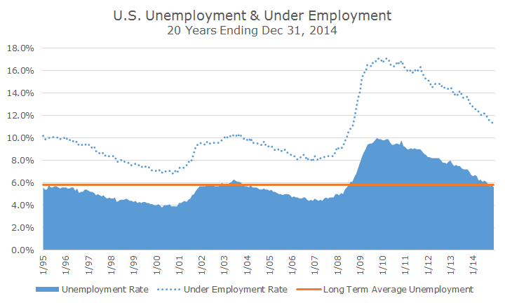
Since I often hear people refer to the underemployment problem in the U.S., I decided to show that rate in the dotted blue line over the past 20 years. This data only goes back to 1994 and has averaged 10.7 percent, so at 11.2 percent, we still have a ways to go before the underemployment situation is ‘back to normal.’
While the recent data is encouraging, it’s not fair to say that all is well in the labor market. There are at least three issues that reflect labor weakness in spite of the good news.
First, the long-term unemployed, which is defined as people out of work for more than 27 weeks, is still more than double what it was before the crisis began.
Second, the overall labor force is shrinking as baby boomers (and other groups) that are having trouble finding work are simply quitting the work force. One way to see this is what economists call the labor participation rate, which is simply the percentage of people over 16 that work.
The chart below shows that in 1960, a little less than 60 percent of the population was in the work force, although that number ramped up significantly in the 1970s and 80s, mostly because more women joined the labor force.
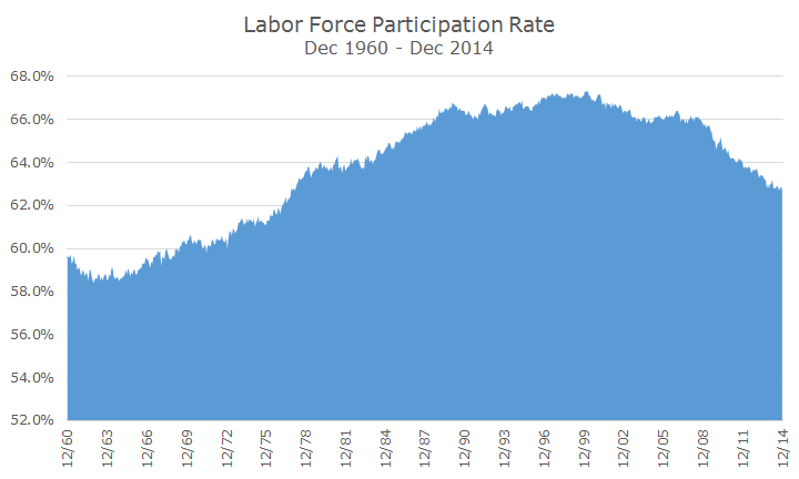
The overall participation rate remained largely unchanged through the 1990s and first half of the 2000s, but since the 2008 financial crisis and recession has fallen dramatically back to levels not seen since the 1970s. Some of that would have happened anyway as Baby Boomers began to retire, but the lack of high quality jobs is also a major factor.
The lessening job quality can be seen in the third structural problem with the labor force. The following chart shows the average inflation adjusted wage since 1947.
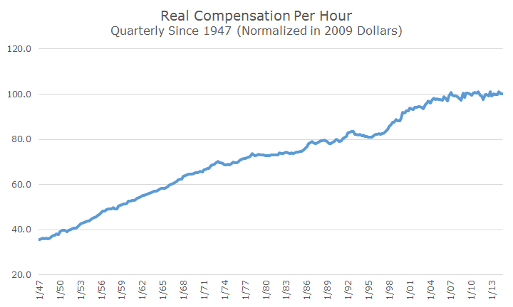
An eyeball look at the chart shows that real compensation climbed steadily until the 1970s, when it leveled off but kept growing. There was a surge in the late 1990s and early 2000s, but wage real growth has essentially been flat for the last seven years.
I’m not trying to rain on anyone’s parade, and except for the wage growth, there has been a lot of progress, but there is still a lot of work to be done. The solution for all of the problems is the same: more economic growth and job creation, which is a lot easier said than done.