There is no question that we haven’t even started to see the economic impact of the coronavirus, since all of the data that we get is in arrears.
For example, last week we got two important pieces of data about unemployment that told different stories. The good news is that the unemployment rate in march was 4.4 percent, which is an increase from the previous month, but not bad.
However, we also got news that 6.6 million people applied for unemployment insurance, double the 3.3 million people from the week before and many, many multiples of the previous record no matter how you adjust it.
How do we square these data points? The unemployment rate is determined by a survey, which concludes on March 12th, before the social distancing took hold. There are some other factors (like whether those taking unemployment insurance are seeking other employment), but the main idea is that economic data is backward looking by definition.
Market data, however, is real time. As a result, it’s often ‘wrong’ because it’s real time without all of the information in hand and certainly no checks, double-checks and revisions that the economic data enjoys.
This week, I thought we’d look at three data points that show that the stress on the market is easing. These aren’t secret indicators that tell us where the market is going (for sure!), but they do help us understand pressure on markets.
Volatility Index
The volatility index (VIX) is a measure of what markets think volatility will be in the next three months based on options prices. It doesn’t do a good job of predicting volatility, but does give you a sense for how traders are pricing uncertainty.
Forgetting the math and high-minded concepts, all that’s saying is that if you aren’t sure where things are headed, you lower the price. And if you’re really uncertain or frightened, you lower it substantially.
This chart shows the VIX for the last three years:
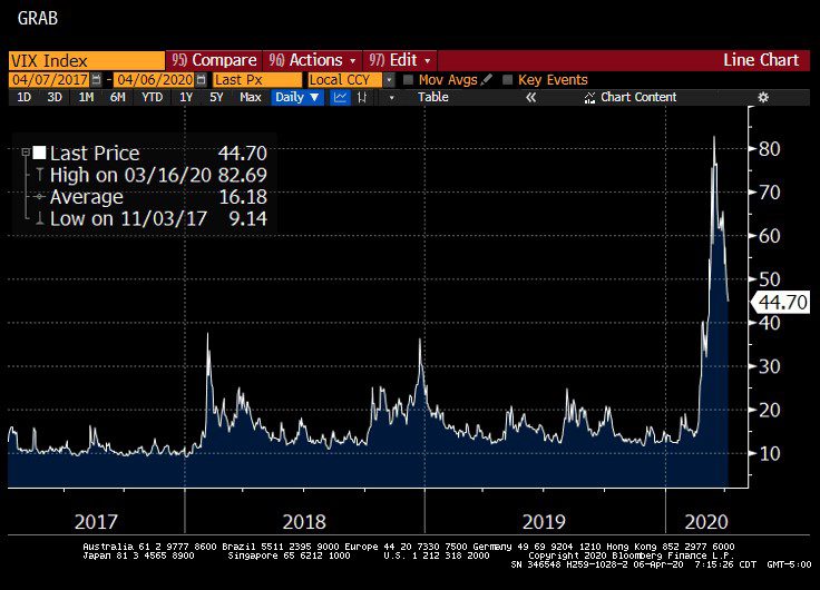
You can see that most of the time, the index ranges between 10 and 20. There were two stress periods, where the index jumped to 40 – more than double the norm. In the panic a few weeks ago, it jumped to 82!
When Lehman Brothers collapsed in 2008, the VIX topped out at 80, so the idea that the expected volatility (or fear) was as great a few weeks ago as it was then is a big deal.
But, we can also see that it’s falling off sharply, as the stress on the market subsides. The current level, 44, is still very elevated, so I’m not saying that the ‘all-clear’ whistle has blown, only that the panic is hopefully behind us.
Bloomberg Financial Conditions Index
Bloomberg and others like the St. Louis Federal Reserve and Goldman Sachs produce ‘financial conditions’ indexes to try and estimate the stress in the market by looking at a variety of factors.
Each index is different, but generally they all look at the level of short and long-term interest rates, the difference between interest rates on corporate bonds and Treasury bonds (credit spreads), foreign exchange rates and stock prices. The goal is to summarize all of those metrics to take the market’s ‘temperature.’
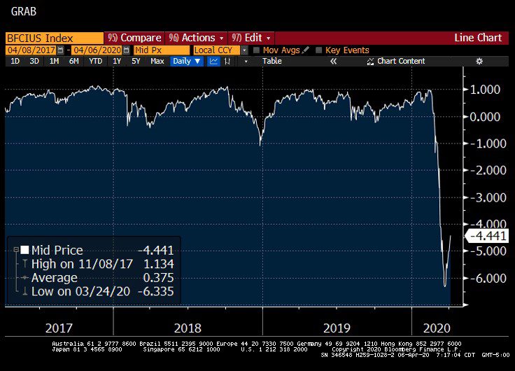
Here we see the daily values for the last three years, and that this particular index mostly floats between negative one and one. These are actually standard deviations, so that means that the index should fall between these two levels about two thirds of the time.
You can see that in the panic a few weeks ago, the index dropped to negative six. During the 2008 financial crisis, this index got to -7.5, so unlike the VIX, financial conditions didn’t get as bad this time, which makes sense since the 2008 crisis was born in the financial sector.
(For you math geeks out there, a six sigma event should happen about once every 1.4 million years, or twice as long as scientists thing that humans have been around. A seven sigma event like 2008 should happen once every billion or so years, which is thought to be about four times the history of the earth.)
ETF Bond Prices
The last measure of stress that I’d like to show is the difference between the price of a bond ETF and the value of the bonds held in the ETF.
This happens to be for the Vanguard Total Bond Market (ticker symbol: BND), but it was happening with a lot of ETFs for all providers (iShares, etc.), especially ETFs that are solely invested in corporate bonds.
I’m using this one because we own a lot of it and unlike the other two, which are more theoretical, this one affected how we traded during this time period.
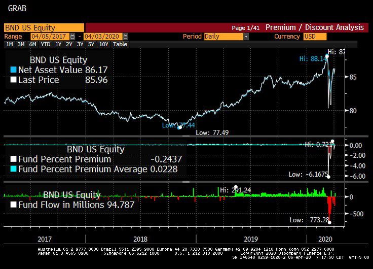
I realize these charts aren’t easy to read, the part of the picture to look at is the bottom right. When you see green spikes, that means that the price of the ETF is slightly above the value of the underlying bond portfolio. Where you see the red valleys, it means that the price is below the value of the portfolio – in this case by about five percent.
During major stress periods, liquidity dries up, and dealers who are normally in the market making prices step back. And, in the case of something like BND where there are almost 17,000 bonds in the portfolio, not all of them are getting priced every day. As a result, it’s hard to tell whether the market price or the NAV is the right price.
However, as the Federal Reserve stepped in with their stimulus, the liquidity came back and you can see a little green spike at the very right, indicating that things are basically back to normal.
Conclusion
A lot of the initial market stress was due to simultaneous, global deleveraging. Said another way, everyone was running for the exits at the same time.
If you have a leveraged portfolio and a market event hits, you don’t have the luxury of determining when you can sell – the bankers (or shadow bankers) that lent you the money have strict rules in place that create forced sellers who don’t care so much about the price they get, only that they get out of the trades that they are in.
Fortunately, our clients are never in this position. Sometimes, our clients use margin in their account to smooth cash flow (when there’s a short amount of time between the purchase of one house and the sale of another, for example), but we don’t use leverage or margin strategically for investment reasons.
Still, we’re affected when other people do, so it’s a relief to have that phase of the crisis (hopefully) in the rear view mirror. Markets will react to the economic data as it comes in, but the reaction will be tempered by expectations.
Even though the panic might be over (emphasize ‘might), and markets are stabilizing, it may still be turbulent. I know that sounds like I’m talking out of both sides of my mouth – what I mean is that stocks will react sharply to new data as it comes out (turbulent), but is operating in an orderly way without the kinds of stresses described above.
Hopefully, the virus is beginning to crest, which will tell us a lot about where things go from here.

David is a trusted advisor to 50 families, delivering comprehensive financial solutions, including financial planning, investment management, cash management, tax planning, estate planning, and charitable giving. As Chief Investment Officer, he leads the Investment Committee and the research and trading team. His team continuously evaluates investment strategies and securities, working closely with Portfolio Managers to implement them effectively.