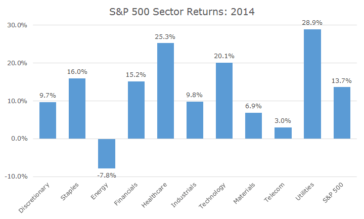
Which sector returns were better last year, healthcare stocks or utilities?
There’s no question that both had great years, up 25.26 and 28.94 percent respectively, compared to 13.66 percent for the S&P 500.
The question, though, asks which is better, and I think the answer depends a little on what you care about. If the answer is straight performance, then clearly, utilities won by 3.68 percentage points. The following chart plots the returns by sector last year.
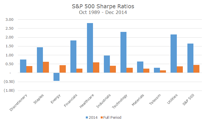
If you care about volatility (and I think you do, whether you realize it or not), the healthcare stocks were the winners because they had a higher Sharpe ratio. The Sharpe ratio measures the return of an asset over cash (which these days just means the return since cash is zero) divided by the volatility of the asset.
So, for example, the S&P 500 returned 13.66 percent and the annualized volatility (based on monthly data) was 8.26 percent. Since we don’t have to worry about cash returns, we simply divide 13.55 by 8.26 and get 1.65 units of return per unit of risk.
Doing the same thing for healthcare stocks and utilities yields Sharpe ratios of 2.80 and 2.16 respectively. Maybe those numbers don’t jump out at you, but they are REALLY high.
It’s often quoted, by us and others, that large cap stocks have earned roughly 10 percent per year since 1926. What is less often quoted is that average volatility of returns is around 20 percent.
If cash has returned around 3.5 percent (I am obviously using round numbers here), then the long-term average Sharpe ratio for large cap stocks is 0.33 (precise numbers come to 0.35, but this is a messy business).
So, to have a Sharpe ratio for the S&P 500 last year of 1.65, that is almost five times better than average. Since the returns are not too dissimilar, that means that it must be the low volatility. I wrote about this in January, but I really was amazed to look at the Sharpe ratios by sector.
Unfortunately, we don’t have good sector data that goes back very far. The good news, though, is that it’s far enough back (to 1989) that you can still get the idea.
The chart below shows the Sharpe ratio for each sector last year in blue, and for the full period starting in 1989 and ending 2014, in orange. With the exception of energy, which was down last year thanks to falling oil prices, the Sharpe ratio was meaningfully higher in ever sector.
I guess that I am a little worried that we, myself included, are getting a little complacent about the low level of volatility.
Yes, we have spikes here and there, but they seem to go away almost as quickly as they arrive. In this case, I’m really referring to sustained periods of volatility that last months or longer.
Volatility is perfectly normal and part of investing. If we get too complacent about it when prices are relatively stable, then it’s possible that we’ll freak out if we get to average levels of volatility, or, dare I say, high volatility.
I’m decidedly not trying to be a Cassandra. In fact, I am usually derided as a congenital bull, and I would fight that label, but I think it’s probably true.
At the same time, though, I want everyone to be fully aware of the risks that they are taking and recognize that what we’ve experienced for several years now just isn’t the norm.
I don’t know when normal volatility will come back, but be as mentally prepared as you can for when that day comes.