There are many articles about where markets ended in 2024 and where they might go from here. This isn’t one of those articles, but we will send our quarterly newsletter out shortly that does and will host an in-person event, our Investor Social, at the end of this month.
One factoid I read was that it was the best two-year return for the stock market since the 1990s, or in more than a quarter century. That seemed believable since markets have been so good since the bear market in 2022. I was ready to write it in this article when I decided to run the numbers.
Perhaps what I read was about the Dow or used a price-only S&P 500 index instead of the total return index that includes dividends. Either way, the statement that this is the best two-year return in more than 25 years isn’t correct.
In the past two years, the annualized return has been 25.6 percent, which is amazingly good—almost 2.5x the long-term average. And I don’t mean to be nit-picky, but in the two years that ended in March 2022, the two-year return was 34.5 percent.
Perhaps they meant calendar returns; I don’t know. Regardless, there are two lessons to draw from this. First, you can’t take what you read at face value. I doubt there was anything malicious, but still.
Second, we’ve had some outstanding returns in the last two years. I wanted to know what the three years since 2022, which were pretty terrible, look like.
I have three histograms below. If you haven’t heard that term in a while, it’s just a bar chart that shows how data is distributed. It organizes data into bins, buckets, or bars (pick your term). It’s a way to count how common or uncommon results were over a particular period.

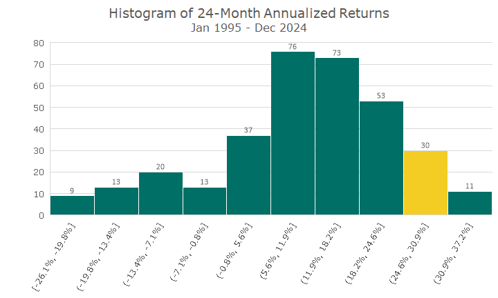
This first histogram divides all of the S&P 500’s two-year returns (not well labeled in my chart) into ten bins.
The first bin has nine two-year periods, ranging from -19.9 percent to -26.1 percent. At the other extreme, on the far right, there are 11 periods where the returns are between 30.9 and 37.2 percent.
Most of the returns are in the middle, although you can see that it’s not a ‘normal’ distribution. The bin with the most periods is 5.6 to 11.9 percent, consistent with the long-term market average.
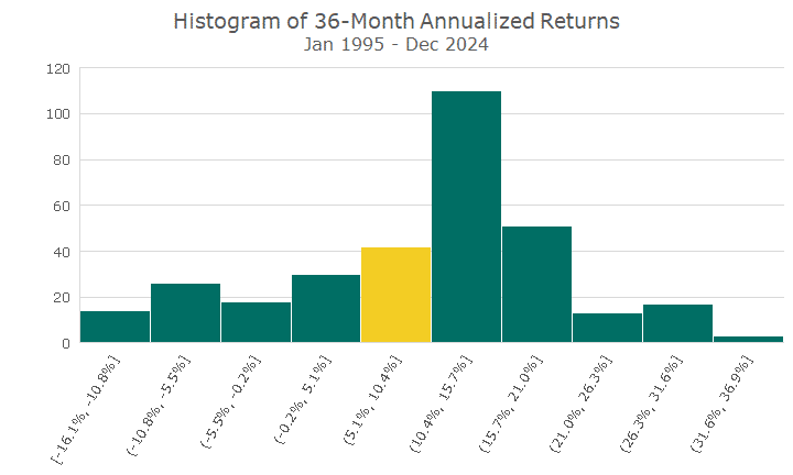
The next histogram does the same thing, but instead of looking at two-year returns, it looks at three-year returns.

This chart looks a little more normal but still pretty lumpy. But the three years that ended in December are pretty good, between 5.1 and 10.4 percent – again, consistent with the long-run average.
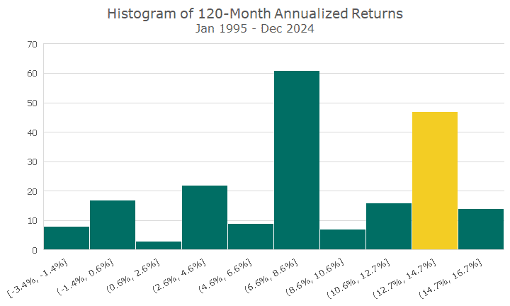
Since I had the data at my fingertips, I ran the same procedure for ten-year returns. My whole study period is 30 years (ignore the first and second chart that say 1997; that’s a typo and should say Jan 1995).
This isn’t a normal-looking curve either, but there aren’t that many data points so that I wouldn’t expect it to. Still, I wouldn’t expect that second bin from the right to be so enormous, either.

This is the second point—the last ten years have been beyond good and probably a lot more than what we should reasonably expect over the next ten years.
I think returns will be positive, but something more in the middle of the distribution, in the high single digits. I would have said the same thing ten years ago, but I was wrong, so I’m happy we didn’t act on my opinion.
Other markets don’t resemble the S&P 500, supporting our globally diversified approach. Again, we were doing that ten years ago, and having those other assets hasn’t been as good as the S&P 500.
But that’s the point—we don’t know what tomorrow will bring, but we will catch all of the outliers, good and bad. Our financial plans capture that concept. To quote the famous investor Howard Marks, “You can’t predict, but you can prepare.”


