Yesterday, Mike Lissner came over to my desk and asked what the Price Earnings-ratio (PE-ratio) was for the S&P 500. I leaned over to my handy-dandy Bloomberg terminal, and looked it up and told him that it was 16.8.
He then asked what the average was and moving to a different screen, I showed him that the average PE-ratio for the S&P 500 since 1954 was 16.4 and the median PE-ratio was 16.8.
At first blush, it was comforting to see that the current PE-ratio is pretty typical: it’s been much lower (7.2 in March, 1980) and much higher (29.9 in June, 1999). Obviously, current prices could fall further and we would be below average, but being in the middle isn’t so bad in this regard.
I told him that the PE-ratios become a quagmire in a hurry because it’s hard to know what ‘e’ to use: there are a lot of choices and the impact of your choice is material.
The chart below shows six different PE-ratios depending on what set of earnings you want to use and you can see that the ratios are quite different ranging from 14.9 at the low end to 24.8 at the high end.
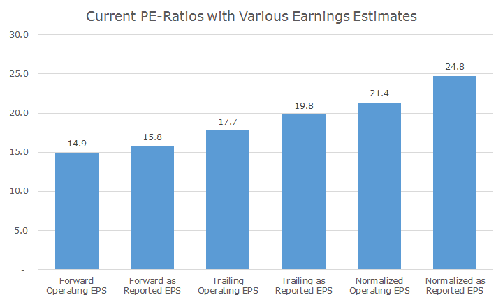
The first two PE-ratios are based on ‘forward’ earnings, which means that they look at the current price compared to analyst expectations for earnings in the coming year. In my opinion, these are the least reliable because one thing we know with certainty is that the analyst projections won’t be accurate.
Notice that there are two sets of ‘forward’ earnings: ‘operating’ and ‘as reported.’ You can think of ‘as reported’ earnings as the kitchen sink because they include everything that happened within the company, including things that won’t likely happen again, like shutting down a factory or paying out all of the claims on a lawsuit.
Operating earnings, on the other hand, are massaged a little bit by management to exclude those one-time events and give a better picture of the ongoing business. I prefer the as reported earnings because it includes all of the ugly ducklings.
The middle two columns show the current price based on the profits over the past 12 months (with the same operating and as reported breakdown). These are pretty conventional, but some people don’t like them because they are naturally backward looking, which is true.
The last two columns are ‘normalized’ earnings, which is a fancy way of saying 10-years’ worth of average earnings, adjusted for inflation. This is the method that Robert Shiller developed and is known as the Shiller PE-ratio that we’ve discussed many times.
On this basis, the stock market looks pretty expensive – 65 percent more so than the forward operating earnings. The last one happens to by my favorite because I like the as reported numbers and Shiller has demonstrated that looking at 10-years’ worth of earnings cuts out a lot of the noise in the data.
It turns out that the predictive power of the Shiller PE ratio is not much better than the trailing method, but it still makes more sense to me anyway, especially since the predictive power is pretty low either way.
The conclusion from all of this is twofold. First, earnings are a rabbit hole for which there is no bottom. Second, you have to pick a metric and use it consistently. I’ve set my sails with the as reported Shiller PE and under this metric, the market is still a little over-valued.
It’s funny because if you look at Shiller’s website, he shows his PE ratio as 24, which is lower than what Bloomberg shows (the rabbit hole) and I think that 20 is a good number, which implies that we’re still overvalued.
Vanguard did a piece recently that I am still working through that explains why it’s OK to have a higher PE-ratio in a low interest rate environment, which makes 24 look perfectly fine, but I haven’t fully digested this yet.
I would still say that the market is a little expensive, but it’s hard to say. In fact, the PE-ratio that I quoted Mike of 16.8 doesn’t match any of the six that I found through a more formal analysis. Down the rabbit hole.