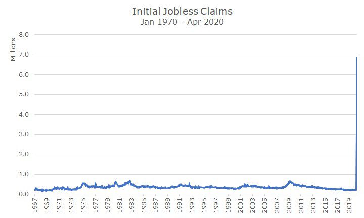
One of the most jarring aspects of the coronavirus epidemic is the speed and magnitude of job losses. We now have four weeks’ worth of data, and a shocking 22 million people have filed for unemployment benefits.
For reference, the previous record for initial jobless claims over a four- week period was 2,697,00 during the 1982 recession. During the 2008 financial crisis, the record was 2,637,000, just shy of the old record. As of last week, we’re already eight times larger than the previous record, and we’re not done yet.
If you look a chart, the recent jobless claims render the rest of the chart almost useless because the scale today is so big, that you can’t really see any variation in any of the previous years.
A recent article at the St. Louis Federal Reserve website did an interesting job of defining the relationship between the progress of the virus and the impact of unemployment. You can find the blog post by clicking here.
They start with an interesting map of the United States by ‘commuting areas’ that is meant to combine areas by local labor market rather than by municipality. Within each area, they show the number of deaths per million people to give us a ‘heat map’ that shows what areas are hit the worst.
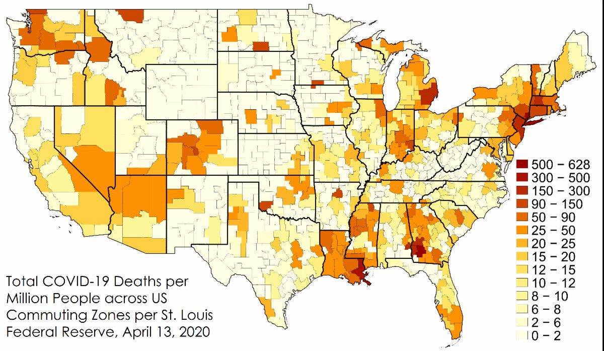
While this map is upsetting, it’s also fascinating. Notice, for example, how badly things look in Louisiana. I had heard that before, but had no idea that it looked as bad as New York.
Then, the folks at the Fed compared the deaths per million people to the initial unemployment claims, which is shown in this chart:
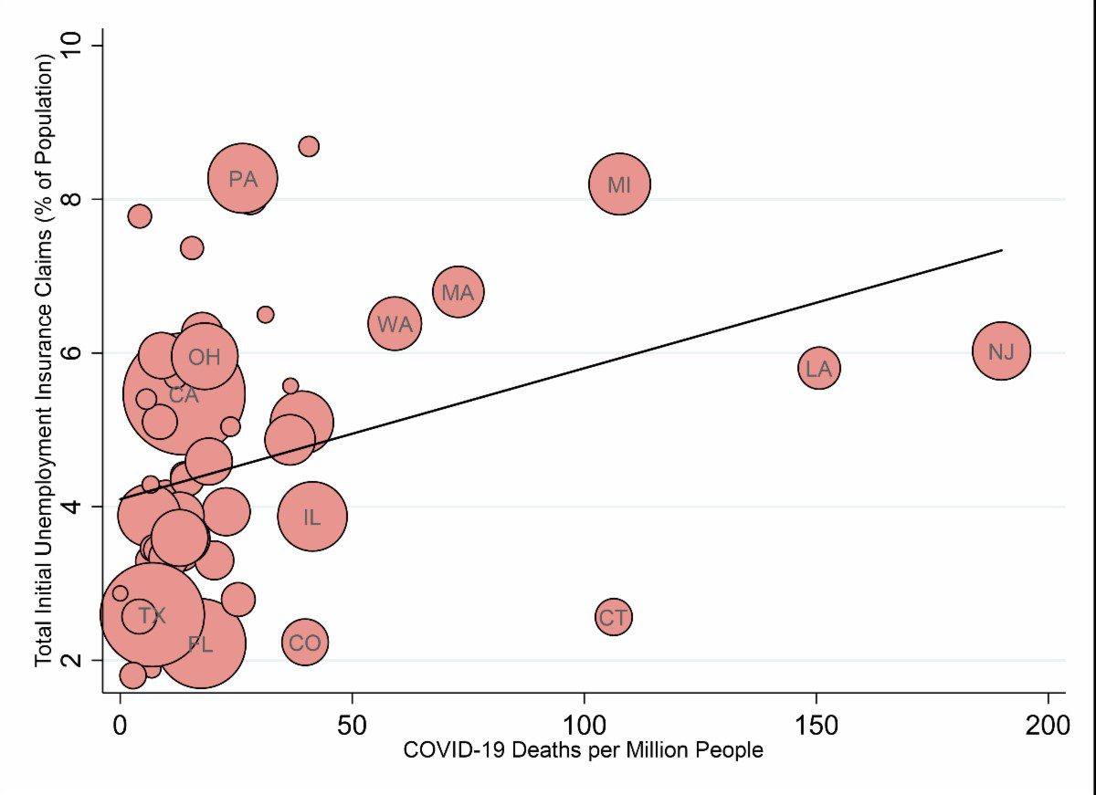
The chart shows that there is a positive correlation between the severity of the health crisis (measured in deaths per million) and the severity of the job losses (measured in initial jobless claims).
Maybe that connection seems obvious, or heartless since people are still dying from the virus. But, in my opinion, it also shows the value of the social distancing, work closures and other restrictions put in place by the various state and local governments.
That’s not to say that the the relationship is perfect, however. If you look at the dates of the restrictions put in place, Missouri announced school closures on 3/23, a full seven days after Louisiana. And the shelter-in-place orders in Missouri were two weeks after Louisiana.
I don’t know whether the dates I’m using are for Missouri or St. Louis county, but you get the idea. Nor can we say what the impact of Mardi Gras may have been.
This epidemic will be studied for years in incredible detail, but it’s still worth looking at the imperfect, but ‘real time’ information that we have on hand to get a broad sense of some of the general relationships.
You never know what might have been if things had been different (sometimes called a counter-factual), but by looking at what happened in different places can help us better understand what to do in the near term if the course of the virus changes until we get better data and analysis in the future.
