In a bear market like this one, when stocks are down -20 percent and bonds are down -10 percent, it’s hard to find good news.
I learned a long time ago that in an up market, investors care about relative returns (earning 12 percent versus 10 percent, for example), but in a down market aren’t interested in that at all (losing, say, -8 percent instead of -10 percent).
In both examples, the outperformance is two percentage points, but relative returns are a secondary concern to whether you’re making or losing money (absolute returns).
So, I haven’t wanted to trumpet the ‘good’ news, but this week I thought I would take a break from inflation, interest rates, and all the rest to look at how value stocks are performing relative to growth stocks.
Since our founding almost 20 years ago, we’ve been value investors, favoring less expensive stocks over more expensive ones. For the first eight years, that felt pretty good – value handily outperformed growth in both up and down markets.
After the financial crisis in 2008, the tables turned. At first, value only underperformed modestly, it just lasted longer than it has historically. Then, the pandemic hit, value stocks were hit harder, and some growth stocks boomed.
That all changed this year, though, and value is outperforming. The Russell 1000 Value index is down -11.5 percent, which isn’t that hot unless you’re comparing it to the Russell 1000 index, which is down -18.5 percent, or the Russell 1000 Growth index, which is down -24.7 percent.
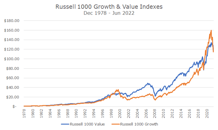
The chart below shows the growth of $1 invested when the Russell indexes were launched in the late 1970s. The Russell indexes aren’t optimal in my opinion (especially the small-cap versions), but they are widely accepted, investible, and have a relatively long track record.
Charts like the one above can be a little hard to read because the values have changed so much over the decades. As a result, I like to take out the overall market and just compare the excess return of the growth index and the excess return of the value index, which is shown in the chart below.
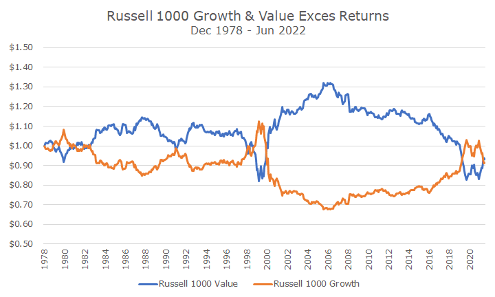
It’s a little easier to see in the chart above that value has historically fared better than growth, but all the excess return was lost in the last 15 years.
The obvious question going forward is whether value stocks will return to their historical prominence, or whether this is a pitstop in growth stock’s permanent ascendance.
No one knows, of course, but my bias is toward value stocks. You could argue that I’m talking about my book because we pursue a value strategy, but the reality is that we could do whatever we want, growth or value, and we prefer value.
My personal view is somewhat simplistic. If you pay average prices for investments, you ought to earn average returns. If you pay lower than average prices, you should earn higher than average returns. And, if you pay higher than average prices, you should earn lower than average returns.
It’s more complicated than that because you have to factor in the growth of a company’s fundamentals, and value stocks are cheap for a reason: they are often struggling or highly cyclical.
And while growth stocks on average may not work out well, there will always be a few stocks that deliver on their high growth expectations, which allows the valuations to be reasonable (think Amazon).
One interesting way to measure the relative cheapness/expensiveness of the two styles is by looking at the valuation difference (or spread) between the valuations of the two indexes.
The chart below is copied from AQR’s website. AQR is a quantitative asset manager that we use in some portfolios.
The chart looks at the relative cheapness of value compared to growth (or the relative expansiveness of growth compared to value – it’s the same thing).
In this case, they aren’t looking at the Russell 1000 indexes, they are looking at all stocks globally. As a result, they don’t have as much data, and it only goes back to 1990.
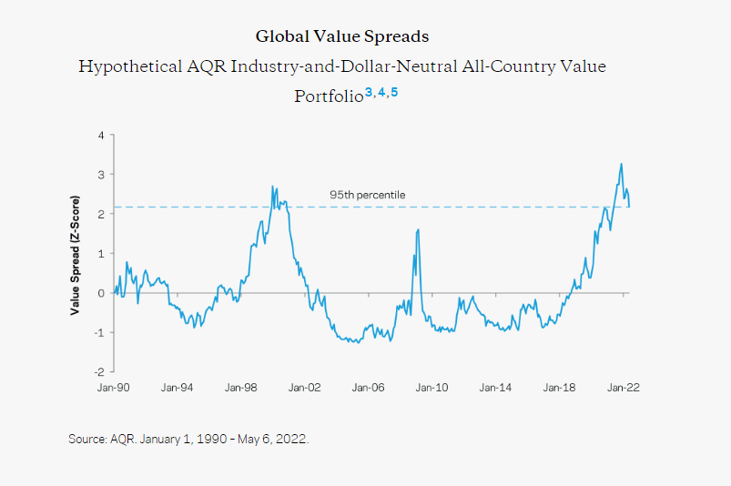
Still, the chart is pretty remarkable. In theory, the blue line that they chart should trade around the zero line, a little above, and a little below. You can see in the late 1990s, growth stocks got really expensive – it was the tech bubble.
If you compare it to the charts above, value stocks didn’t do as well as growth stocks – not because their fundamentals weren’t keeping up, but because people were willing to pay increasingly high prices, until the prices became absurd and the tech bubble turned into the tech bust.
There’s a brief period around 2008 where you can see another spike, but that isn’t about expensive growth stocks, it’s about cheap value stocks. In this case, banks and energy stocks got really, really cheap when the banking system was insolvent and needed a bailout.
But the point of the picture is the real spread in valuation over the last three or four years when growth got really expensive again. So expensive that it looked like the tech bubble.
This year, some of that has unwound, and the point of the chart was to say that if the valuations spread reverts back to something more normal, there is a long way to go, which would be good for value investors like us.
Again, it’s impossible to know what happens next, but as I’ve written before, I think it’s a lot easier to own value stocks, especially when they are cheap compared to growth stocks, as they appear to be today.
