A great way to visualize asset class returns is to put them into what the industry calls a ‘periodic table,’ which I’ve done below. The basic idea is to order the returns of asset classes in each calendar year from best to worst.
In the chart below, 2006 is the first year and the best performing asset class in gray was 35.9 percent. At the bottom of the column is an asset class in a medium blue that earned 10.3 percent.
When we present this, you don’t get to see what those asset classes are, although in this case, the key (and the punchline) is over to the right. But before we get to that, lets’ keep looking at the table.
The first thing that I notice is that the range of returns within each year is really dramatic. In 2006, there is a 25.6 percent difference between the best and worst return.
It turns out that this is typical – the average range is 30 percentage points, the tightest being in 2012 with a 3.7 percent range between the best and worst performing asset class and the widest is in 2007, when it’s 56.2 percentage points.
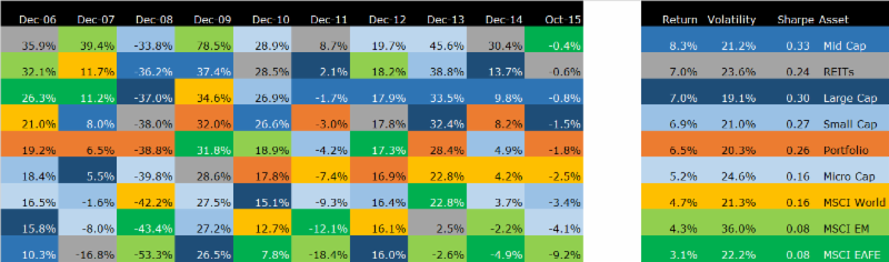
(Incidentally, I realize that this is hard to read in the email. I encourage you to click here and see a larger version on our website).
The second thing to look at is how the asset class returns bounce around from year to year. The best return in 2006 happens to be the worst return in 2007 and that kind of jumpiness is not uncommon. It’s impossible to predict how returns will rank in any given year.
Now for the punchline – the key is what each color represents along with the annualized returns, volatility and Sharpe ratio for each asset class.
It’s interesting to me that the best performing asset class over this period, mid cap stocks, was never the best performing asset class – and one year it was the worst.
The worst asset class in terms of cumulative returns, the MSCI EAFE, was around the bottom a lot, but was near the top at the beginning of the period and most recently.
When I picked the colors for this chart, I intentionally kept most of the asset classes in cool colors of greens, blues and gray. The two warm colors, yellow and orange, are a little special.
The orange portfolio is a good proxy for our target allocation for a 100 percent stock portfolio. What I want you to notice here is that it is never at the top or the bottom of the list – it’s always right around the middle.
That’s what you would expect from a diversified portfolio too – something in your portfolio always looks good and something always looks terrible. They say that if everything in your account is doing well, then you’re not diversified.
The second warm color is the MSCI All Country World Index (ACWI), which includes all traded stocks – large, mid and small from the developed and emerging markets.
Normally, we all think of the S&P 500 as a proxy for stock returns, but it’s not a great benchmark because it’s just one segment of one country. Yes, granted it’s the largest asset class in the largest country, but it’s not reflective of a globally diversified portfolio.
If you think of the S&P 500 as benchmark for our diversified asset mix, then we haven’t fared as well because the returns for the S&P 500 were higher and it was a little less volatile. To a large extent that’s a function of the last 10 years and if we picked a different period, we wouldn’t see that same thing.
If you accept the MSCI ACWI as a reasonable proxy for our asset mix, you’d conclude that we did well – higher returns and lower volatility. Since we have a ‘home bias’ and weight a lot more of our portfolio to US stocks than the MSCI ACWI, it makes sense that we would have fared well – again, it’s partly a function of this particular time period.
The bigger question, of course, is what’s going to happen in the next time period. Will US stocks continue to outperform because our economic fundamentals look better than the rest of the world? Or, will other stocks fare better because they are so much cheaper than our market right now?
Sadly, it’s impossible to tell, especially when you look at the randomness in the above chart. What I am willing to bet is that our diversified mix lands right in the middle and I’m perfectly happy with that.

David is a trusted advisor to 50 families, delivering comprehensive financial solutions, including financial planning, investment management, cash management, tax planning, estate planning, and charitable giving. As Chief Investment Officer, he leads the Investment Committee and the research and trading team. His team continuously evaluates investment strategies and securities, working closely with Portfolio Managers to implement them effectively.