It should not come as a surprise to anyone that markets have performed very well over the past five years. The S&P 500 has earned 16.12 percent per year in the five years that ended in February.
Few investors realize that corporate bonds have also done very well over the past five years. For the five years that ended in February, the Barclays US Corporate Bond index has earned 6.22 percent, which is 2.51 percent per year better than the Barclays US Treasury bond index, which gained 3.71 percent over the same time period.
In some ways, that makes a lot of sense because corporate bonds suffered during the 2008 financial crisis and the last five years only includes the recovery and not the crisis period.
If you look at the last ten years that ended in February, corporate bonds still outperformed with the Barclays US Corporate Bond index earning 5.63 percent compared to 4.49 percent for the Barclays US Treasury Bond index, an outperformance of 1.14 percent.
I’ve said for at least a year now that stocks are and with yields as low as they are on all bonds, it’s fair to say that bonds are expensively priced as well.
The low yield environment has caused some clients to ask whether we should buy more corporate bonds, so I thought it would be interesting to see if corporate bonds were cheap or expensive at this point.
The first chart shows the yield on all US investment grade corporate bonds (in orange) compared to all US Treasury bonds (in blue) over the same time period.
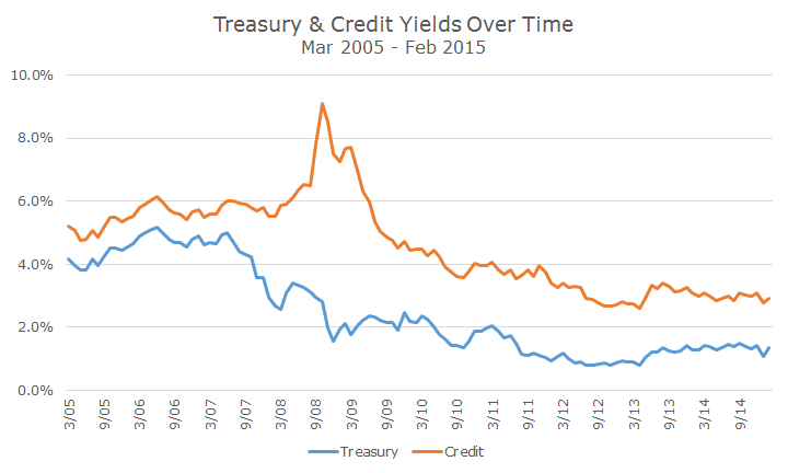
In the years leading up to the crisis, notice how small the difference is between the two yields. In bond parlance, we would say that ‘spreads are tight.’
During the crisis, when there was a lot of uncertainty about whether corporations could make their interest and principal payments, corporate bonds fell, which means that the yields went up. Corporate bond yields went up while Treasury yields were falling and the difference became very wide, or what we call a ‘blow out.’
As the crisis subsided, the difference in yield narrowed, although it’s worth pointing out that the difference between the two, the spread, is not as narrow today as it was in the years prior to the crisis.
The second chart below attempts to show this same relationship a little more clearly by simply plotting the difference, or spread, between the two yields over time.
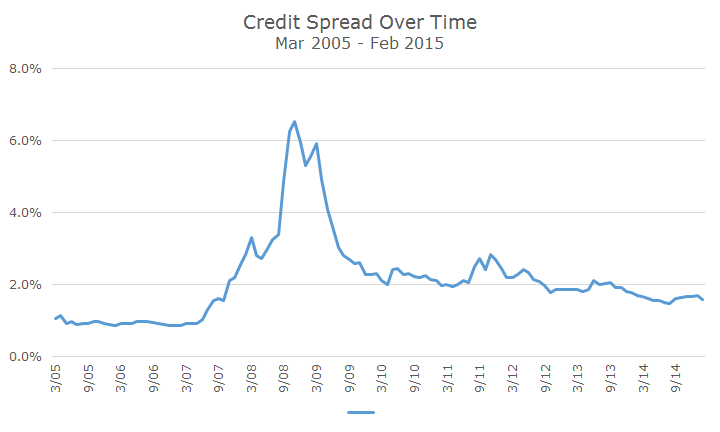
Although this is not a scientific view (and even when they sound scientific, they aren’t), but it would seem to me that corporate bonds may be on the expensive side, but they aren’t outrageously expensive either.
Like most managers, we overweight corporate bonds somewhat compared to the overall bond market and at this point, I am still comfortable with that long-term strategic position.

David is a trusted advisor to 50 families, delivering comprehensive financial solutions, including financial planning, investment management, cash management, tax planning, estate planning, and charitable giving. As Chief Investment Officer, he leads the Investment Committee and the research and trading team. His team continuously evaluates investment strategies and securities, working closely with Portfolio Managers to implement them effectively.