Over the last ten years, the oldest technology ETF I could find, the Select Spider Tech fund (ticker symbol XLK), has made more than 20 percent per annum through September 30th. A $10,000 investment in that fund would have been worth $64,172 at the end of last month.
Even though I know better than to drive forward while looking out through the rearview mirror, I can’t help it: I want that return, so I wonder whether we shouldn’t overweight tech stocks or at least stop underweighting them.
The phenomenon of taking recent past events and extrapolating them is called recency, but I can’t help thinking: Is ten years that recent? Isn’t it obvious that tech stocks will keep crushing the market (which earned an awesome 13.2 percent during that same period but still feels paltry)?
So, my itch is that I want this performance, and to scratch that itch, I have to look at the history in more detail and think about where things could go from here.
Let’s start with the history. I pulled the S&P 500 technology index returns to 1991. I started using XLK, but it only dates back to 1999, so you get most of the tech bubble bursting but not much of the bubble itself. Using the index data, I see the good and bad parts of the bubble.
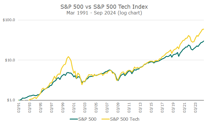
I’m showing this data in logarithmic terms, which allows you to see the impact of the bubble. If I didn’t do that, you couldn’t see the bubble at all because the recent performance obscures everything else.
What’s interesting to me is that for 25 years, from 1991 to 2016, tech stocks didn’t outperform the overall market. Sure, they did in the late 1990s, but they underperformed just as much in the early 2000s. As noted already, bubble and burst.
Next, I decided to examine valuations. I studied the price-to-earnings and price-to-book ratios before settling on the price-to-sales ratio, and they all tell the same story: tech stocks are expensive.
I went with price-to-sales (P/S) because it’s simple to understand: there is no management manipulation to achieve earnings, you can have negative earnings, and there is no question about the company’s book value (tangible vs. intangible), etc.
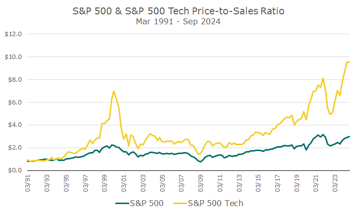
The chart above shows that tech stocks are always expensive compared to the overall market. That makes sense because they grow faster.
But I was amazed that tech stocks are more expensive on a price-to-sales basis now than they were in the bubble. I’m not calling this a bubble, but I find it a little spooky (to draw on Halloween terminology).
You can also see that the market is more expensive today than it was in the late 1990s. The next chart simply divides the price-to-sales ratio for the tech index over the price-to-sales ratio for the overall market to show its relative expansiveness.
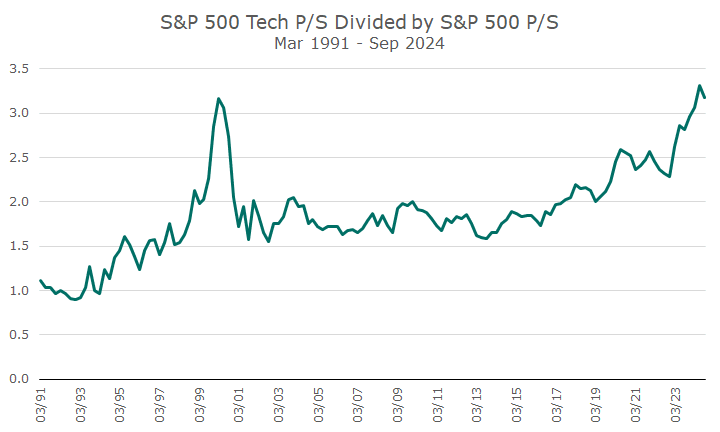
Measured this way, tech stocks still look frothy – about the same level as they were in the tech bubble. Interestingly, the take-off point for the expansiveness appears to be 2016, when tech stocks started to outperform the overall market if we look at the index back to 1991.
I wish I had those returns, but they feel less desirable if the valuations are just getting higher and higher. I’d much prefer it if the fundamentals were getting better and better, which they did, just not as much as people’s willingness to pay higher prices.
I want to reiterate that I am not saying this is a bubble—it could go on for years or last forever. At the same time, I’ve scratched the itch and am perfectly content to remain underweight in tech stocks.
Happy Halloween!

- David Ott
- David Ott
- David Ott
- David Ott
- David Ott
- David Ott
- David Ott
- David Ott
- David Ott
- David Ott
- David Ott
- David Ott
- David Ott
- David Ott
- David Ott
- David Ott
- David Ott
- David Ott
- David Ott
- David Ott
- David Ott
- David Ott
- David Ott
- David Ott
- David Ott
- David Ott
- David Ott
- David Ott
- David Ott
- David Ott
- David Ott
- David Ott
- David Ott
- David Ott
- David Ott
- David Ott
- David Ott
- David Ott
- David Ott
- David Ott
- David Ott
- David Ott
- David Ott
- David Ott
- David Ott
- David Ott
- David Ott
- David Ott
- David Ott
- David Ott
- David Ott
- David Ott
- David Ott
- David Ott
- David Ott
- David Ott
- David Ott
- David Ott
- David Ott
- David Ott
- David Ott
- David Ott
- David Ott
- David Ott
- David Ott
- David Ott
- David Ott
- David Ott
- David Ott
- David Ott
- David Ott
- David Ott
- David Ott
- David Ott
- David Ott
- David Ott
- David Ott
- David Ott
- David Ott
- David Ott
- David Ott
- David Ott
- David Ott
- David Ott
- David Ott
- David Ott
- David Ott
- David Ott
- David Ott
- David Ott
- David Ott
- David Ott
- David Ott
- David Ott
- David Ott
- David Ott
- David Ott
- David Ott
- David Ott
- David Ott
- David Ott
- David Ott
- David Ott
- David Ott
- David Ott
- David Ott
- David Ott
- David Ott
- David Ott
- David Ott
- David Ott
- David Ott
- David Ott
- David Ott
- David Ott
- David Ott
- David Ott
- David Ott
- David Ott
- David Ott
- David Ott
- David Ott
- David Ott
- David Ott
- David Ott
- David Ott
- David Ott
- David Ott
- David Ott
- David Ott
- David Ott
- David Ott
- David Ott
- David Ott
- David Ott
- David Ott
- David Ott
- David Ott
- David Ott
- David Ott
- David Ott
- David Ott
- David Ott
- David Ott
- David Ott
- David Ott
- David Ott
- David Ott
- David Ott
- David Ott
- David Ott
- David Ott
- David Ott
- David Ott
- David Ott
- David Ott
- David Ott
- David Ott
- David Ott
- David Ott
- David Ott
- David Ott
- David Ott
- David Ott
- David Ott
- David Ott
- David Ott
- David Ott
- David Ott
- David Ott
- David Ott
- David Ott
- David Ott
- David Ott
- David Ott
- David Ott
- David Ott
- David Ott
- David Ott
- David Ott
- David Ott
- David Ott
- David Ott
- David Ott
- David Ott
- David Ott
- David Ott
- David Ott
- David Ott
- David Ott
- David Ott
- David Ott
- David Ott
- David Ott
- David Ott
- David Ott
- David Ott
- David Ott
- David Ott
- David Ott
- David Ott
- David Ott
- David Ott
- David Ott
- David Ott
- David Ott
- David Ott
- David Ott
- David Ott
- David Ott
- David Ott
- David Ott
- David Ott
- David Ott
- David Ott
- David Ott
- David Ott
- David Ott
- David Ott
- David Ott
- David Ott
- David Ott
- David Ott
- David Ott
- David Ott
- David Ott
- David Ott
- David Ott
- David Ott
- David Ott
- David Ott
- David Ott
- David Ott
- David Ott
- David Ott
- David Ott
- David Ott
- David Ott
- David Ott
- David Ott
- David Ott
- David Ott
- David Ott
- David Ott
- David Ott
- David Ott
- David Ott
- David Ott
- David Ott
- David Ott
- David Ott
- David Ott
- David Ott
- David Ott
- David Ott
- David Ott
- David Ott
- David Ott
- David Ott
- David Ott
- David Ott
- David Ott
- David Ott
- David Ott
- David Ott
- David Ott
- David Ott
- David Ott
- David Ott
- David Ott
- David Ott
- David Ott
- David Ott
- David Ott
- David Ott
- David Ott
- David Ott
- David Ott
- David Ott
- David Ott
- David Ott
- David Ott
- David Ott
- David Ott
- David Ott
- David Ott
- David Ott
- David Ott
- David Ott
- David Ott
- David Ott
- David Ott
- David Ott
- David Ott
- David Ott
- David Ott
- David Ott
- David Ott
- David Ott
- David Ott
- David Ott
- David Ott
- David Ott
- David Ott
- David Ott
- David Ott
- David Ott
- David Ott
- David Ott
- David Ott
- David Ott
- David Ott
- David Ott
- David Ott
- David Ott
- David Ott
- David Ott
- David Ott
- David Ott
- David Ott
- David Ott
- David Ott
- David Ott
- David Ott
- David Ott
- David Ott
- David Ott
- David Ott
- David Ott
- David Ott
- David Ott
- David Ott
- David Ott
- David Ott
- David Ott
- David Ott
- David Ott
- David Ott
- David Ott
- David Ott
- David Ott
- David Ott
- David Ott
- David Ott
- David Ott
- David Ott
- David Ott
- David Ott
- David Ott
- David Ott
- David Ott
- David Ott
- David Ott
- David Ott
- David Ott
- David Ott
- David Ott
- David Ott
- David Ott
- David Ott
- David Ott
- David Ott
- David Ott
- David Ott
- David Ott
- David Ott
- David Ott
- David Ott
- David Ott
- David Ott
- David Ott
- David Ott
- David Ott
- David Ott
- David Ott
- David Ott
- David Ott
- David Ott
- David Ott
- David Ott
- David Ott
- David Ott
- David Ott
- David Ott
- David Ott
- David Ott
- David Ott
- David Ott
- David Ott
- David Ott
- David Ott
- David Ott
- David Ott
- David Ott
- David Ott
- David Ott
- David Ott
- David Ott
- David Ott
- David Ott
- David Ott
- David Ott
- David Ott
- David Ott
- David Ott
- David Ott
- David Ott
- David Ott
- David Ott
- David Ott
- David Ott
- David Ott
- David Ott
- David Ott
- David Ott
- David Ott
- David Ott
- David Ott
- David Ott
- David Ott
- David Ott
- David Ott
- David Ott
- David Ott
- David Ott
- David Ott
- David Ott
- David Ott
- David Ott
- David Ott
- David Ott
- David Ott
- David Ott
- David Ott
- David Ott
- David Ott
- David Ott
- David Ott
- David Ott
- David Ott
- David Ott
- David Ott
- David Ott
- David Ott
- David Ott
- David Ott
- David Ott
- David Ott
- David Ott
- David Ott
- David Ott
- David Ott
- David Ott
- David Ott
- David Ott
- David Ott
- David Ott
- David Ott
- David Ott
- David Ott
- David Ott
- David Ott
- David Ott
- David Ott
- David Ott
- David Ott
- David Ott
- David Ott
- David Ott
- David Ott
- David Ott
- David Ott
- David Ott
- David Ott
- David Ott
- David Ott
- David Ott
- David Ott
- David Ott
- David Ott
- David Ott
- David Ott
- David Ott
- David Ott
- David Ott
- David Ott
- David Ott
- David Ott
- David Ott
- David Ott
- David Ott
- David Ott
- David Ott
- David Ott
- David Ott
- David Ott
- David Ott
- David Ott
- David Ott
- David Ott
- David Ott
- David Ott
- David Ott
- David Ott
- David Ott
- David Ott
- David Ott
- David Ott
- David Ott
- David Ott
- David Ott
- David Ott
- David Ott
- David Ott
- David Ott
- David Ott
- David Ott
- David Ott
- David Ott
- David Ott
- David Ott
- David Ott
- David Ott
- David Ott
- David Ott
- David Ott
- David Ott
- David Ott
- David Ott
- David Ott
- David Ott
- David Ott
- David Ott
- David Ott
- David Ott
- David Ott
- David Ott
- David Ott
- David Ott
- David Ott
- David Ott
- David Ott
- David Ott
- David Ott
- David Ott
- David Ott
- David Ott
- David Ott
- David Ott
- David Ott
- David Ott
- David Ott
- David Ott
- David Ott
- David Ott
- David Ott
- David Ott
- David Ott
- David Ott
- David Ott
- David Ott
- David Ott
- David Ott
- David Ott
- David Ott
- David Ott
- David Ott
- David Ott
- David Ott
- David Ott
- David Ott
- David Ott
- David Ott
- David Ott
- David Ott
- David Ott