Last week, I said I would preview slides from the 5th Annual Investor Social on January 30th.
Before I go any further, I want to announce that we’ve hit capacity on the Investor Social and can’t accept any more RSVPs. We’re going to have to find a new venue for next year! Thank you to everyone that is attending!
Last week, I showed a slide that I’ll discuss but offered some more details I won’t cover in the presentation.
This week, I am actually not showing slides from the presentation. Instead, these are slides that I decided to cut from the presentation.
I wanted to include some evidence supporting my view (and others) that value stocks are well-positioned after a long period of underperformance.
After creating two charts that I think are totally awesome, I decided they would require too much explanation for the wide audience at the Social. But for you, dear readers, I get to go very deep into the weeds!
The first slide is my attempt to recreate some charts created by Cliff Asness of AQR. I admire him and his firm, and I thought the slide was cool.
His chart compares the difference in valuation between value (cheap) stocks and growth (expensive) stocks. If you look at the links, which I think are funny, you can see that the difference between the two valuations is high when the line chart is high.
The joke is that he doesn’t add much each time except in the footnotes and disclosures. The more serious implication is that value stocks were super cheap in 2021, and after a strong 2022, they are still reasonably cheap.
Now, I’m not as sophisticated as Cliff, so my version is just the Russell 1000: it isn’t industry neutral, and may not be built in the same way. That said, it tells basically the same story – perhaps even more because the tech bubble was bigger in the US.
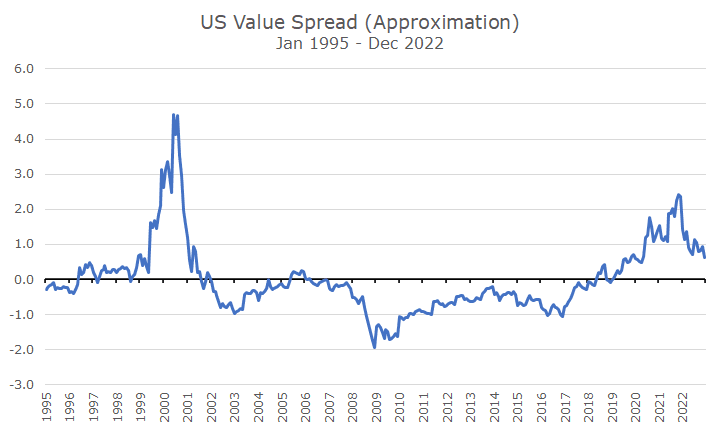
The x-axis in the above chart shows the number of standard deviations the data is from the average. In the tech bubble, the valuation between growth and value stocks, measured this way, was almost five standard deviations away from the norm.
Five standard deviations really shouldn’t happen for this kind of thing. It tells you that this situation was really odd, that standard deviations may not be the best measurement tool since it won’t be a billion years before it happens again, and, most controversially, markets may not be efficient (okay, that’s only controversial for the hard-core efficient market hypothesis people).
At the end of 2021, my chart shows that the valuation difference was two standard deviations away from the average, which is pretty unusual but not stupid unusual. After the strong year that value had, we’re still one standard deviation from the average, which is where the hope comes from that the good value results aren’t over.
One of the problems with looking at the data this way is that it doesn’t actually tell you whether value is cheap or whether gross is expensive – it only tells you that the difference is wider than usual.
So, I fussed around with the data and came up with a second chart that I think is cool too.
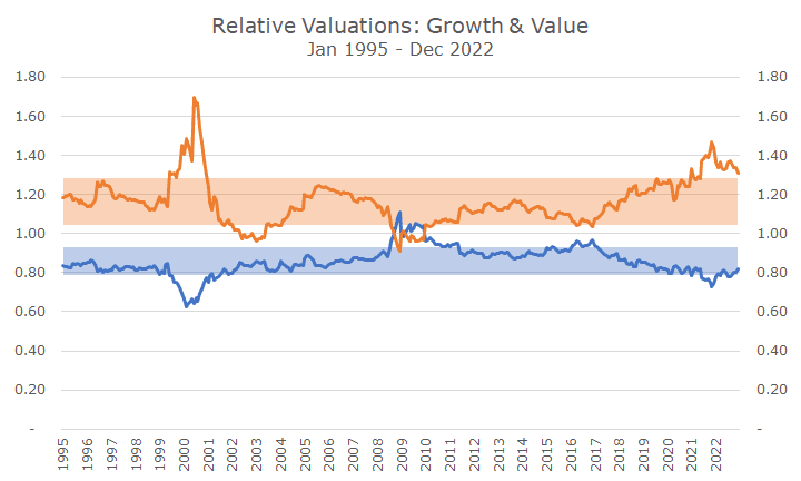
This chart shows similar data but in a different way. The chart shows the relative expensiveness of the Russell 1000 Growth Index (same as above) to the Russell 1000 index. So, a 1.2 means that the growth index is 20 percent more expensive than the marker.
You can see the same thing with the value index, except it’s always on the less expensive side. When it says it’s 0.8, that means the value index is 20 percent cheaper than the overall market. This data isn’t looking at growth and value compared to each other but compared to the broader market.
You can see that value is pretty much always cheaper than the market and that growth is more expensive than the market almost all of the time. The bands show the ‘normal’ range that captures two-thirds of the data, and the remaining one-third is split between the high and the low side.
You can see in the tech bubble that value stocks were cheap and growth stocks were expensive, but it was more about growth being expensive than about value being cheap.
Notice how screwed up things got in the 2008 financial crisis. That’s because markets were haywire, but it’s also about the definition of growth and value.
In this case, it’s not just about valuation. Value is cheapness based on metrics like price-to-earnings and price-to-book. But the growth data isn’t based on measures of expansiveness; it’s about earnings growth, momentum, etc.
Different providers use different metrics, so it would matter whether we used Morningstar, Dow Jones, S&P, MSCI, or an academic database. Presumably, the story would be the same, but the details might differ some.
Over the last few years, you can see that value got pretty darn cheap – outside of the band that captures most of the results. And growth did, too, on the expensive side. That came in during 2022, but there is still plenty of room for value to get richer and growth to get cheaper – just what we want as value investors.
If your head is spinning and this seems like too much detail, rest assured that I’m not going into this kind of detail at the Investor Social. I took this out because it was ‘too much.’ But I thought it was still really cool, so I thought I would share it. I hope you enjoy it!

David is a trusted advisor to 50 families, delivering comprehensive financial solutions, including financial planning, investment management, cash management, tax planning, estate planning, and charitable giving. As Chief Investment Officer, he leads the Investment Committee and the research and trading team. His team continuously evaluates investment strategies and securities, working closely with Portfolio Managers to implement them effectively.