Legendary investor Peter Lynch once said that if you spend 13 minutes per year on economics, you’ve wasted 10 minutes.
Although I spend more than three minutes per year looking at economic data, I do tend to look a lot less than others in the industry. Many years ago, I saw a study that showed that the connection between gross domestic product (GDP) and stock market returns were lowly correlated, which is odd because you would think that the two would be highly connected.
I recently came across an article titled ‘The Growth Puzzle,’ by Elroy Dimson and Mike Staunton, who are professors at the London School of Economics and two of the three co-creators of one of my favorite data sources, the DMS database.
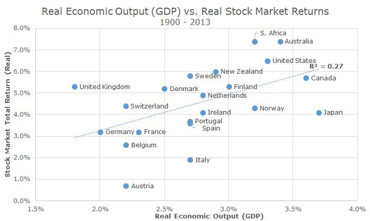
The chart above plots the real economic growth rate for each of the 20 countries studied in the DMS database over the past 113 years (real simply means adjusted for inflation; as opposed to fake) on the x-axis. The y-axis shows the real total return for stocks in each market.
Visually, we can see that some kind of relationship exists: generally speaking, lower economic output countries have lower market returns (and vice versa).
The dotted line that runs through the scatter chart shows is a better measure of the eyeball test and the R2 (or r-squared) is a statistical measure of the relationship.
There are two ways to read the R2. First, you can say that real economic output explains 27 percent of real stock market returns over very long periods. That makes sense intuitively: it matters but only explains part of what’s going on – real GDP growth doesn’t explain 73 percent of returns; there are other factors at play.
It turns out that the ‘R’ in R2 is the correlation, so if we look at the square root of R2, we get the correlation, which is 0.52. That correlation number might be more useful to many readers who know that a correlation of 1.0 means that two things are perfectly related, -1.0 means that they are perfect opposites and zero means that there is no relationship at all.
So, hard core data analysis tells us what we already believe: stronger GDP growth is generally good for investors. In the article, the authors (DMS) wonder then, why has it been so difficult to make money buying stocks in countries that are improving their economic position?
In the conclusion, DMS offer a few explanations. First, they say that stock prices reflect expected business conditions, not current or previous circumstances. GDP is backward looking and, as we know from the multiple releases and revisions, are subject to change. Stock prices are forward looking and can’t be changed in retrospect. In a previous paper, DMS shows that past economic growth does not predict future stock market returns.
This is also the argument for efficient market proponents, who say that current prices already reflect the consensus views on the economy and adjust extemporaneously when the collective economic view changes. Everyone has the same information and you can’t reliably outsmart the crowd.
Second, DMS argues that buying into countries that are improving faster than others are less risky, which in turn leads to lower expected returns. We believe that risk and return go hand in hand, so it makes sense that you would pay a higher price for something safer, which in turn leads to lower realized returns.
Since we don’t believe that we have special information about what economies are likely to outperform one another (and no one else does either), we simply hold most countries by their market weight with one major and a few minor exceptions.
The major exception is that we have a ‘home bias’ to the United States. If we simply held the global market without exception, the US would make up a little less than half of our stock portfolio. In fact, within stocks, our non-US exposure is around 25 percent of our holdings, so we have a large, explicit bias to the US.
Minor exceptions are based on our overweight towards small value stocks in developed markets. While the fund that we use has bands that don’t allow it to deviate too far from the global market weight, it does deviate, albeit slightly. For example, the largest country exposure in the index is Japan at 19.9 percent, but with our size/value tilts, our exposure is 21.1 percent.
This topic was very popular a few years ago when growth in the US looked sluggish and a lot of investors wanted to buy emerging markets stocks. We didn’t think the case was strong enough and didn’t make changes, which has turned out well so far since the US stock market has strongly outpaced emerging markets stocks in the past few years.

David is a trusted advisor to 50 families, delivering comprehensive financial solutions, including financial planning, investment management, cash management, tax planning, estate planning, and charitable giving. As Chief Investment Officer, he leads the Investment Committee and the research and trading team. His team continuously evaluates investment strategies and securities, working closely with Portfolio Managers to implement them effectively.