The unemployment numbers on Friday weren’t surprising, but they were still shocking.
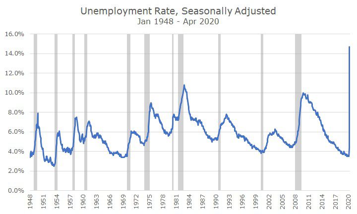
The unemployment rate was 14.7 percent, and although that was better than expected, it’s still the highest reading by a long shot since the inception of this data in 1948. In fact, the unemployment rate only breached 10 percent in two of the recessions since then.
The unemployment rate is an interesting and useful statistic, but it attempts to estimate some factors that are difficult to measure.
The goal of the unemployment rate is to find out the percentage of people that are not working and are actively seeking employment. Figuring out who isn’t working isn’t so tough, it’s the part about those that are actively seeking employment that’s hard to measure.
In fact, it’s not easy to figure out during normal times, but even tougher during this period. If someone were to actively seek employment, where would they do it? Most companies aren’t hiring. What if they’re sick or taking care of family members who are sick? Or, they’re just afraid of getting sick?
As a result, I prefer the simplest measure, which is the employment to population ratio, which simply divides the number of people working by the number of people over 16.
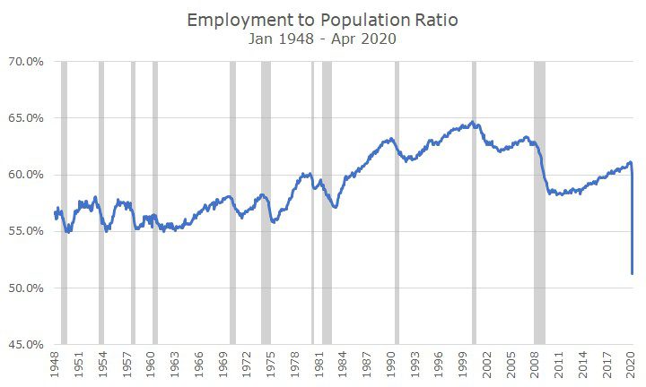
I like this chart, in part, because it tells the story of women in the workforce. Throughout the 1950s and 60s, you can see that the ratio is fairly constant between 55 and 57 percent. Then, in the 1970s, 80s and 90s, the ratio crosses 60 percent and nearly reaches 65 percent.
That’s where the bad news starts, though. The ratio falls to around 62 percent after the Tech Wreck, and then well below 60 percent after the 2008 global financial crisis.
You can see that although the unemployment rate got down to multi-decade lows recently, the percentage of people working never got back to the post 2008 high even before the virus.
And, with the new data, you can see that the employment picture hasn’t been so grim since the data started being collected.
And, worse yet, the numbers are likely to continue to deteriorate further in the coming months. Treasury Secretary Steve Mnuchin said over the weekend that the unemployment rate may already be over 25 percent and that it’s going to get worse before it gets better.
Yet, stocks posted strong gains on Friday. Why?
For a few reasons. First, the numbers were better than the market expected. It’s not a surprise to anyone that the unemployment rate jumped, it’s a surprise that it wasn’t as bad as we thought.
Second, it appears that markets are pricing in a ‘V-shaped’ recovery, which means that the economy could recover almost as quickly as it fell apart.
Of course, the ‘v’ shape doesn’t refer to unemployment, but to the overall level of economic growth (which we will get a reading on this week).
The unemployment rate, as we see in the chart above shocks higher quickly, and then gradually moves lower over time. It’s perfectly reasonable to expect the same thing to happen this time, especially if we can get a grip on the virus.
