Over the last few months, I’ve read multiple articles making the claim that the correlation between stocks and bonds is shifting and that the new relationship will negatively impact portfolios.
One recent Bloomberg article, titled ‘Easy Allocation Models ‘Doomed’ as Diversification Breaks Down’ really set me off and caused me to take a closer look at some of these claims.
The thrust of the claim is that the recent negative correlation between stocks and bonds isn’t the historical norm and now that interest rates may be rising, stocks and bonds may become positively correlated.
This is important because low, no or negative correlation lowers the overall volatility of a portfolio. In fact, you need three things to calculate the volatility of a two asset portfolio: the weights of each asset, the volatility of each asset and the correlation between the two assets.
It’s the correlation that makes the overall portfolio volatility less than the weighted average of the two individual asset volatilities.
To investigate this claim, I started by calculating the rolling five-year correlation between the S&P 500 and five-year US Treasury notes, dating back to 1926 with data from Ibbotson.
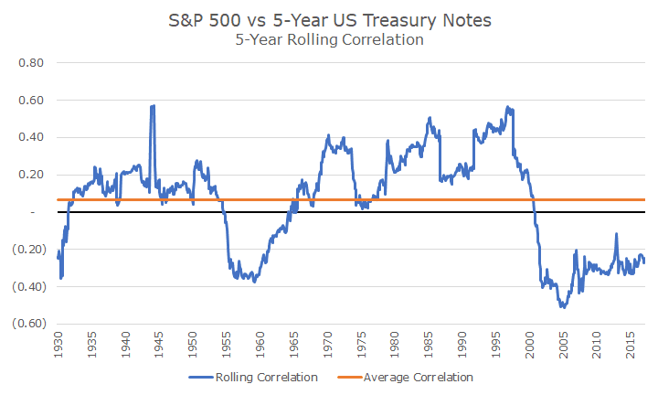
The chart above shows the rolling correlation in blue, and you can see that the correlation between the two assets shifts fairly dramatically over time. At some points, it’s quite positive, like in the late 1990s and there are some periods, like since 2008, where the correlation is quite low. The flat line in orange, shows the average correlation over the entire period.
So far, the claim is fair because it does appear that the correlation between stocks and bonds is historically low and on the rise. Does that mean that a stock/bond portfolio is ‘doomed’ because diversification is breaking down? Nope.
To show the impact of different correlations, plotted below is what’s known as the efficient frontier, one of the cornerstone ideas of modern finance. The efficient frontier is the visual picture of the benefit of diversification.
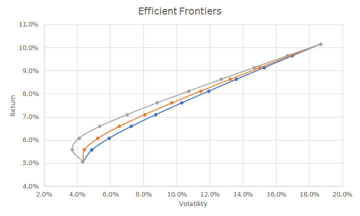
The efficient frontier plots the return of a portfolio on the x-axis and the volatility of a portfolio on the y-axis. The three plots above show the efficient frontier for stocks and bonds using the risk and return data back to 1926.
In this chart, though, I’ve input three different correlations to show the impact of the changes. The orange line shows the average correlation, which is pictured in the top chart.
The grey line shows a negative correlation of -0.35, which about matches what we saw in the 1950s and in recent years. You can see, especially on the left, that the negative correlation lowers the volatility of the portfolio.
The blue line is the opposite: it plots the efficient frontier using a correlation of 0.35, which is what we saw from the 1960s until about 10-years ago. And, you can see that the efficient frontier moves to the right, which does mean that the positive correlation hurts the overall diversification.
Is it doomed? Hardly. You can see from the chart that regardless of which correlation number that I used, nothing much changed. Since the efficient frontier is a little hard to read for most people, I plotted the volatilities for 10 portfolios below using each one of the three correlations.

On a 60/40 stock/bond portfolio, you can see that the difference between a -0.35 correlation and a 0.35 correlation isn’t very high, about 10 percent. While 10 percent may sound like a lot, it really isn’t. It’s akin to going 54 miles per hour on the highway instead of 60 – you can tell the difference by looking at the speedometer, but not by looking out the window.
The much bigger factor is the proportion of stocks and bonds, which you can see in the chart above. Using bonds to modulate the risk of a total portfolio makes as much sense today as ever and certainly isn’t doomed in any way.
As usual, news outlets take something that has some truth to it, but blow it way out of proportion with outrageous headlines. I can tell you that the alternative investment community has glommed onto this storyline too in order to sell alternatives investments.
A quick look into the facts reminds us that the tried and true strategies are still tried and true, even if correlations may be shifting a little bit. It may be that the benefits of diversification may be marginally lower than they were over the last 10-years, but not enough to adjust the strategy.

David is a trusted advisor to 50 families, delivering comprehensive financial solutions, including financial planning, investment management, cash management, tax planning, estate planning, and charitable giving. As Chief Investment Officer, he leads the Investment Committee and the research and trading team. His team continuously evaluates investment strategies and securities, working closely with Portfolio Managers to implement them effectively.