Last week’s Insight about the risks associated with so-called bond alternatives with higher yields prompted a lot of feedback, which I always appreciate. Here’s the article in case you missed it.
One curious reader asked a great question: what if we allocated some of the bond money to a few of these higher-yielding options? That was enough to send me down the rabbit hole, looking at all kinds of higher-yielding substitutes. I may have ‘over answered’ here, but I thought it was fun!
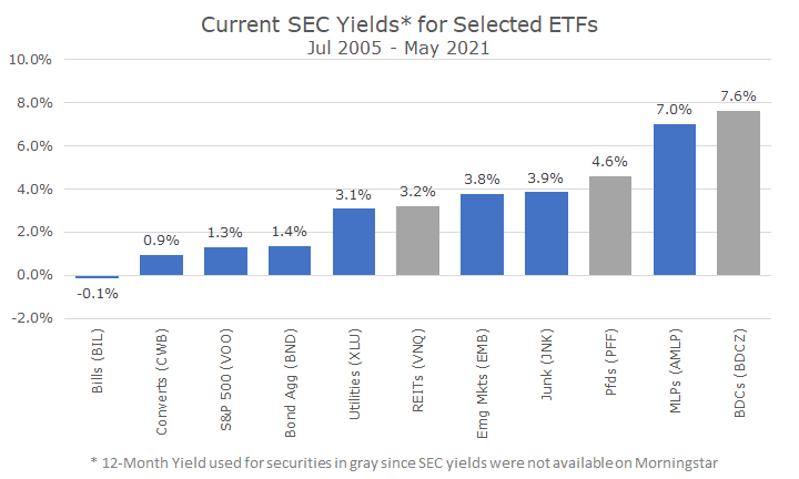
The first chart shows all of the securities that I reviewed. There are more alternatives, but conceptually, they are all the same: surprise, surprise – there is no magic bullet.

The SEC yield isn’t a perfect measure, but it tries to standardize yields, so I tried to use it across the board. As it happens, three securities didn’t have a stated SEC yield on Morningstar, so I used the 12-month yield.
Also, in this chart, I used the yields on actual, live exchange-traded funds (ETFs), which represent what we could actually get in the marketplace. The following charts all show the underlying indexes, which aren’t live but allow us to understand the general characteristics of the various asset classes.
On the left, you can see that the ETF that holds Treasury bills actually has a negative yield, since the expense ratio of the fund exceeds the interest earned. Then you see the allegedly high-yielding options, an ETF that invests in convertible bonds. Convertibles, or converts, are bonds issued by companies that can be converted to the company’s stock under certain conditions.
Next, we see the yields for the S&P 500 and Bloomberg Barclays Aggregate bond ETFs and they’re about the same. And, about where the yields jump, we start to see the higher-yielding alternatives. Some of them, like utilities, are pretty straightforward, while others like Business Development Companies (BDCs) are fairly arcane (but also have the highest yield!). I’ll put a quick description of each at the end of this article.
All of the underlying indexes date back to different times, so I started the analysis with the longest period where I had all of the data, which is when the MSCI REIT index was created in 2005. Most of them don’t go back a whole lot further.

The table may be a little hard to read, so I am going to include charts of the most salient data below. The table shows the annualized returns, annualized volatility, Sharpe ratio, and the beta for each security type.
The returns are easily understood, and as you might expect, cash fares the worst, bonds are a little better, stocks have the highest returns and everything else is in between, which is what I think we’d all expect.
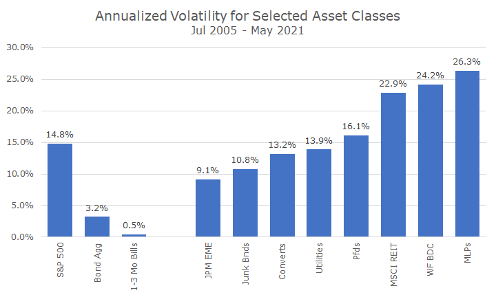
The next line shows the volatility, and that’s probably not as well understood, so I’ve put it in chart form below. I put stocks, bonds and cash on the left since I think everyone has a feel for the volatility of those assets, even if they don’t know the numbers.
Then, I added all of the others – and who would have thought that bonds issued by emerging markets countries would be the least volatile? The top five issuers are Qatar, Saudi Arabia, Turkey, Russia, and the Philippines. What does it mean that BDCs and MLPs were three times as volatile? Part of it is that bonds are still bonds (and BDCs and MLPs are not), and 40 percent of the issuing companies in the fund are investment grade.

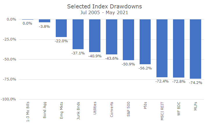
Okay, so if volatility is a little bit of a fuzzy concept, how about a drawdown, which looks at the losses compared to a recent high? Here’s a primer I wrote a while ago if drawdowns don’t ring a bell. I think the picture will give the idea:

Wow! Those are some incredible losses! Three of the asset classes, which are supposed to pick up a little yield, lost about -75 percent while the stock market ‘only’ lost -50 percent.
And this is the point, do you really want to boost your yield with something that can lose as much or more than stocks? I can tell you that we don’t find it all that appealing.
But, one of the core ideas in finance is that you care about the portfolio more than you care about the individual pieces because how they work together makes a huge difference.
So, let’s look at three results for three different portfolios. The ‘Classic 60/40’ is 60 percent S&P 500 and 40 percent the Bloomberg Barclays Aggregate bond index.
The ‘Alternative 60/40’ is 60 percent S&P 500 and takes the remaining 40 percent and invests equally in the eight bond substitutes.
The ‘Mix 60/40’ is a hybrid that is 60 percent S&P 500, 20 percent Barclays Bond Aggregate and puts the last 20 percent in the eight alternatives.

The results are mostly what you would expect. The returns for the alternative bond portfolio are better than the Classic or the Mix, but the risks are higher. The Sharpe Ratio, which essentially looks at the returns per unit of risk aren’t as good as you add more of the alternatives, which is because the alternative bond strategies have a lot of correlation to the stock market.
That’s essentially what the beta shows – how much of the return can be attributed to the stock market. In the Classic portfolio, about 60 percent of the return can be attributed to the stock market, which makes a lot of sense because 60 percent of the portfolio is in stocks!
While that shouldn’t be a surprise, it may be a surprise to know that 91 percent of the return for the Alternative 60/40 portfolio can be attributed to the stock market – probably much more than anyone (including me) would have guessed). At that point, you might as well go to all stocks.
It’s hard living in the low-yield environment, but we view sticking to core bonds as requiring as much discipline as sticking to stocks when the stock market is falling. Simple, but not easy.
We learned the hard way in the financial crisis that we want a bright line between the relatively safe and risky assets. The worst outcome is someone who invests in one of the substitutes, thinking that it’s safe as a bond, only to lose 20, 30, or 80 percent. We think it’s best to take risks with stocks where the upside is unlimited and stay safe with bonds, which generally have limited downside.
I hope this answered any questions that you may have had – keep them coming!
Bond Substitutes Definitions:
- Business Development Companies (BDCs) are a type of closed-end fund that generally loan money to corporate buyers that can’t borrow elsewhere. The yields are high to reflect the riskiness of the loans.
- Real Estate Investment Trusts (REITs) are trusts that one and/or manage commercial real estate.
- Utilities are regulated utilities; this analysis only included utilities from included in the S&P 500.
- Master Limited Partnerships (MLPs) are publicly traded partnerships that combine the tax treatment of partnerships but have the liquidity of publicly traded stocks. They typically invest in oil and gas infrastructure.
- Junk bonds are bonds issued by companies that are not deemed investment grade by rating agencies.
- Convertible bonds are bonds that can be converted to the stock of the company issuing the bonds.
- Preferred stocks are a class of stock that has a higher claim on dividends than common stockholders, usually have some voting rights, and are preferred over common stocks in liquidation (but are below bonds).
Emerging Market bonds are bonds issued by foreign countries that are considered emerging, versus developed. In this analysis, the bonds are denominated in US dollars.


