Yesterday’s insight on drawdowns was quite popular and enough people asked for the same thing, so I thought I would do an immediate update. (Click here for the original post.)
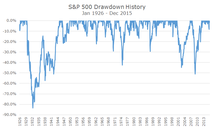
The first request was for the full history of the S&P 500 since yesterday’s chart only went back 25 years. I picked 25 years somewhat randomly, but mostly because the other chart that went with it was difficult to read going all the way back.
The full history does a nice job of showing just how bad returns were during the Great Depression. Seeing this chart helps illustrate what made the last 15 years so difficult – two of the three worst drawdowns happened within this short span, which is unusual, as the record shows. I count four more bear markets and a lot of corrections in the full history.
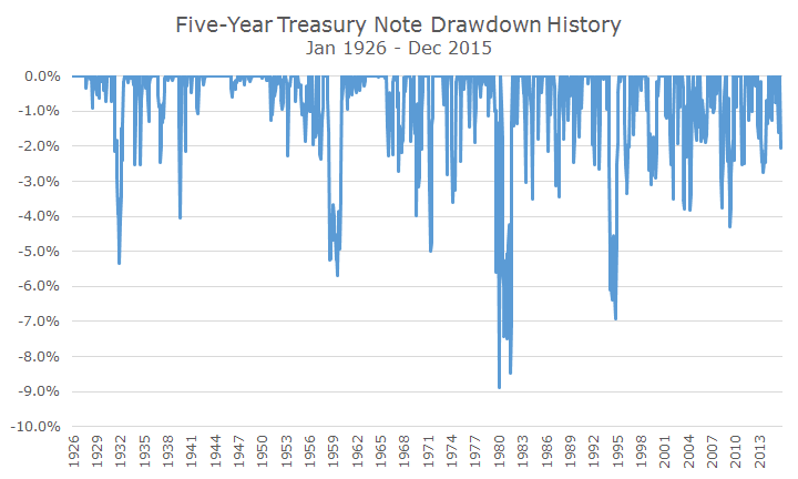
The next drawdown that people requested was the full-history of the Barclays Aggregate because people wanted to see what bond market drawdowns looked like during periods of rising interest rates.
The Barclays Aggregate was created in 1976, which doesn’t capture the full increase in interest rates that started in 1954, when the yield on the 10-year US Treasury was 2.4 percent (sound familiar?). The five-year Treasury index created by Ibbotson & Associates is a reasonable proxy for the bond market and has a 0.91 correlation to the Barclays Aggregate since 1976.
Over the next 27 years, the yield on the 10-year rose steadily and peaked at 14.95 in 1981. Notice that the drawdowns during that period weren’t any more dramatic than the drawdowns during the period falling the peak. Even the worst drawdown was only eight percent.
No one requested the last one, but I thought it would be interesting because one reader expressed concern about stock drawdowns that I showed yesterday. That client wasn’t fully invested in stocks, so I thought I would show a simple 60/40 mix of the S&P 500 and five year Treasury notes. That’s not exactly how we invest, but it gets the point across.
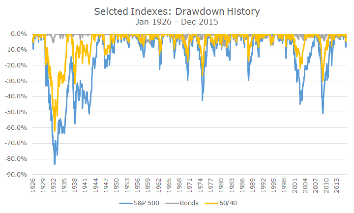
As you might expect, including bonds blunted the drawdowns of the stock part of the portfolio. There were still losses, but the number of 20 percent declines falls from seven to four. Interestingly, the drawdown during the Great Depression was a lot shorter when bonds were included in the portfolio.
The balanced portfolio still loses money (every investment does), but the losses are a lot less substantial. As you look at the data, keep in mind that we’ve isolated the view to the losses and not getting a picture on the gains. It’s an interesting view, but it isn’t the full picture.
