Last week, I saw an interesting table from Goldman Sachs that estimated economic growth across the globe.
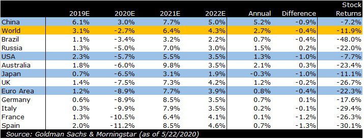
The table looked exactly like the first four columns of this table, including the various highlights. Those columns show the annual inflation adjusted (or ‘real’) growth rates for those economies.
I took their data and annualized 2020 through 2022 to see what they expect in the first year of the downturn and what they expect in the two subsequent years. Then, I compared the annualized growth rate to the growth rate in 2019, which is still being finalized (which is why it shows as an estimate).
I was interested to see that, for the most part, Goldman expects annualized growth over the next three years look a lot like the experience in 2019 (albeit with a lot more volatility).
Of course, as sharp as they are, the folks at Goldman can’t predict the future any better than anyone else, so I wouldn’t put a lot of weight on the point estimates. Still, I think there are few interesting insights worth mentioning.
It appears that Goldman expects what I would call a ‘v-shaped’ recovery. I didn’t see the report that accompanied the data, so they may not say that, but if we plot what it looks like in a chart, decide for yourself whether that looks like a V.
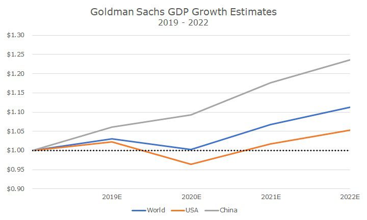
In China (plotted in gray), it’s not even a V, because there is no actual contraction, just a slowdown in growth. I’m not sure if that’s true or not, but I don’t think anyone really knows what’s happening on the ground in China (including the Chinese government).
But, since China is a giant economy, the world GDP (in blue) barely contracts down to the level at the end of 2018. The US takes a bigger dip, but is higher by the end of 2022.
There’s still the matter of GDP that was lost and all of the people that became unemployed, but at least the economy is higher at the end of 2022 than it was before this crisis started.
Even though I’m referencing Goldman estimates, I think that this broadly reflects what investors are seeing generally, as noted by the stock prices in the far-right column.
To calculate the returns, I used the year-to-date ETF returns for corresponding iShares products that track each country. That’s not the same as an index, but it’s consistent, and a good proxy for each market’s experience in US dollar terms.
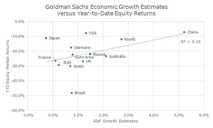
This chart plots Goldman’s GDP estimates on the x-axis and the year-to-date market returns on the y-axis. Broadly speaking, there is a relationship between the growth expectations and the market returns.
You could say that the GDP estimates explain about 20 percent of the returns (and 25 percent if you exclude Brazil which has it’s own oil- related problems). That’s not a very high relationship, and there aren’t many data points, but it’s probably unfair to say that there is no relationship either.
In other words, I think that markets are looking at expected economic growth, from Goldman and others, and pricing that into stocks – which is pretty much what you’d expect.
There are many, many factors that go into price stocks – so many in fact, that it’s impossible to know how many there are, and the impact of each one, which is why we maintain a diversified portfolio.
In the end, I don’t view the markets as confirming Goldman’s estimates, but I do see the connection between the estimates and the market returns as a signal of what markets believe about economic growth.
And, for now at least, markets seem to be pricing in a v-shaped recovery in the US. Whether that comes to pass or not is the trillion-dollar question.

David is a trusted advisor to 50 families, delivering comprehensive financial solutions, including financial planning, investment management, cash management, tax planning, estate planning, and charitable giving. As Chief Investment Officer, he leads the Investment Committee and the research and trading team. His team continuously evaluates investment strategies and securities, working closely with Portfolio Managers to implement them effectively.