When I describe ‘balance’ in a portfolio, here or in person, I am almost inevitably talking about an allocation that is somewhat evenly split between stocks and bonds. I don’t have to specify that I am talking about how much money is in each allocation (forgetting for a moment all of the sub allocations).
In recent years, however, some investment managers have pointed out that a portfolio that is evenly split in dollars is far from balanced because the equity risk dominates the portfolio. I’ve written about this topic more extensively here, but the basic idea is that because stocks are so much more volatile than bonds, stocks dominate the volatility of what we would normally describe as a balanced portfolio.
The following chart breaks down (or decomposes in fancy finance lingo) the stock and bond volatility for a ‘balanced’ 50/50 portfolio that is split between the S&P 500 and the Barclays Aggregate bond index since 1991.
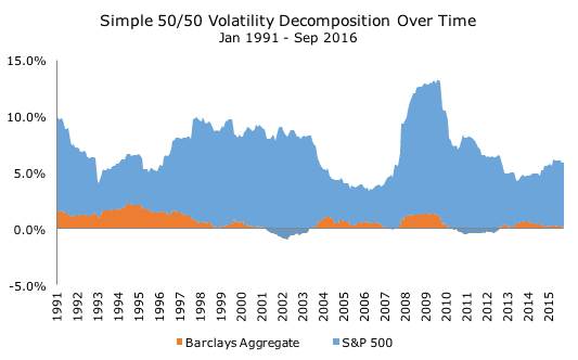
Over this time period, the average volatility for stocks is 14.5 percent and 3.6 percent for bonds. The average volatility for the portfolio is 7.7 percent, less than the simple average of the two thanks to the low correlation between the two assets. Using some clever mathematics, we can see that the stocks account for 92 of the portfolio volatility.
You don’t need the equations to see this in the chart, which I think is pretty intuitive. The volatility for stocks, in blue, dominate the picture, while the volatility for bonds, in orange, is scant at best. The volatility for both change over time, as does the volatility for the portfolio and the contribution of each asset.
Critics of traditionally balanced portfolios argue that because stocks dominate the volatility of the portfolio, it isn’t properly diversified and say that it is more useful to diversify by risk. They’re right that the stock volatility dominates – it’s just math. What it means or what to do about it isn’t so clear to me.
One thing to notice about the chart above is that the volatility never really exceeds 10 percent, and, as I note above, it averages 7.7 percent. The chart below plots the same thing, but for a portfolio that is 100 percent invested in the S&P 500.
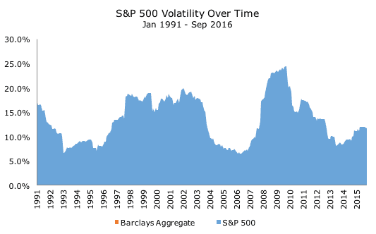
This chart obviously looks a lot like the chart above, but is quite different when you look at the y-axes, which runs as high as 25 percent. The entire scale is different, so even though equity risk dominates the 50/50 stock/bond portfolio, the bonds are still critical for lowering the overall portfolio volatility.
Cliff Asness, founder of AQR and proponent of risk-balanced portfolios, says that bonds are more dilutive than diversifying in a traditional capital based portfolio, and he’s right.
Cliff’s solution, known as risk parity, takes equal risk within stocks and bonds (and other asset classes like commodities and credit). The chart below shows what this portfolio could look like, which, on average, has a 20 percent stock allocation and an 80 percent bond allocation.
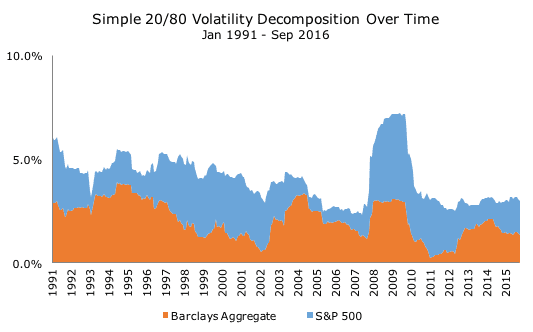
I should note that if Cliff read this post, he would object because AQR manages their risk-balanced portfolios so that the risk is more balanced all of the time, whereas I just took the average weighting and applied them to the whole time period. My way is less accurate, but far easier to compute.
Notice the scale on the y-axis again, which is now much lower than the 50/50 portfolio. That makes sense because this is a very conservative 20/80 stock/bond mix. The trouble with it is that it historically has a very low return (and an even lower expected return for the foreseeable future given the low interest rate environment).
To earn a higher return, you have to use leverage. That’s a scary word to a lot of people (us included), but, properly managed, this approach can work out nicely and offer more stable results than the traditional balanced portfolios over very long periods because it isn’t so reliant on stocks (especially if you add those other asset classes).
After careful consideration, we’ve ruled out risk-parity as an approach, but I wanted to show these charts to illustrate how stocks impact our portfolios: stock volatility dominates overall portfolio volatility, but bonds are still useful because they lower the overall volatility, in addition to earning a return of their own.
Five years ago, I had never heard of risk parity and, sadly, I’ve seen a lot of advisors misuse it for clients because they didn’t understand it. It certainly took me a while to get it.
In the future, I intend to look at volatility allocation within stock or bond asset classes. For example, I assume that because corporate bonds are more volatile than Treasury bonds that the credit risk swamps the portfolio, but I won’t be able to understand the degree of that relationship without the tools. The same goes for emerging market stocks within equities.
Ongoing research like this is fascinating to me and I am grateful to understand something like risk parity because even though we aren’t likely to use it at the overall portfolio level, it deepens our understanding of risk and hopefully allows us to better manage your money within our more traditional structure.

David is a trusted advisor to 50 families, delivering comprehensive financial solutions, including financial planning, investment management, cash management, tax planning, estate planning, and charitable giving. As Chief Investment Officer, he leads the Investment Committee and the research and trading team. His team continuously evaluates investment strategies and securities, working closely with Portfolio Managers to implement them effectively.