While I’m dying to take a break from the ongoing financial crisis in Greece, I also want to show how the calamity isn’t destabilizing markets so far.
Importantly, US stocks barely budged yesterday in response to the news, although stocks overseas didn’t fare as well. The FTSE Developed Markets ex North America index fell by -1.61 percent while the FTSE Emerging Markets Index dropped -1.98 percent.
While prices tell us a great deal, there are other useful indicators that tell an interesting story about what investors think about the Greek saga.
The first chart shows the level of volatility that investors expect in the next three months based on options prices. I’ve charted the 10-year history for the volatility index (or VIX) for the S&P 500 and the MSCI EAFE index for developed markets.
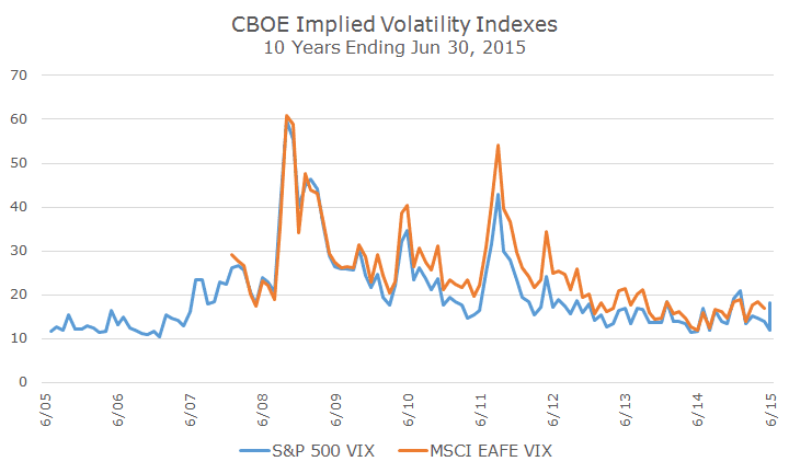
The VIX for the EAFE (in orange) doesn’t go back 10 years, but you can see that the two track each other reasonably well, which makes sense given the interconnectedness of global markets.
The current readings (17.01 for the S&P 500 and 22.65 for the MSCI EAFE) are in line with normal market conditions and nothing like what we saw during the 2008 financial crisis or the last Greek debt crisis in 2011. In other words, the market expects normal volatility for the next three months – nothing special either way.
The second chart shows two indexes that are designed to measure financial stress in an economy based on a variety of indicators that attempt to assess the availability and cost of credit.
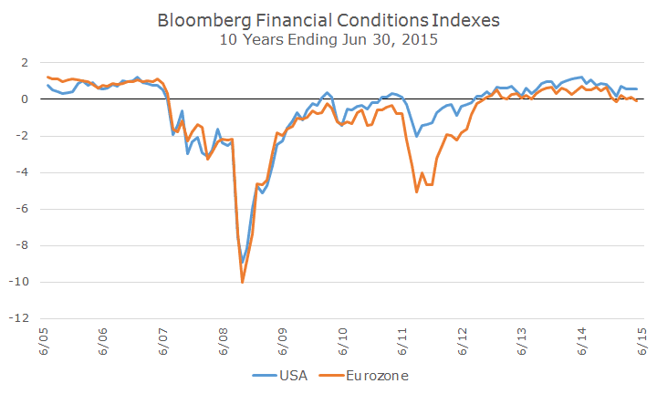
Some of the indicators are relatively easy to understand like the direction of the stock market, its expected volatility (our friend the VIX from above) and some are fairly obscure like the Swaption Volatility index (no, that’s not a typo, a swaption is the option to enter into an interest rate swap and this measures the volatility of those options, but that’s for another day).
For the Financial conditions indexes, a reading above zero suggests that conditions are accommodative while something below zero suggests some strain. Right now, the Eurozone index is slightly negative, although statistically, it’s pretty hard to see anything different than zero.
Like the VIX index chart above, it’s really just useful to see that, at this point, the financial conditions are nowhere near as bad as they were in 2008 or in 2011 when the problem in Greece first erupted.
It’s scary to hear about bank closures and we all feel a little doubt after the 2008 debacle, but so far, markets are not showing any signs of conditions like what we experienced during the crisis.
We certainly may get a stock market correction – I’ve been saying for some time that markets are overvalued and have gone an unusually long time without a correction, but you can have corrections all the time without having a true crisis – it’s a normal part of investing.

David is a trusted advisor to 50 families, delivering comprehensive financial solutions, including financial planning, investment management, cash management, tax planning, estate planning, and charitable giving. As Chief Investment Officer, he leads the Investment Committee and the research and trading team. His team continuously evaluates investment strategies and securities, working closely with Portfolio Managers to implement them effectively.