Last Thursday night, I attended a Financial Planning Association (FPA) meeting here in Chesterfield presented by William Emmons, an economist from the Federal Reserve Bank of St. Louis.
His presentation, titled Recession Risk in 2018 is Greater Than You Think, was fascinating. Despite what people say about government workers and folks from the Federal Reserve, I thought Mr. Emmons was smart, fair and thoughtful – important traits for an economist.
Mr. Emmons started with the idea that recessions come in three different varieties. First, the economy can become ‘over-extended’ and run up against labor or capital constraints. Examples of these types occurred after long expansions in 1969, 1990 and 2001.
The second variety arise when financial conditions deteriorate, either sharply or cumulatively. Examples include the 1980 and 1982 recessions brought on by Federal Reserve tightening and the 2007-08 financial crisis brought on by falling home prices.
Lastly, there are recessions that come out of left field, like the 1973 OPEC oil shock. Although all recessions are hard (if not impossible) to forecast, this type is totally impossible.
Then, Mr. Emmons presented two signals that seem to have some ability to signal that a recession may be on the horizon. The first signal simply looks at the current unemployment rate versus the average unemployment rate for the previous 10-years.
The second signal looks at the difference between short and long-term interest rates compared to the average difference over the previous 10-years.
The chart below is from his presentation and shows the two signals side by side in the year prior to each recession. If you’d like to see more or the context, you can find the whole presentation here.
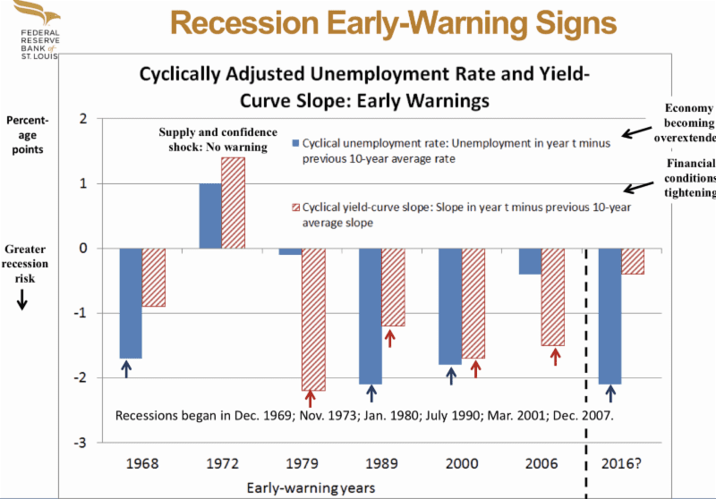
When the signal is positive, there is no sign of a recession. Notice that in the year before the 1972 recession, both signals are positive. This is the recession that was out of left field, the OPEC oil embargo. In the year prior to all of the other recessions, one or both of the other signals are present.
He then combines the signals and looks at them right before each recession happened.

When presented this way, it really looks as though a recession is imminent, not including the risk of some kind of event from left field.
Although I absolutely took Emmons as a fair broker of information, I had a few questions. The first question, which I asked him, was whether he had looked at these signals in other economies. One of the problems with analyzing recessions is that there just isn’t much data – the chart shows 50 years of data, but there are only six recessions to analyze.
A second problem is that you can’t see whether or not there are any false positives. Did these signals predict two dozen of the last six recessions? I think Emmons would have said as much, but since he hadn’t looked at these signals in other countries, I decided to pull the data for myself.
I also thought it would be interesting to see the data in monthly terms. I couldn’t match his results exactly, but I got close enough to draw some reasonable conclusions. Although I used a line chart, the basic idea is the same: when the combined signal is below zero, the recession risk is higher. The recessions are shaded in gray.
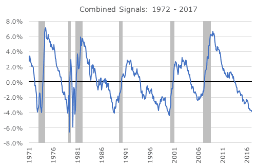
First, although I didn’t test any overseas markets, there aren’t any false positives in the US. Second, the two signals do seem to foreshadow recessions, but the signals can be deeply negative many years ahead of the actual recessions.
Even though Emmons shows an ‘early warning’ slide a year ahead of each recession, those early warnings start much earlier than one year. You certainly wouldn’t have wanted to act on the signal in 1986, 1995 or 2005 – years ahead of the recessions or stock market corrections.
Third, the chance of a recession is higher than I thought. If you had asked me before the Thursday presentation what the chance of recession was, I would have said 10 or 15 percent – low, but the chance is always something. I don’t know what I would say now, but something higher than 10-15 percent, maybe 15-20 percent.
I can’t say what would cause a recession, but that’s the thing about the economy and markets – causes often seem easy to identify in hindsight, but are perilously difficult to predict in advance. Personally, I’m going to keep my eye on the yield curve. Ryan did an excellent write up on shifts in the curve in November, which can be found here.
While the risk is higher than I thought, it’s not enough for me to abandon our buy and hold approach. We set asset allocations based on long-run risk and return estimates knowing that neither we nor the Fed can predict the economy or the markets.
Still, I think it’s good to be aware of the risks so that investors can make sure that they are comfortable with their asset allocation. Thanks to the high market valuations, I’ve been saying that there is no time like the present to make sure that you’re satisfied with your stock/bond mix. That’s as true now as ever.