The term ‘stagflation’ hasn’t been part of our everyday vocabulary for years, but I am seeing it more and more, and Google Trends confirmed my casual observation.
Stagflation, a portmanteau of stagnation and inflation, is defined by Wikipedia as a period where ‘the inflation rate is high, economic growth rate slows, and unemployment is steadily high.’
The thrust of the articles that I am seeing argue that we’re already in a period of high inflation and that the supply chain issues, geopolitical problems, and more hawkish Federal Reserve will slow economic growth and hurt the unemployment rate. And, I’d say that the markets agree, with both stocks and bonds lower so far this year.
When I think of stagflation, I tend to think of the 1970s and associate the term with another term from the 70s, the Misery Index. The Misery Index tracks two of the three components, inflation and unemployment, but omits economic growth. It’s a simple index too, it simply adds the inflation rate and the unemployment rate.
The chart below shows the Misery Index in blue, the inflation rate in green, and the unemployment rate in gray.
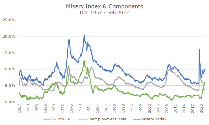
I find the chart pretty interesting because you can see the primary source of the misery. In the 1970s and early 1980s, both the inflation and unemployment rates were high.
In 2008, you can see that the unemployment rate drove the misery, just like it did at the outset of the pandemic. Now, though, inflation is behind the misery, which you can see by the crisscrossing gray and green lines.
If you look at the Misery Index data, the current reading is right on top of the long-term average reading, and well within the normal distribution curve; it doesn’t look interesting at all.
However, a hairy eyeball analysis of the chart would suggest that the reading is pretty high outside of the malaise of the 1970s, early 80s, and 2008 financial crisis.
But, my take on the chart is also that after a spike, it tends to fall, albeit not immediately.
As much as I don’t like the market uncertainty that comes from the Fed’s hawkishness, the chart above tells me why they have to do it: higher interest rates will quell the inflation part of the index, and the unemployment part is so low that some slowdown in the economy will hurt employment, but probably not as much as the inflation is right now.
That ties into the term stagflation, used at the outset. I’d say that we don’t have stagflation today because economic growth is still high, and the unemployment rate is too. But, we may get stagflation if the Fed raises rates too much, which is what markets are fretting over so far this year.
I’d argue that markets will continue to worry, and prices will continue to be volatile until the inflation data starts to cool.
We’re going to do what we’ve done for the past 20 years: maintain a balanced portfolio, rebalance when appropriate, manage the risks that we can, and look for opportunities as they present themselves. It’s not easy, but as I’ve said before, we’ve planned for this.

David is a trusted advisor to 50 families, delivering comprehensive financial solutions, including financial planning, investment management, cash management, tax planning, estate planning, and charitable giving. As Chief Investment Officer, he leads the Investment Committee and the research and trading team. His team continuously evaluates investment strategies and securities, working closely with Portfolio Managers to implement them effectively.