I’ve been accused of repeating myself, and, in truth, it’s a fair accusation.
Today I want to show a chart that I’ve shown before. Instead of showing the total growth of the stock market over time, where the good drowns out the bad, I want to highlight the bad. I don’t want to scare anyone; I actually think it’s reassuring.
The measure I’m showing is called a drawdown, which shows the market loss at any given point versus the recent high.
The y-axis shows the loss relative to a dollar invested. In this chart, you can see that, right off the bat, a $1 investment is worth a little less than 60 cents on the dollar, which represents a 40 percent loss.
I started the chart in the middle of the Great Depression because the 90 percent drawdown overwhelms the rest of the chart. I also drew a red line at the 20 percent decline mark, which is what most investors call a ‘bear’ market.
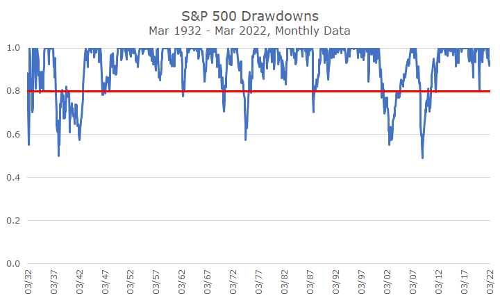
My casual count shows 10 bear markets since 1932. There were more if you use daily data – looking at monthly results obscures some of the losses, like at the start of the pandemic, when stocks lost a third.
I’d say they are almost double as many ‘corrections,’ which are losses of ten percent or more. Reasonable people could count a handful more or fewer corrections depending on which ones you think are distinct and which ones are connected to each other. It’s an imperfect measure, but I think it’s ‘k for close.’
Now to the point of the chart – the current selloff is a big deal, and I don’t mean to minimize it, but hopefully, the relative scale of this selloff is relatively normal. Now, in fairness, the March number is only through Friday, and it helped the chart a lot to have a big, five percent up last week.
And that’s part of the point – big things happen that are unexpected, both to the downside and to the upside. I couldn’t have told you Monday that the week would be up, let alone up as much as it was.
Markets are unpredictable. We all know it, but it’s still hard to live with. We all want certainty, even when we don’t have it. And it’s easy to make up stories that fit our views on what will happen next, but, in truth, we don’t know what’s around the corner – it could get a lot better or a lot worse.
Our solution to this problem is to find a portfolio that will help you meet your goals and emotional risk tolerance, and stick with it, even when it’s scary.
It’s scary right now, in my view. I don’t have any comforting forecasts or predictions, but I’m going to stay invested, knowing that this too shall pass, even though I don’t know the path from here to there.
In the meantime, we’ll do what we always do: rebalance, make changes when appropriate, work with clients to make sure their portfolio works for them, and continue to monitor our holdings and the markets to make sure that our approach makes sense.
Oh, and for sure, I’ll keep hoping for more weeks like the last one.