Every investor suffered losses last year because the two most basic investment building blocks, stocks and bonds, both lost value.
Many of the investment community’s intelligentsia are in a twist because the correlation between stocks and bonds is now positive for the first time in two decades. They say, full of sound and fury, that bonds offer less diversification now that the correlation is positive.
My goal today, without getting too deep in the weeds, is that what they are saying is true, but it doesn’t signify much.
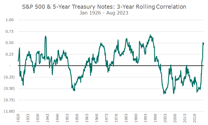
Let’s start with the things that we agree on. First, the correlation between stocks and bonds is now positive for the first time in decades.
The chart below shows the rolling three-year correlation between the S&P 500 and five-year Treasury notes. I used five-year notes so that I could go all the way back to 1926.
I could have used the Bloomberg Aggregate after 1976, which would show an even higher correlation because it has a lot of bonds with credit exposure, which is highly correlated with stocks. But this tells the story well enough and allows for an apples-to-apples comparison.
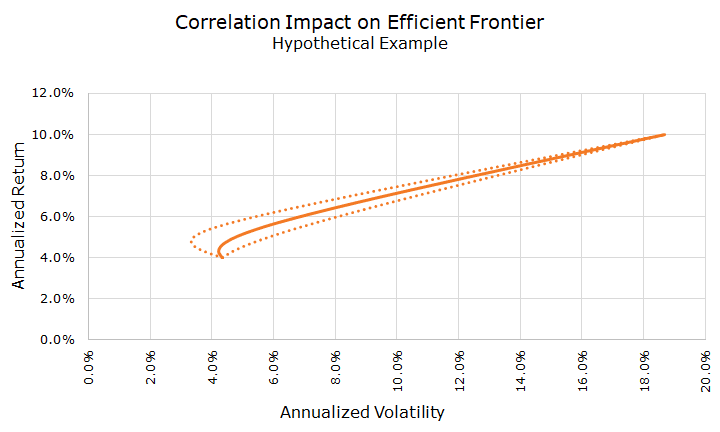
Now let’s show how correlation impacts diversification. The next chart shows what is called the ‘efficient frontier,’ and depicts the optimal allocation given specific returns, volatilities, and correlation.
In this case, I made up the returns, and used 10 percent for stocks and four percent for bonds. I also made up the standard deviation (volatility numbers).
You can see that as the allocation to stock increases, the annualized return rises, and so does the annualized volatility. Hopefully that makes intuitive sense.
What may be less obvious, is the hook on the left size where the return and volatility numbers are relatively low.
That’s the benefit of diversification: a portfolio with some stocks is less volatile than a portfolio with no stocks because stocks and bonds aren’t perfectly correlated.
The solid orange line depicts a zero correlation, which is the long-run average of the data above (okay, you got me, it’s actually 0.05, but that’s pretty close to zero).
The two dotted lines reflect a positive correlation of 0.5 (the lower line) and -0.5 (the higher line with the bigger hook). I used 0.5 and -0.5 because those are the ranges from the chart above.
I could have made the second chart more compelling if I used +1 and -1, but since it’s never happened with these assets over this time frame, it didn’t make a lot of sense to me.
Since you probably haven’t looked at a lot of efficient frontier charts, I thought I would show the same data slightly differently.
The chart below shows the volatility for stock/bond allocations at five percent intervals. On the left is a 100 percent bond portfolio and the two columns are the same height because the correlation between two assets doesn’t matter when you only own one asset. The same is true on the far right, which shows a portfolio with no bonds.
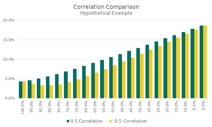
The diversification benefit of low correlation is the difference between the green and yellow columns. The green columns reflect the volatility when the correlation is 0.5, and the yellow columns are when the correlation is -0.5. Since we want lower volatility, we want a negative correlation.
So, back to what I said up top: the fact that correlations are positive isn’t as good as when they are negative.
Now, back to my argument: Does that matter? Not so much, in my view.
Most of our clients have something like a 60/40 stock-bond portfolio. In this hypothetical example, the diversification benefit of the lower correlation is a volatility of 10.4 percent instead of 12.2 percent.
Not many folks know what that means, so let me give an example. Would you rather buy a shirt for $42.5 or $50? Of course, you’d rather buy the same shirt for $7.50 less, but it doesn’t fundamentally change anything.
Another way to look at it is from the perspective of how much your volatility goes down when you shift from a 100 percent equity allocation to a 60/40 stock/bond mix.
Assuming a -0.5 correlation, the volatility drops by 43 percent, and if you use a +0.5 correlation, the volatility drops by 34 percent. Of course, I would prefer the larger drop, but you’re also getting 80 percent of the benefit even when correlations are positive (34/43).
You certainly don’t have to abandon bonds because the correlation is higher. Most investors still benefit a great deal from including bonds in their portfolios. They don’t get as much benefit, for sure, but they still get enough.
I would prefer a negative correlation, but it isn’t critical to the overall success of the classic 60/40 portfolio.
