The S&P 500 is up 12.4 percent year-to-date as of Friday, which is excellent news. Less excellent, however, is that just a few stocks are powering the entire return.
The half-dozen largest stocks in the index are worth about 25 percent of the index, and they are up 67.9 percent on average. They are all up by over one-third, and two have more than doubled.
My back-of-the-envelope calculates that the other 494 stocks in the index are down this year, albeit modestly.
I’ve heard commentators say everything from, ‘it’s always like this’ to ‘it’s an incredibly bad sign.’ Although I’ve read that a relatively small number of stocks drive most of the market return, the truth is that I don’t have a great metric to measure the breadth of market performance.
Although I couldn’t find an index of the S&P 6 or the S&P 494, there is an S&P 100 index that looks at the performance of the largest 100 stocks that dates back to 1976. For the entire period, the S&P 500 beat the S&P 100 by two percentage points per year, suggesting it pays to have more than the largest 100 companies.
And two percentage points per year (on average) is a big deal: the S&P 100 was up 6,454 percent since 1976, which is pretty awesome, but the S&P 500 was up 15,284 percent during that same time, which is even more awesome.
I also looked at the performance of the S&P 500 equally weighted index, which just assumes that you own an equal amount of the largest and smallest stocks. That’s unlike the traditional market cap-weighted index, where the largest holding is now about seven percent of the index, and the smallest stock is about 0.01 percent.
This index goes back to 1989, and during that period, the equally weighted index outperformed the regular index by almost one percent per year. That fits with the idea that the largest stocks aren’t necessarily the ones to own over the long run. That also works with the academic evidence that smaller stocks tend to beat larger ones.
Of course, the outperformance of the equally weighted and market cap indexes doesn’t come in a straight line. The following chart shows the path of the outperformance by dividing the growth of the equal-weighted index growth by the growth of the regular S&P 500.
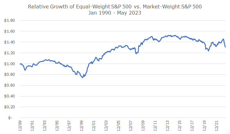
First, let me point out the sharp decline at the far right – that’s the recent underperformance of the equal-weight index. In fact, of the five worst months for the equal weight index compared to the standard index, two of them were this year.
You can also see that the regular index (or market cap index) vastly outperformed the equal weight index in the late 1990s during the tech bubble. Although it’s less dramatic, the market cap index outperformed in 2007 and 2020 just before big selloffs, which is why many people think such a narrow breadth is a bad signal for the overall market.
I’m not sure we have enough evidence to say for sure – I’d love to see an academic study that looks at different periods, market cap schemes, asset classes, and countries to confirm what we can see casually here.
I would prefer the positive market performance to be broader based, and I think it’s a better sign of the overall tide if all of the boats are rising – not just a few big ones.