One of the interesting market developments so far this year is the relative performance of momentum versus value in large cap stocks.
Earlier this year, I wrote a primer on each strategy (found here and here) and at the end of the momentum article, I pointed out that value and momentum work especially well together.
While both strategies have enjoyed higher returns than the overall market, they do so at different times, which means that the combination of the two strategies is better than either one on its own on a risk-adjusted basis.
At this point, we are seeing that historical relationship play out between the two strategies. Through yesterday, the S&P 500 is down -2.49 percent so far this year. In contrast, the MSCI USA Momentum Index is up 5.39 percent while the MSCI USA Value Index is down -5.60 percent.
(I’m not supposed to talk about funds on our Approved List, but I feel compelled to say that our momentum fund hasn’t fared as well as the MSCI index, and our value fund hasn’t suffered as much either. While the numbers are different, the concepts are the same).
What we’re seeing this year is well documented in academic circles and is no particular surprise to those who believe, as I do, that the future doesn’t repeat the past, but it rhymes (to paraphrase Mark Twain).
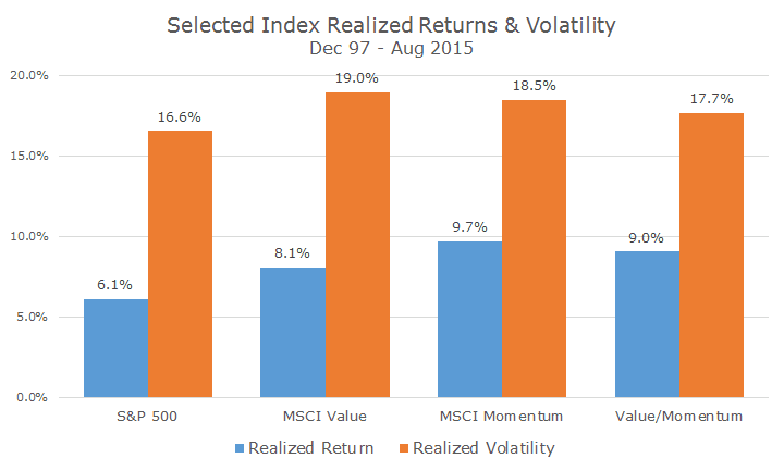
The chart below shows the realized return and volatility characteristics for the MSCI indexes since the momentum index was created in 1997.
What you can see is that both value and momentum outperform the S&P 500, by a fair margin. While momentum does better than value, the index doesn’t include the transaction costs of implementing the strategy, so that return is probably unrealistically high (I covered this in my momentum primer).
Notice that the volatility for both value and momentum are higher than the volatility for the S&P 500 as well, suggesting that risk and return go hand-in-hand.
The last two columns on the far right show a simple 50/50 mix between the value and momentum indexes. The return, as you would expect, is between returns for each index individually, but importantly, and as theory would suggest, the volatility of the combination is lower than each one individually.
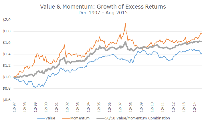
That’s because the two strategies aren’t highly correlated. In technical terms, just the premiums are negatively correlated (-0.2 percent) and the following chart will show what I mean by that.
Normally, when we look at a chart, we are looking at the growth of an investment. In this chart, we are only looking at the growth of outperformance, or excess return. This way, we can evaluate the various strategies without the noise of the overall market.
In the late 1990s, when the tech bubble was in full force, momentum (in orange) sharply outperformed the overall market, while value (in blue) underperformed. In the tech wreck that followed, momentum lost ground while value gained. Each one outperformed by 2002, but at different times.
The thick, gray line is the 50/50 split of the two strategies. The combination also outperformed during the tech boom and bust, but it’s a much smoother experience than either one individually. We see the same thing, but in the opposite, in the aftermath of the 2008 financial crisis, when value did well and momentum underperformed.
Although a down market is always a bummer (but also to be expected), it’s nice to see the value momentum combination ‘working’ so far this year, as it has historically. If we were just value investors, as we were in the past, we would be a lot unhappier than we are now. And, next year, if we were just momentum investors, perhaps we’d be equally unhappy.
Of course, a winning strategy doesn’t mean making money all of the time, or even outperforming all of the time. Every strategy goes through tough periods (except for Bernie Madoff) and value and momentum, even in combination, are no different.
As always, we’ll continue to look for the optimal way to try and capture the value and momentum premiums so that we can hopefully all benefit from the historic relationship between these two strategies.


