A few weeks ago when Federal Reserve Chair Janet Yellen testified before Congress, she said that ‘readings on housing activity, a sector that has been recovering since 2011, have remained disappointing so far this year and will bear watching.’
Since the World War II, residential housing activity has been about 4.75 percent of gross domestic product (GDP). During the bubble that hare increased to about 6.4 percent, cratered to two percent in 2010 and now stands at 3.11 percent.
It’s funny to think that such a small component of housing could have such a large impact, but the basic idea is that building homes creates a lot of high quality jobs and buying a home leads to a lot of other economic activity.
Given everything that’s happened in the housing market over the last decade, I thought it would be interesting to look at some of the important housing related indicators in pictures to help show where we’ve been and where they stand today.
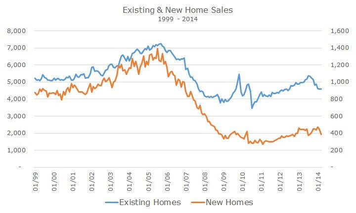
As you can see from the chart, existing home sales (the left axis) are basically back to pre-recession levels. That may be good news for realtors, but new home sales are still in the tank (right axis), barely off the bottom levels seen in the recession.

From a straight Economics 101 standpoint, it didn’t make sense to build new homes: why create additional supply when there is very little demand? One way to measure the supply/demand imbalance is to look at the inventory of homes, which is measured in months.
Before the crisis, it would take four months of sales to work off of the supply of homes for sale. We’re about back to pre-recession levels, which could mean that the market is ready for new supply in the form of new construction.
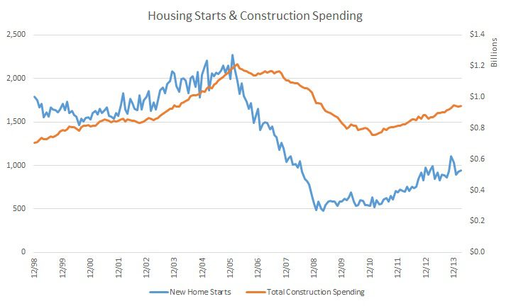
We’ve already seen some activity in a sense because total construction spending is back to pre-crisis and the number of new housing projects getting started (or starts) is increasing.

Home prices have recovered back to 2004 levels, according to the Case-Shiller 20-City home price index (but how can we trust an index that doesn’t include St. Louis?). Home prices stopped falling in 2009 but are only marginally higher than they were then – or in 2004, prior to the bubble.
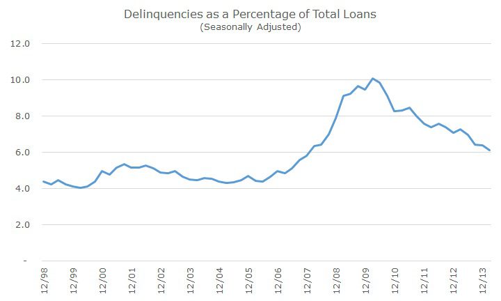
Thanks to higher home prices, the stock market recover and lower unemployment (yes, it’s still weak and there are plenty of caveats), the consumer is in better shape. We can see that delinquencies are lower and are now approaching pre-crisis levels.
The delinquencies show that payments are being made, but a lot of homeowners are still underwater. I couldn’t find a time-series data set to show the changes over the past five years, but according to academic researchers and the New York Times, 10 million Americans are still underwater on their home, which is 20 percent of homeowners that have a mortgage.
It also looks like there will still be a lot of foreclosures. Prior to the crisis, about 1-1.5 percent of homes were foreclosed on and at the peak in 2011, 4.5 percent of homes were foreclosed on. Today, that number is down to 2.5 percent, so there’s more pain to come in order to get back to normal.
It’s no wonder than Yellen is watching this market very closely and thinking about how higher interest rates could impact the tepid recovery. The average 30-year conventional mortgage costs 4.3 percent, above the 3.3 percent low in November 2012, but still well below the 6.25 percent average rate since 1994.
It’s been five years since the crisis ended (with the stock market as my primary gauge). The economic destruction was so powerful that the housing recovery didn’t bottom out for some time after the stock market did and the recovery continues to be slow and fragile.
