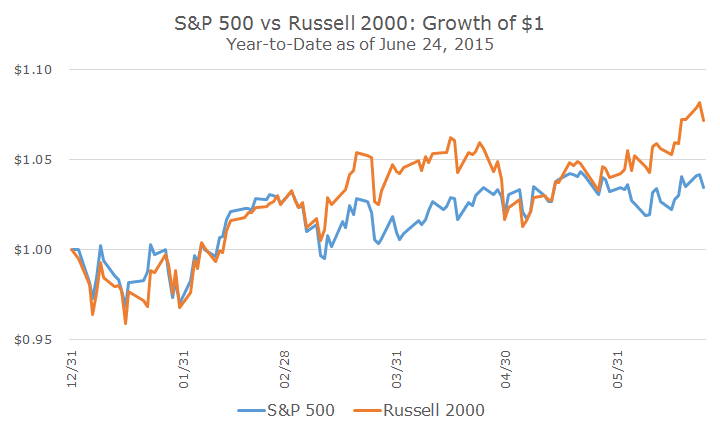
A number of people have noted that small cap stocks are really strong this year, as you can see from the chart below.
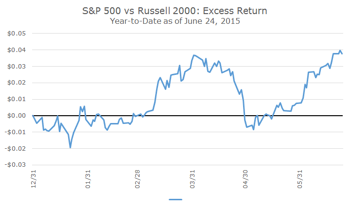
I want to illustrate this outperformance a little differently in the chart below, which requires a little explaining.
In the first chart above, I showed what a dollar invested in each index would have turned into. Although you can’t invest a dollar in anything, let alone an index (it would have to be an index fund), it helps to show how the indexes are doing in an intuitive way.
The next chart is less intuitive, but once you get used to it, is a really nice way to evaluate over and underperformance. Instead of looking at the growth of each index, it shows the growth of the outperformance.
You can see that for a few months, there was effectively no difference in performance, which matches the first chart. Then in February, small cap pulls ahead only to lose steam in April and power back since then. Remember, it’s showing the same thing the first chart shows, just a little differently.
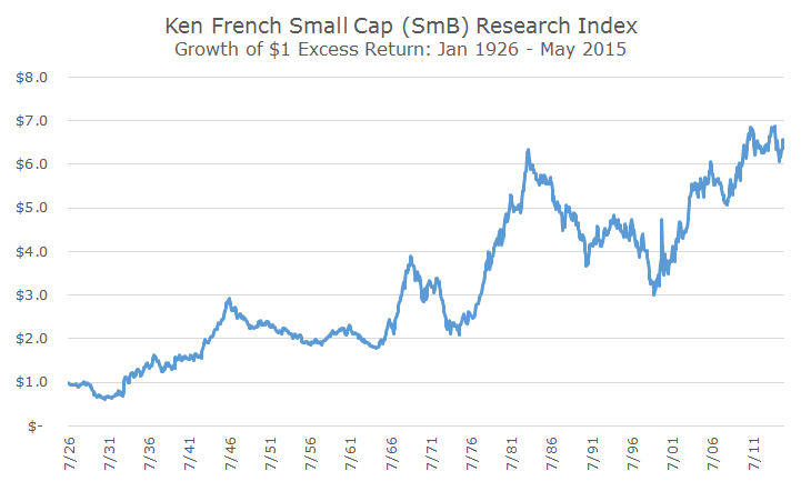
The reason that I want to present this concept is so that I can expand the time horizon for looking at small cap stocks all the way back to the beginning of good data in 1926.
For this chart, though, I am not using the S&P 500 or the Russell 2000, I am using an academic data set from Ken French, one of the most famous and regarded professors in finance.
His oddly titled index called SmB, which stands for Small minus Big (referring to market capitalization) looks at the difference between all small cap stocks and all large cap stocks.
The construction is different (and better) than what I showed up top, but the idea is the same – we’re looking at the cumulative growth of investing in small cap stocks compared to large cap stocks over time.
What I want to illustrate with this chart is that the outperformance of small cap over large cap varies a lot over time. There were long stretches where small outperformed (from the late 1990s through today), where it underperformed (from the early 1980s until the late 1990s) and did no better or worse (from the mid 1940s to the mid 1960s).
You can definitely see a long-term positive trend from small cap that has some stability, but there are long periods where small cap stocks don’t work well. I write about this in a lot more detail in a primer about small cap stocks that can be found here (including an explanation for why small cap benefits a portfolio even when it underperforms).
My point today, though, is not about small cap outperforming over time or that it can go through long periods of over/underperformance. My point today is that what you see year-to-date, is mostly just noise that really doesn’t mean that much.
The first chart shows how quickly outperformance (and underperformance) can come and go and, just like I wrote about bonds a few weeks ago, we’re just watching volatility. It takes years to see how these strategies really play out and the last six months tells us very little about the long run.
Today I’m writing about small cap, but the same thing applies to our other strategies like value, momentum and quality, which is why we diversify across strategies in the US and overseas. Isn’t if funny how so much of what we do boils down to diversification?


