When it comes to reading the newspaper online, I was an early adopter. While I miss the physical paper sometimes, I don’t miss the massive recycling effort and I appreciate getting up to the minute news throughout the day.
I don’t like some of the tricks that they play online, though. Yesterday, I was looking at the Wall Street Journal (WSJ) online and saw the headline, ‘Small Cap Stocks Especially Volatile this Year.’ When I clicked on the link, the headline changed to ‘For Stocks in 2014, Even Volatility is Volatile.’
What bothers me even more than the morphing headlines is that neither one is true! You’d think that if you wrote two headlines for a single story, there’s a 50/50 shot that one of them will be right!
For the last five years, stock volatility has been abnormally low, so I thought that the first headline must be wrong on its face. I ran two tests to see whether small cap stocks have been especially volatile this year.
The first test, pictured below, shows the rolling 12-month volatility of the Russell 2000, the most widely followed small cap index and the one featured in the WSJ article. The solid blue line reflects the realized volatility over time and the dotted blue line shows the long term average. Obviously, the last 12 months is well below the long term average.
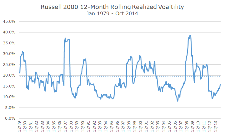
I thought that persnickety readers (which I appreciate since I am being finicky with the WSJ) might say, ‘Dave, the last 12 months extends into last year and the headline only refers to this year.’ If you annualize the daily realized volatility through yesterday, you get an annualized volatility of 16.4 percent, well below the 19.74 percent long-term average volatility.
The second headline isn’t any better, since it obviously isn’t true that this year is more volatile than others (the same is true for large cap stocks).
Why does this bother me? Other than the fact that major newspapers like the WSJ ought to get the facts right, it bothers me that they are reporting higher volatility when that just isn’t the case.
If you talk about low volatility times as if they were high volatility periods, people will get understandably upset when high volatility period really arrives. It’s like the boy who cries wolf: don’t do it when there’s no wolf.
To me, the real story is how quickly expected volatility (which differs from realized volatility) has really evaporated from the market in the past few weeks.
The following chart looks at the CBOE Volatility indexes for both the S&P 500 and the Russell 2000 and you can see when stocks sold off, volatility spiked. As stocks have recovered, expected volatility has simply fallen by the wayside.
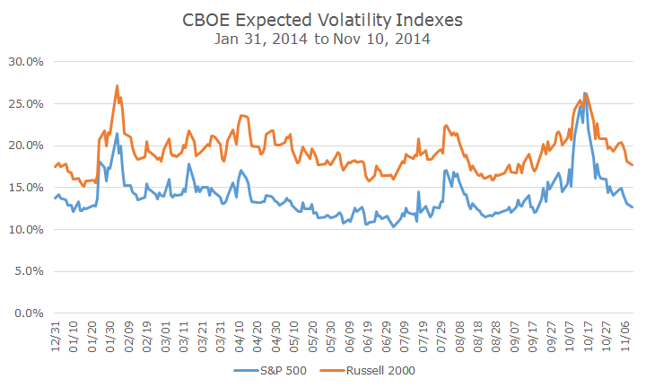
Expected volatility is calculated based on the market prices for futures and options, and they have been running a little hot this year since most investors have expected a lot volatility that hasn’t come to pass.
Now that’s a story that I’d love to read.