After two years of staying home, Acropolis is hosting our 5th Annual Investor Social (invite below).
I thought it would be fun to preview some of the slides leading up to the event, partly in hopes of drawing folks and partly to give the out-of-towners who weren’t invited some of the content (I’ll be happy to email the presentation after the event to those who missed it).
This week, I want to show the inflation chart, which I’ll be able to cover in more detail here than I will be able to on stage.
There is no doubt that inflation was the big story of 2022. The US hasn’t seen anything like this in decades. It caused the Fed to hike interest rates, which caused stocks and bonds to fall, and we feel inflation in our everyday lives.
This chart breaks inflation down into its big components to try and see what happened on the way up and the beginning of the way down. Before the pandemic, inflation was pretty stable, mostly in services and housing (the two shades of blue since housing is technically a sub-component of services).
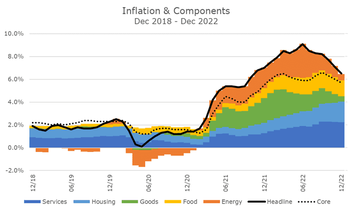
The pandemic’s start is pretty obvious because headline inflation (the solid black line) plummets when energy prices (in orange) fall through the floor.
Then, in the first half of 2021, goods inflation (in green) comes out of nowhere as we start to reopen. People are buying stuff, and the supply chain bottlenecks are forcing prices higher. That’s where you’ll find the microchip problem that caused new and used car prices to skyrocket.
Things get worse at the start of 2022 when Putin invades Ukraine, raising energy and food prices. The other issues in everything else are just getting worse.
It’s about that time that the Federal Reserve starts to raise interest rates, and it’s often said that monetary policy operates with a long and variable lag (which just means they don’t know when the effects will be felt).
And it’s hard to see the impact so far. They don’t get much credit for energy prices, although they get a little because investors expect a recession from the hikes, and energy prices fall in anticipation of the recession. They don’t get much credit for the goods inflation since that’s about supply chains.
But they probably get credit for the slowdown in housing. But when you look at the chart, you can’t see anything. That’s because the housing data is mostly a computation rather than a measurement, and it operates with a six or eight-month lag, depending on the economist that you listen to.
Since ‘everyone’ knows that, seeing it level off is good enough. For more on the housing computation, click here.
Now, astute observers will note a problem with the chart. The five color components all add up to the headline rate. But the three components that makeup core inflation don’t add up to the core rate, which is the dotted line.
I went down a three-hour rabbit hole trying to get the data to reconcile, but it felt more like a doom loop than a rabbit hole. Ryan and I think it has to do with some data being seasonally-adjusted and some not.
I wanted the headline and core rates to be what you see in the newspaper. While the components add up correctly to the headline, they don’t add up to the core rate. All I can do is shrug my shoulders and tell you that’s how Ph.D. economists spend their time.
I think the chart is still a helpful visualization of what happened and (hopefully) gives a sense of where we are headed next. Moreover, I hope it entices you to come to the Investor Social if you can!