While no one expected the yields on bonds to fall materially this year (and remember, falling yields translate into higher prices), some elements of the bond market performance have been perfectly normal.
The chart below shows the year-to-date performance of selected bond indexes through Friday, December 12, in blue. The orange bars show the performance of each index since inception of the indexes in 1976 through the end of November, 2014.
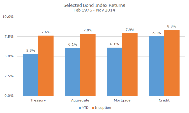
The main takeaway from this chart is that the three major subsectors of the Barclays Aggregate (Treasury, Credit and Mortgage bonds) performed generally how you would expect.
I’m not talking about the level of return, but to the returns relative to each other across sectors.
For example, Treasury bonds, which have the least credit risk since the government can print money to repay their debts unlike a corporation, have the lowest return because they are the safest. Conversely, corporate bonds have the highest yield for basically the same reason but at the other end of the spectrum.
Mortgage bonds, this year as in the past, fall somewhere in between.
Mortgages never had much credit risk because Fannie Mae and Freddie Mac always had the implied full faith and credit of the US government and when they were insolvent, the government made good on that promise.
That doesn’t mean that mortgages are risk-free, though. As we’ve discussed before, the two primary risks in bonds (and there are many secondary and tertiary risks), are credit risk, the risk that you won’t get your money back, and term risk, the risk associated for the length of your loan.
Mortgages are a little funny because you don’t really know the term risk at the time of purchase. A normal bond states the maturity date along with the coupons so you know exactly when you’ll get your money back.
A mortgage bond is a little different because you are buying a pool of home mortgages. You may agree to loan 100 people money for 30 years, but most will repay that money before the term is up.
Some people move and pay off the mortgage, others pay off a little bit more principle each month to reduce their debt more quickly and others will refinance when interest rates go lower.
The following chart shows how the duration (a measure of the term that includes other factors) shows this pretty nicely.
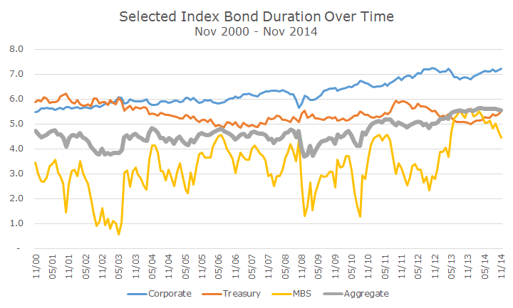
Notice how the duration for Treasury bonds, measured in years, stayed pretty steady over the last 14 years. It was as short as five years and as long as six years – not much shifting over time.
Corporate bonds are interesting because the duration started around five years and is now over seven. That makes sense – interest rates are low, so companies are borrowing money for longer terms, trying to lock in low interest rates.
The duration on mortgages flop around a lot – less than one year in 2003 and more than five years about a year ago and a lot in between.
The uncertainty about the timing of your coupon payments means that investors demand a higher yield. Mortgage bond investors will get their money back, they just don’t know when and there is compensation for that uncertainty.
What’s interesting to me is that the duration in the Aggregate, which combines all three sectors, stays pretty steady. It is longer today than it was in years past due to corporates, but could fall if the recent trend in mortgages continues.
I would say that the over the last decade, duration was typically just under five years, but more recently is a little more than five years. Our model portfolio is slightly shorter than the Aggregate, partly because we invest in non-US bonds (that are generally hedged for currency risk) and the duration is shorter.
As always, we will keep a keen eye on how these trends shake out and make changes as necessary. We like all of these sectors and will continue to diversify among them for the long-term.
