In the market summary section above the performance table yesterday, I mentioned that St. Louis Fed President James Bullard had broken ranks with his fellow Fed members and his previous statements and said that he expected rates to stay even lower for longer.
I made a quick reference to the famous ‘dot plot’ and said that his dots were pretty far from the consensus. I thought today I would show the dot plot, and found a nice screen from Bloomberg that shows its current position.
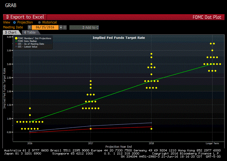
It’s a little hard to read, but the y-axis on the left shows the rate expectations for 2016-2018 and the ‘longer-term’ as seen on the x-axis.
Each time period shows a cluster of dots that shows the estimate for fed fund rates from each of the governors and the green line shows the median across the group.
Down below, you can see a single dot that is well below the rest of the group and although we don’t know with certainty, everyone thinks that’s where Bullard is today based on his recent comments.
The red and blue lines show the market estimates for fed funds based on the day of the announcement and yesterday.
The market based estimates are pretty far away from the Fed members, which is nothing new – the market and the Fed have been at odds for a long time and, so far, the market has been more accurate (and less optimistic) than the Fed.
It’s interesting that Bullard changed so dramatically, and it’s also interesting in my opinion that his new outlook matches the market. Will he continue to stand apart from his fellow members, or is he the first domino to fall across the group – we’ll just have to wait and see.
