Private investments, or simply ‘privates’ in the current vernacular, are among the hottest investments in recent years.
Private investments, which are often considered one of the most prominent alternative investments, means owning securities that aren’t publicly traded.
Private markets can include equity (stocks), credit (bonds), and real estate. Each major group has subcategories. Private equity can be venture capital, buyout equity, or growth equity. Credit can mean direct loans, mezzanine loans, or distressed loans. Real estate can be office buildings, infrastructure projects, or data centers.
Privates aren’t new – I wrote about the Kohlberg Kravis & Roberts (KKR) leveraged buyout of RJR Nabisco in the tenth grade (I still have it, and while it isn’t very good, it’s fun to see).
Privates have long been part of institutional portfolios – large pensions and endowments and were made famous by people like David Swepson of Yale. What’s new is that they are making their way down to retail investors.
Of course, that means that I put on my chef’s hat and buy these things in my personal account, which I consider the test kitchen. We like to say that we eat our own cooking, but I also want to sample the food before we serve it, which means learning how things work by owning for some time.
In the case of private markets, I’ve come to believe that one of their big selling points is pretty bogus.
The selling point in question is that the idea that private markets are less volatile than public markets, and that correlations are low, which lowers in lower portfolio volatility.
A common rebuttal is that private markets don’t have accurate prices, and there is a risk of self-dealing because the private market purveyor can put in bogus prices.
I’m sure that happens, but my point today is much broader: the whole set up behind the math isn’t sensible and shouldn’t be used in the way that the private market sellers use the data.
I’m 100 percent stealing this idea from a Nobel Laureate in finance, Robert Merton, who I saw speak on the topic a few months ago. He wrote a paper on it in the 1980’s or 90s. It’s not a new idea, but all the folks buying and selling privates seem to have forgotten about his paper.
His idea was to simply set prices for the S&P 500 less frequently than the overall market does. Pretty simple, right? And yet, it’s very powerful because you see the impact of infrequent pricing on an index that we all know and love.
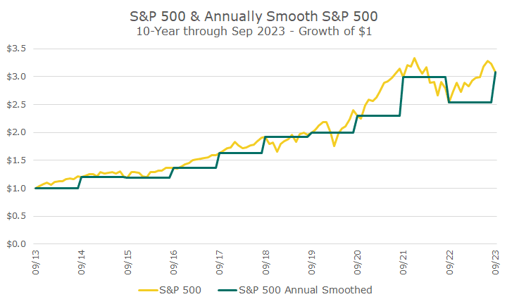
The graph below shows the idea. The yellow line is the monthly total return for the S&P 500. The green line is the total return, but for the whole year, so you don’t see all of the noise that happens each month. Of course, markets price all day every day, so looking at the monthly data has some smoothing effects.
You can see that $1 invested in the S&P 500 that prices monthly turns into exactly the same amount of money as the S&P 500 that prices once a year (which I call ‘annual smoothed’ in my chart).
The big difference, clearly, is the volume of squiggles in the yellow line that represents the monthly pricing. Of course, we now have two lines that aren’t identical to each other, which is another way of saying that the correlation isn’t perfect.
Normally, returns aren’t shown this way. Instead, we routinely see them as they are presented in the box below.
The first line show that the returns are extremely close, but they aren’t identical. That has to do with rounding and compounding, but the returns are pretty close – about 0.1 percent per year different, which adds up to a cumulative difference of one percent over a decade.
The volatility for the smoothed S&P 500, which is meant to copy the private equity market, shows the realized volatility is lower by 12 percent. You might be thinking that isn’t very much, which is true. But, there are two ways to run this, the other way shows the volatility at five percent, which is silly to even consider.
The Sharpe ratio basically shows the risk divided by the return (after subtracting out the T-Bill return. Since the returns are effectively the same, and the volatility is 12 percent lower, it fits that the risk-adjusted measurement would be higher by about the same amount (13 percent).
Remember, these portfolios are identical- they are both the S&P 500 – the only difference is how often I price the portfolio to get the return. Looking less frequently, annually in this case, changes the numbers.
The lower two numbers, the beta and alpha, are commonly used metrics to understand the risk of an investment and the skill of a manager.
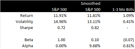
In this example, the beta of the smoothed S&P 500 is the relative volatility, times the correlation, which is very low.
In this period, the beta of the smoothed S&P 500 data is 0.10, which means that only 10 percent of the return is the result of the S&P 500 return – which, on its face, makes no sense since the S&P 500 market return explains 100 percent of the smoothed return.
The alpha is determined by figuring out how much of the smoothed return is due to the market (based on the beta) and measuring the excess return. In this example, the ‘alpha’ for the smoothed strategy is 9.68 percent per year, which again, doesn’t make any sense.
None of this is to say that the smoothed return is a bad return (it’s the same as the market!). The point is that the common tools to evaluate a manager don’t apply, which is my problem with a lot of the marketing materials from the private market purveyors. Although, to be fair to them, I haven’t seen anyone misuse beta or alpha in this way – I took that from Merton.
After trying alternatives in my account for some years now, my conclusion is that there is nothing wrong with private markets. There are some very good managers, but there are some aspects that are hard to live with, namely very high fees and low or no liquidity.
There can be a number of reasons to want to own them (and as many for not owning them), but investors who buy them because of their purported low volatility and correlation are fooling themselves.

David is a trusted advisor to 50 families, delivering comprehensive financial solutions, including financial planning, investment management, cash management, tax planning, estate planning, and charitable giving. As Chief Investment Officer, he leads the Investment Committee and the research and trading team. His team continuously evaluates investment strategies and securities, working closely with Portfolio Managers to implement them effectively.