I wasn’t sure what I was going to write about this week and thought about simply starting with a picture of inflation, as measured by the Federal Reserve’s preferred measure, the core Personal Consumption Expenditure, or PCE.
Like the core Consumer Price Index, core PCE strips out food and energy prices because they are so volatile, but don’t really change the numbers of the long run. Said, another way, they add a lot of noise, but don’t improve the signal.
PCE differs from CPI because it measures overall inflation in an economy, not just what the consumer encounters. They both measure the price changes of certain baskets of goods and services – the difference is the weights of the items in each basket.
The classic example is healthcare costs. PCE measures all of healthcare costs, but CPI only measures what consumers see out of their own pocket. PCE includes the cost of care covered by employers, Medicare and Medicaid.
Also, PCE tries to account for how consumers respond to higher prices. If the price of bread goes up, PCE attempts to adjust the basket to account for people buying less bread because it’s more expensive, whereas CPI uses the same weight.
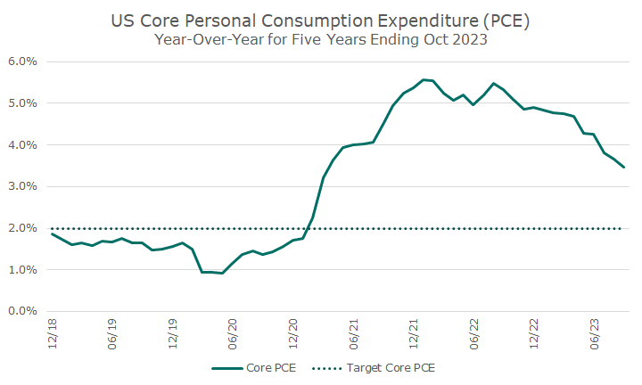
The chart below shows the core PCE over the last five years, and my intent in showing is to illustrate how inflation is decelerating. Using this measure, inflation is still higher than the Fed target, but it’s better than it was at the height of the inflation shock.
I was looking at the year-over-year data, but then decided to look at the long run history of the index, which is shown below. I’ve got a typo that I’ll fix for the website, but it starts in 1959. You can see the difference in the slope between the 1970s, the Great Moderation that followed, and the covid shock.
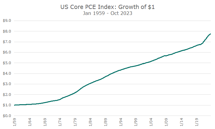
I like this chart because it reminds me of how my dad paid a quarter to go to the movies in the 1950s: ten for the ticket, five cents for popcorn, and ten cents for a Coke.
Using that chart, it would imply that the cost is 8x higher, but we all know that you can’t watch a movie with popcorn and a drink for $2 (let alone stay in the theater all day). Other costs clearly came down to offset the higher cost of the movies.
The problem with this chart is that it’s upward sloping, which kind of makes you think that inflation is a good thing. The chart below takes the same data and puts it in purchasing power terms: what one dollar then would buy today. The picture is much different.
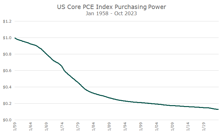
This is the picture that reminds me of why we invest at all. If we just put $1 under our mattress or in a hole in the back yard, it won’t buy as much goods and services as time goes on because of inflation.
Even when inflation is gradual, like it was over the last 20 years before covid, a dollar still lost a lot of purchasing power over time. We buy stocks and bonds because, historically, the rates of return on those investments have exceed inflation – not all of the time, but on average and over time.
Those investments, those risks, are what have allowed savings to maintain their purchasing power over time. A penny saved is indeed a penny earned, but it has to be invested to buy a penny’s worth of goods and services over time.
