Probably not surprisingly, I follow the major economic data releases, but I often look at charts because I find the charts provide useful context about the new information.
Take the nonfarm payrolls release last Friday. Everyone seems pretty excited about the data because it beat expectations and suggests that the economy is holding up reasonably well despite much higher interest rates.
The chart below shows the monthly nonfarm payrolls for the last 25-years. You can see the pre-2008 average looks like it was round 200k per month. Then, the labor market shrinks in the global financial crisis, but the average number of jobs created in the 2010s is about 200k.
Then the pandemic comes along, and I clipped the chart because the losses were so bad and then the recovery was so sharp, that it skewed the entire chart. You might call the pandemic ‘off-the-charts.’ Har-dee-har-har!
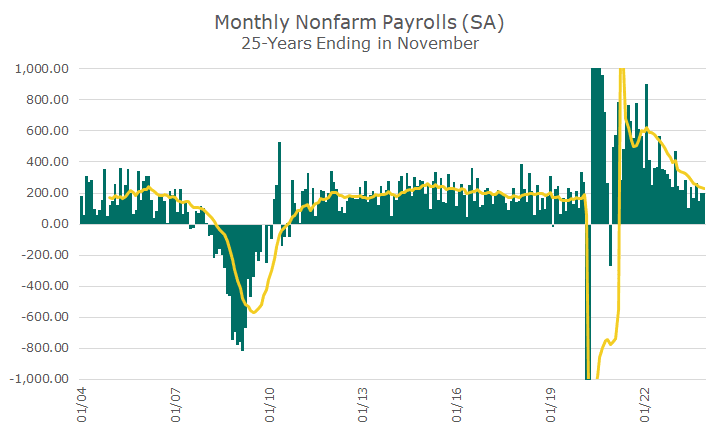
The trouble with the nonfarm payrolls number for me is that the size of the labor market changes, so 200k new jobs now is different than it was 20 years ago, which is why it’s useful to look at percentages.
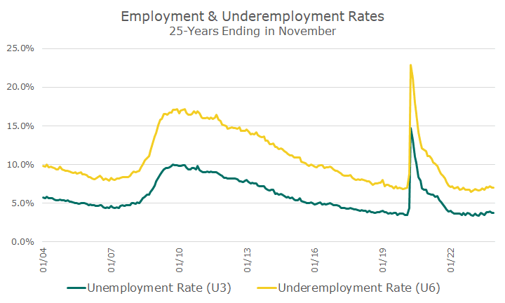
The chart below shows the unemployment rate, in green, and the underemployment rate, which adds in workers that are marginally attached to the workforce and have given up looking for work.
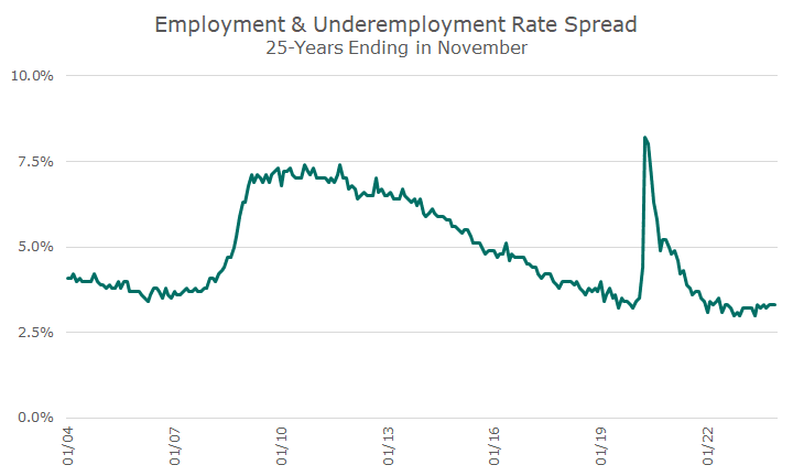
Those two lines are interesting, but are a little hard to compare to each other, so the next chart shows the difference between the two rates. I like this because you can see that before the 2008 crisis, the difference was around four percent.
Over time, the number whittled itself down to levels before the crisis, but you can see it took a full decade. Then, the pandemic came along, and a natural question was whether the same thing was going to happen again.
Thankfully, history didn’t repeat itself, and the difference dropped down to the level just before the pandemic in relatively short order.
The good news about rates is that the information is relative to a total. The bad news is that a lot of people believe that the data providers, aka the government, manipulate the data to serve political purposes.
One measure that mostly gets around that problem is the percentage of the labor force to the entire population of eligible workers. This doesn’t require a lot of PhD’s – it’s the number of people working divided by the number of people. It’s also called the employment rate.
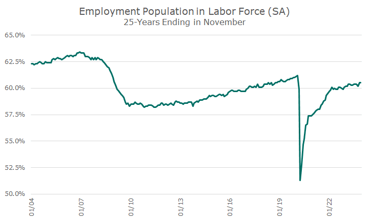
Here again, we see the massive and long-lasting impact of the 2008 global financial crisis. Before the crisis, the percent of people employed was in the low sixties. The crisis comes along, and the percentage falls to the high fifties.
Then, the number of people working slowly makes increases until the pandemic, when it falls of a cliff bigger than the 2008 crisis. Thankfully, this time, the recovery is a lot faster, although we’re still not back to pre-pandemic levels.
Hopefully, these visuals allow you to get a better picture on the labor market situation. My view is like the market’s: these numbers are pretty good, and I’d like the current trends to continue.

David is a trusted advisor to 50 families, delivering comprehensive financial solutions, including financial planning, investment management, cash management, tax planning, estate planning, and charitable giving. As Chief Investment Officer, he leads the Investment Committee and the research and trading team. His team continuously evaluates investment strategies and securities, working closely with Portfolio Managers to implement them effectively.