Yesterday, I wrote that the yield on the 30-year US Treasury closed at an all time low at 2.25 percent. I also wrote that the yield on the 10-year was 2.66 percent, which was completely wrong: it closed at 1.66 percent on Friday, I simply made a fat fingered mistake – sorry.
This mistake notwithstanding, I was struck by the two yields because the all-time record-low yield on the 10-year note is burned into my mind at 1.39 percent, set back in 2012.
Seeing the yield on the 10-year still more than a quarter point higher than the all-time low and knowing that the 30-year yield was at a fresh all-time low made me think about the difficulty in predicting the twists and turns in the yield curve.
The chart below looks at the yield curve for US Treasury bonds on July 24, 2012, the day that the 10-year reached it’s all time low and yesterday, when the 30-year traded at its all-time low.
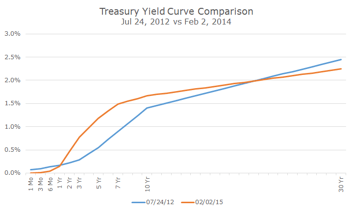
It’s interesting because if you look at the short end of the curve, one-year and under at the left, you can say that rates are lower. You can say the same thing about the long end of the curve on the right, where the blue line crosses the orange line. In the middle of the curve, rates are higher.
So, did rates go higher or lower? Yes, they did. Go higher and lower, that is.
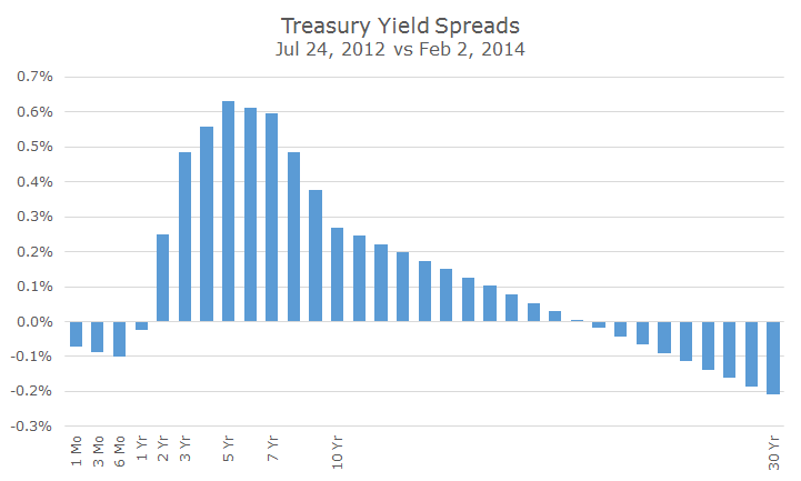
The chart below showed the same thing by looking at the difference in the two curves. I’ve interpolated some of the off-the-run yields, so this isn’t a perfect look, but it gives the right idea – rates are lower at the short and long end and higher in the middle.
Clients sometimes tell me that they are worried about losing money on bonds when interest rates go up.
The first problem is figuring out when that might be, but as we can see from the charts above, you also have to decide which rates might go up – there are a bunch of sections in the curve to choose from. When you have that figured out, there are more curves to choose from: corporate, mortgage, inflation-protected, etc.
But let’s just stick with Treasury bonds for a moment. Looking at the cart above, knowing that rates went up anywhere from two to 20 years, wouldn’t you assume that you lost money in bonds? And that the longer the duration, the more you lost?
It turns out that this isn’t necessarily the case. Let’s look at three investors that bought various Barclays Treasury indexes.
The first investor was very worried about rising rates and he bought bonds with a two-year duration. Over this time period, when rates rose in his section of the curve, he earned a cumulative return of 1.6 percent or so.
Shouldn’t he have lost money – rates went up? While the price of the bond did fall, there are two components of return: price changes and interest payments. The interest payments offset the price loss and earned a little bit of interest.
The next investor, like us, was concerned about higher rates, but wanted the higher yields on the five-year section of the curve. That investor earned a cumulative 3.7 percent return. The price loss initially was higher, but so were the cumulative interest payments.
The last investor threw caution to the wind and bought 10-year bonds. We don’t have the guts for this, but where there is risk, there can be return. This investor earned 6.7 percent over the same time period cumulatively, even though rates went up.
There are a few lessons here. First, it’s nearly impossible to know which direction rates may go in one part of the curve, but it’s actually impossible to get it right in multiple parts of the curve.
All of this talk about the Federal Reserve raising rates, for example, is about the short end. Even if they hike, what will happen in the middle or the long end of the curve is still unknown.
Second, just because rates go up, doesn’t mean that you are going to automatically lose money. In fact, you want interest rates to go up – these levels are for the birds!
As long as your time horizon is longer than your duration, rising rates is a benefit. For our clients, we are pretty comfortable in what is called the ‘belly’ of the yield curve, which is around a five year duration.
That area of the curve offers a reasonable balance of yield and interest rate risk – and who among us is willing to admit that their time horizon may be less than five years?
