There are only a handful of index providers globally and their intense competition breeds some very interesting innovation.
Recently, one of the large providers, MSCI, launched a series of indexes that attempt to reflect the performance of companies based on their economic exposure rather than the location of their headquarters. When indexes were first created, most companies economic reach didn’t expand much beyond their own borders.
Today, however, businesses are global and their domiciles are less relevant. The issue became especially pronounced last year when several companies based in the US attempted to shift their corporate headquarters to other countries to save taxes in a process known as an inversion.
Even without inversions, it’s a complicated issue. The iconic American company, General Electric, is headquartered in Fairfield, Connecticut but in 2013, earned 62.2 percent of its profits outside of the US. Is that an American company?
What about Nestle, the food giant; they’re based in Vevay, Switzerland, but only 1.6 percent of their revenue comes from within Swiss borders. Are they a Swiss company?
The MSCI economic exposure indexes organize companies by where their revenue is earned. For example, the top 10 holdings of the China index includes several US companies like Qualcomm, Texas Instruments and Yum Brands (parent company of Taco Bell, KFC, Pizza Hut and others).
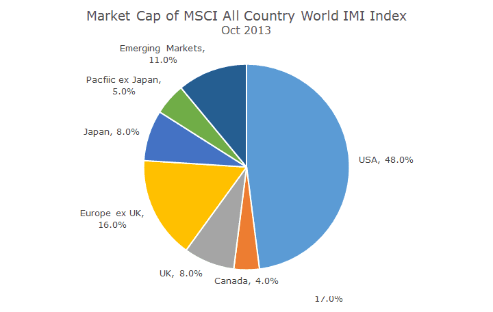
The impact is dramatic, as seen in the next two charts. The first chart is the classic categorization based on domicile. It’s amazing because the value of all of the companies in the world outside of the US are worth just barely more than our market.
In this chart, MSCI organizes the markets by where the revenue is earned.
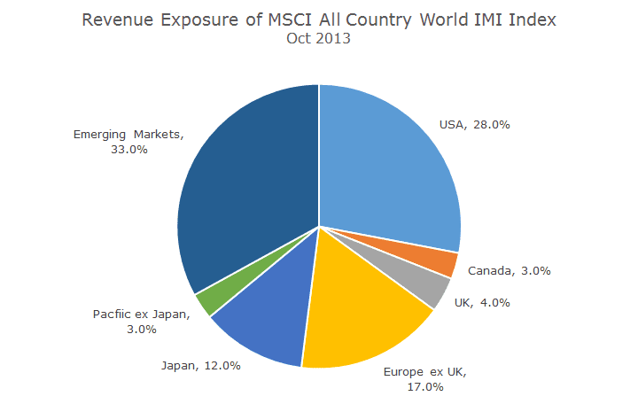
Organized this way, the US shrinks dramatically. Of all of the revenue earned by the world’s publicly traded companies, ‘only’ 28 percent is derived in the US.
Amazingly, most of the revenue earned worldwide is made in Emerging Markets, countries like China, India, Brazil, and Mexico to name a few of the 23 constituents.
The obvious implication is that US companies earn a ton of money in Emerging Markets. That’s not true for everyone – in Europe (minus the UK) the relative weights of market capitalization and revenues are about the same.
Of course, there are European countries operating in emerging markets, but someone else (like the US) is in Europe by a roughly equal amount.
As I pondered these two pie charts (which I recreated from a MSCI presentation), I thought it made sense that so much of the revenue earned worldwide is in emerging markets because that’s where the people are. Even though emerging markets aren’t wealthy, companies can earn a lot of revenue on volume.
While thinking about the size of these populations, it dawned on me that these revenue numbers are out of whack compared to the number of people that live in the Emerging Markets.
So, I went to Wikipedia armed with the country list from each of the segments pictured above and drew a third chart based solely on population.
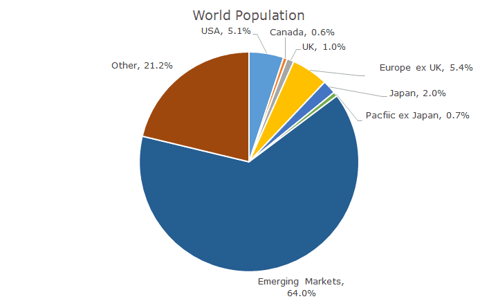
I knew the number was going to be big, but I didn’t realize that two thirds of the world’s population lives in what we consider Emerging Markets.
Maybe I’ve been doing this for too long, but when I think of Emerging Markets, I naturally think of the 11 percent market capitalization (yes, that’s part of my on command mental data bank).
A funny thing happened as I was looking at the list of countries on Wikipedia – there were countries that weren’t listed in either of the MSCI indexes.
Take Pakistan, for example. It doesn’t have any representation in the MSCI indexes (maybe in a Frontier index, but that wasn’t in the original presentation) and 189 million people live there according to Wikipedia.
I went down the list and counted the top 20 countries that aren’t in the MSCI indexes and there are a lot of people that aren’t represented – they fall into the 24 percent ‘other’ category.
I stopped at 20 for no particular reason, which cut off Venezuela, which as 30 million people, four million more than the state of Texas. That means that my numbers aren’t quite right, although you get the idea.
It’s impossible to look at these pie charts and not be thankful for our incredibly good fortune. It’s a little depressing to think about the economic disparity, but the optimist in me also thinks there must be tremendous opportunity here as well.
Here’s to the future!
